In my journeys in the search for art I have acquired some things which might not be considered art but they are works which contain artworks. I have in my collection a set of ‘The Graphic Illustrated Paper’ from September to December 1870 but they are for another day. Today, I wish to talk about two publications which are illustrated by the same artist. One of the great etchers and engravers of all time. Gustave Dore by name. And the two books from my collection in to-days blog are DON QUIXOTE (2 volume set published Cassell 1906) and ‘THE NATIONAL FAMILY BIBLE ( published by Pike & Brothers @ 1880).

Don Quixote
by Gustave Dore
The wonderful artist Gustave Dore (1832-1883) was a French engraver, illustrator, and sculptor. Doré worked primarily in wood and steel engraving. He illustrated a number of books and in the 1860’s he illustrated a French edition of Cervantes’s Don Quixote, and his depictions of the knight and his squire, Sancho Panza, have become so famous that they have influenced subsequent readers, artists, and stage and film directors’ ideas of the physical “look” of the two characters. Dore’s illustrations for the English Bible were also very successful. Amazingly, Dore was known for his painting while he was alive and although fine paintings they are his woodcuts and engravings are where he excelled as an artist.
The first two images come from the Don Quixote and the third comes from the Family Bible. The first image is the frontispiece of Volume 1 and is titled ‘A world of disorderly notions, picked from out of his books, crowded into his imagination’ and if you look closely you will find images from throughout the whole two volumes.
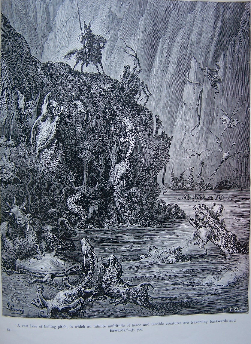
Lake of Boiling Pitch
by Gustave Dore
‘A vast lake of boiling pitch, in which an infinite multitude of fierce and terrible creatures are traversing backwards and forwards’ is our second image and our trusty hero, Don Quixote, without reflection or considering dangers cast himself into the midst thereof, only commending himself to heaven and to his lady.
And finally, ‘The Temptation’ from the national Family Bible.
One can easily see from these few images that Dore was a truly gifted artist and well deserves his renown.
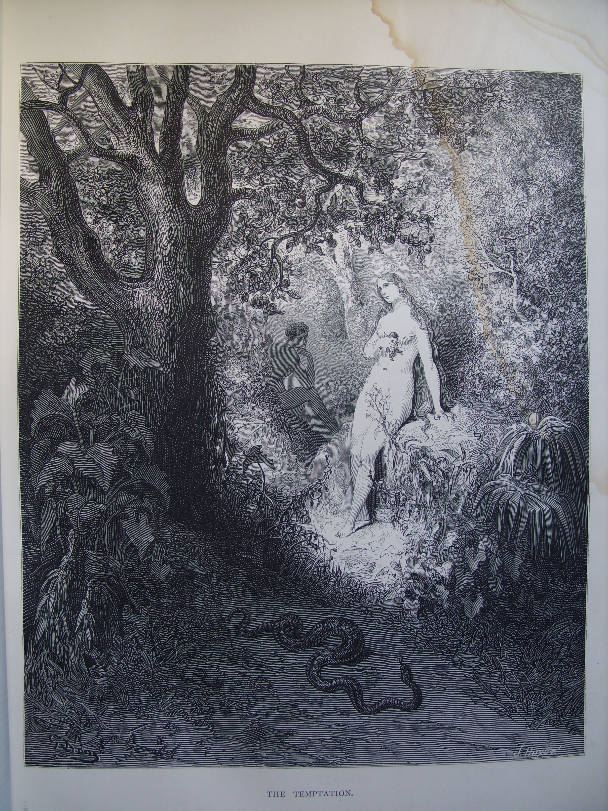
The Temptation
by Gustave Dore @ 1880