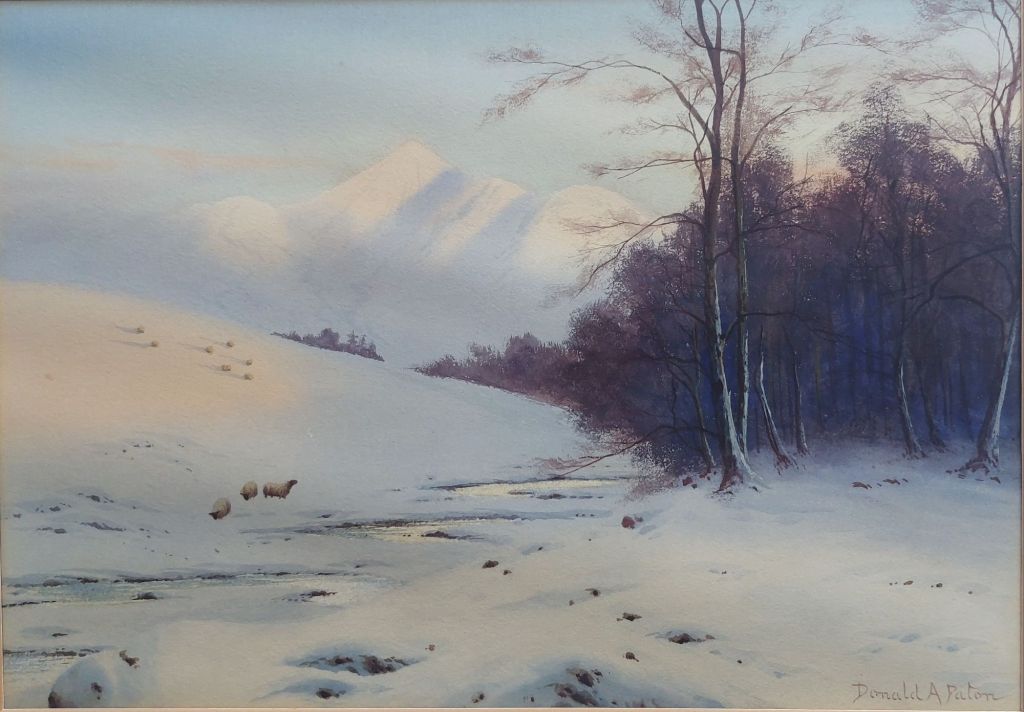
We go back to the Lake District and visit another artist who painted this area of England. #EdwardHoraceThompson (1879-1949) was born in Seaton, Workington, in Cumbria. His artistic talent was seen early, and he began painting at the age of 12. After his studies, he continued to paint but only in his spare time as he worked an office job to make a living. By 1918, he had established a reputation as a good artist, and he turned to life as a full-time painter. Shortly, thereafter, he set up his studio in Eaglesfield near Cockermouth. He moved to reside close to Bassenthwaite, Cumbria, and from there, he captured the varied moods and colours of the mountains and lakes that surrounded him..
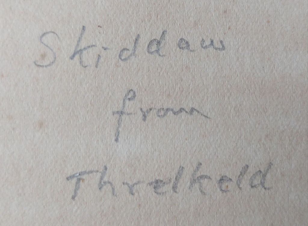
Skiddaw from Threlkeld – title on verso
Thompson began using pseudonym #DonaldAPaton around 1924 for most of his Scottish scenes. Thompson worked mainly in watercolour and is now considered to have been a very fine artist. He produced a series of images/works that were produced as postcards to promote the Lake District and Scotland.
Skiddaw from Threlkeld – watercolour by Edward Horace Thompson (aka Donald A. Paton)
One can see from this fabulous winter scene the talent that Thompson possessed as well as his love and respect for the Lake District in which he lived.
About an hours drive from where I live stands #StMarytheVirginChurch in Elsing. The church is a 14th-century structure and was built at the behest of #SirHughHastings. The church has a number of features that make it a standout. The church has no aisles. It has a single span roof, which stretches over 12 meters. The broadest in East Anglia and one of the biggest in England. There remains fragments of the stained glass that once filled the windows and a magnificent font, but we have come to look at a brass – that of Sir Hugh Hastings.
Sir Hugh Hastings A Brass in Elsing Church
This brass is considered one of the best examples of church brasses in England. We see Sir Hugh born by angels to heaven while mourners, 7 in total, line either side of his effigy (one is missing in this engraving but has been replaced)
On Sir Hugh’s right, the mourners are King Edward III, Thomas Beauchamp – Earl of Warwick, missing Sir Hugh le Despenser, and Sir John Grey of Ruthin.
King Edward IIIThomas Beauchamp, Earl of Warwick Sir John Grey of Ruthin
To Sir Hugh’s left, we find – Henry (Plantagenet) 4th Earl of Lancaster, Lawrence Hastings, Earl of Pembroke, Ralph Stafford, Lord Stafford, and Almeric, Lord St. Armand.
Henry (Plantagenet), 4th Earl of Lancaster Lawrence Hastings, Earl of Pembroke Ralph Stafford, Lord StaffordAlmeric, Lord St. Armand
Towards the top of this wonderful lifesize brass, we see St George and further yet Mary being crowned Queen of Heaven and Christ enthroned on high. A magnificent brass.
Sir Hugh Hastings being born by angels while St George sits astride his steedMary being crowned and Christ enthroned
The engraving (on laid paper) was created in 1782 for publisher #JohnCarter of Wool Street, Westminster, and bears a J Whatman watermark. A fine engraving to add to my collection.
One of the most beautiful areas in England is the Lake District. Many artists, across the centuries, have portrayed the beauty of this area in their works. One such artist was #RobertLeslieHowey (1900-1981)
#JohnWilliamHowey, Robert’s father, was a well-respected amateur artist who was a member of the Staithes Group of artists. Robert was born in West Hartlepool, and after his studies at art school, he became a professional artist based in Hartlepool.
Robert is best remembered as a creator of coastal and #LakeDistrict scenes. He worked in various media; oils, watercolours, and pastels and exhibited works at the Royal Scottish Academy and the Laing Gallery in Newcastle
Ullswater – pastel by Robert Leslie Howey @ 1920
The piece I acquired this past week is a pastel view of Ullswater in the Lake District. A well constructed view, a simple, not overly fussy portrayal with a well selected palette of colours nicely blended. Created in 1920, it is a fine example of his talent early in Robert’s career. A nice addition to my collection.
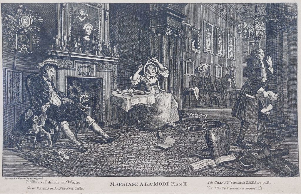
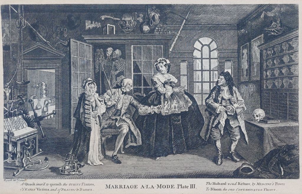
When we think about the arts in Britain in the first half of the 18th century, one must consider the works of #WilliamHogarth (1697-1764). Hogarth’s works were mostly satirical caricatures that satirised customs at the time and often created in series. ‘The Rakes Progress’ was his most famous series. The engravings of which were much plagiarised, so much so that Hogarth lobbied for The Copyright Act of 1735.
The Marriage Settlement, from Marriage A-la-Mode – plate I
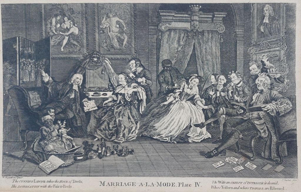
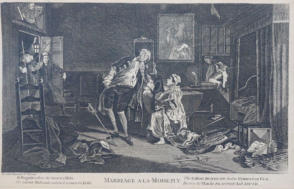
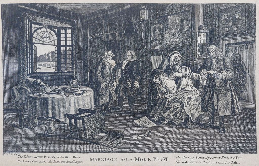
This past week, I acquired a set of engravings by #JohnJune (fl. 1740-1770) depicting Hogarth’s Marriage a la mode. June was an engraver and print maker best known for portraits and book illustrations, and he was regularly employed by the publisher Robert Sayer for such. This series might well have been commissioned and published by Sayer or, for that matter, by Hogarth himself.
The Tete-aTete from Marriage A-la-Mode – plate II
Hogarth painted this series of six for Marriage A-la-Mode intending engravings to be made and copies to be sold to the general public. A main source of revenue for many artists.
The Inspection from Marriage A-la-Mode – plate III
The story details the negotiations between an Earl and a London City Alderman to wed the Earl’s son to the Alderman’s daughter (which gives the Earl access to money and the Alderman an aristocratic title) and the resulting wedded non-bliss.
The Toilette from Marriage A-la-Mode – plate IV
Throughout the series, we see the calamitous results of an ill-considered and pre-arranged marriage for money and social status.
The Bagnio from Marriage A-la-Mode – plate V
The young couple, their families, and acquaintances are portrayed at their worst: seen engaging in affairs, drunkeness, gambling, as well as several other vices.
The Lady’s Death Marriage A-la-Mode – plate VI
Alas, much to Hogarth’s chagrin, the series was not well received, making the artist a very modest amount of income. He had planned to follow on with a series entitled The Happy Marriage, but this did not occur and only exists in a series of very rough sketches.
A very lovely set, wonderfully executed and well inked, which was most likely produced during Hogarth’s life. A good addition to my collection.
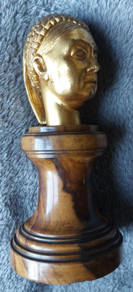
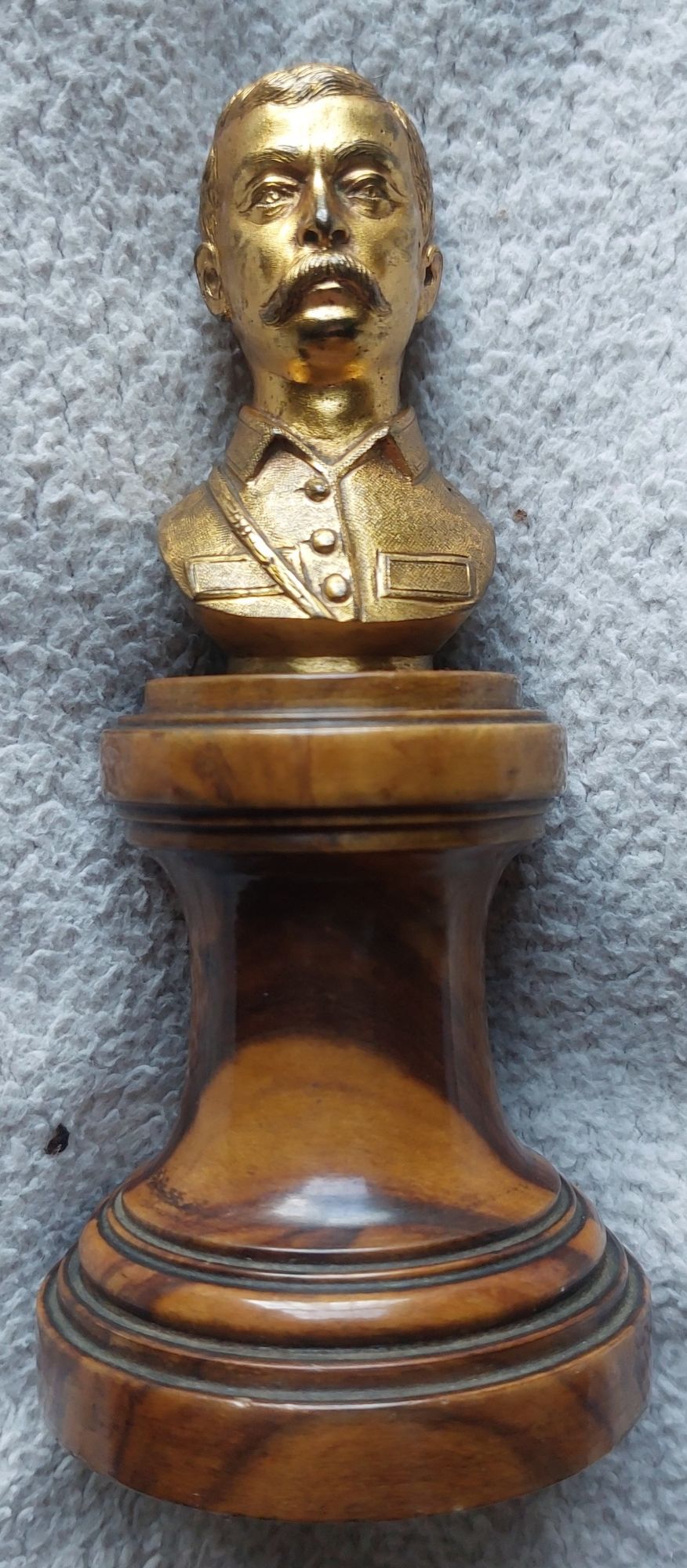
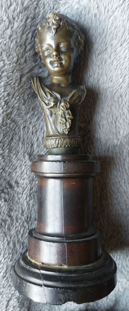
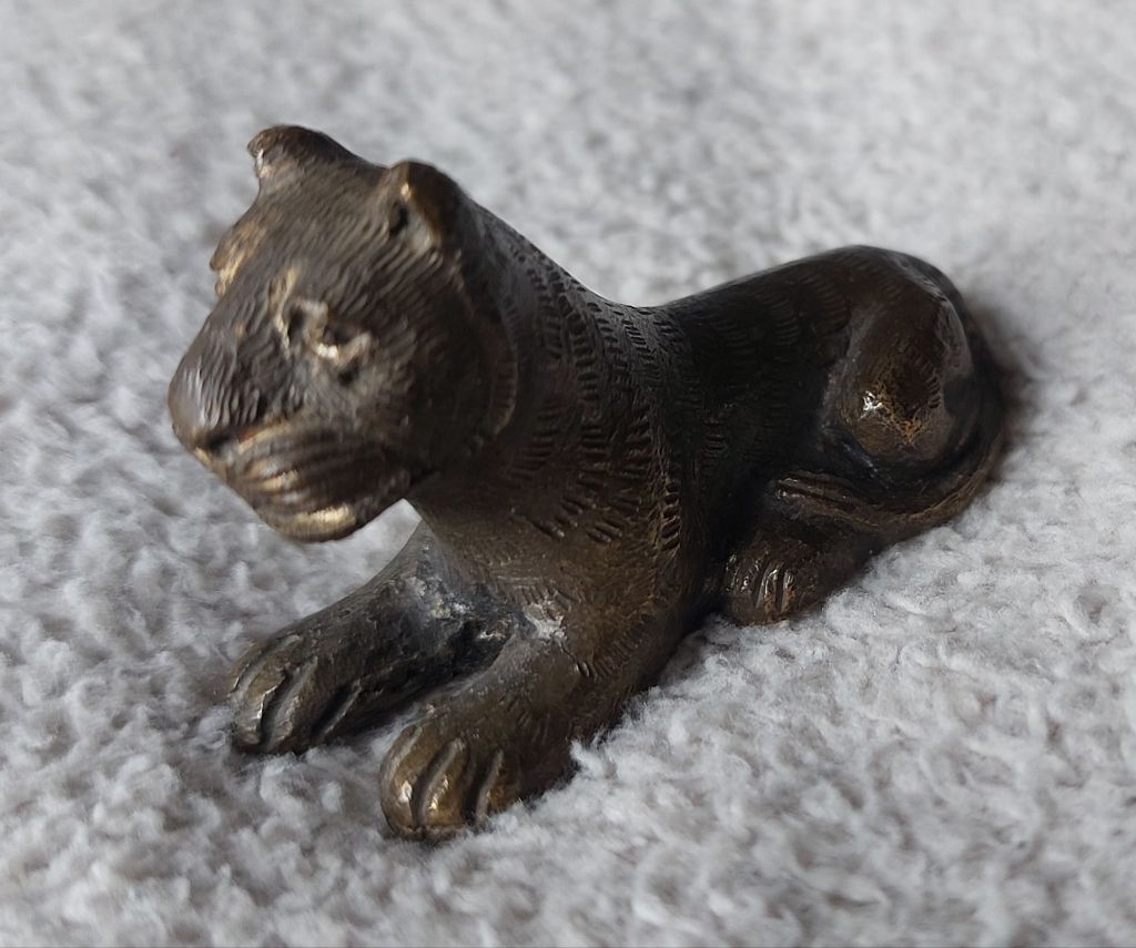
In my travels, I come across small pieces of #sculpture that I like. I certainly am not well versed in the field of #bronze work, but pieces do catch my eye. Three small #busts; two of people that might have been living, a small child/cherub, and a leopard/lioness are today’s focus.
Ladies bust mounted on turned wood plinth – unknown maker, date and subjectSoldiers bust mounted on turned wood plinth – unknown maker, date and subject
The above pair are mounted on similar turned wood plinths, which make me think they were cast by the same maker. The lady does have some semblance to a stern Queen Victoria, and the second might be a First or Second World War general, or even earlier.
Small child/cherub bust on turned wood plinth.Bronze leopard or lioness
This bust of a small child/cherub, I believe, is 19th century and made in France, but once again, there are no identifying marks to be seen.
The bronze cat may be Chinese in origin – again, no markings.
All these small cast figures are nice examples of what can be achieved in the casting of bronze. If any of my readers recognise the people portrayed, please let me know.
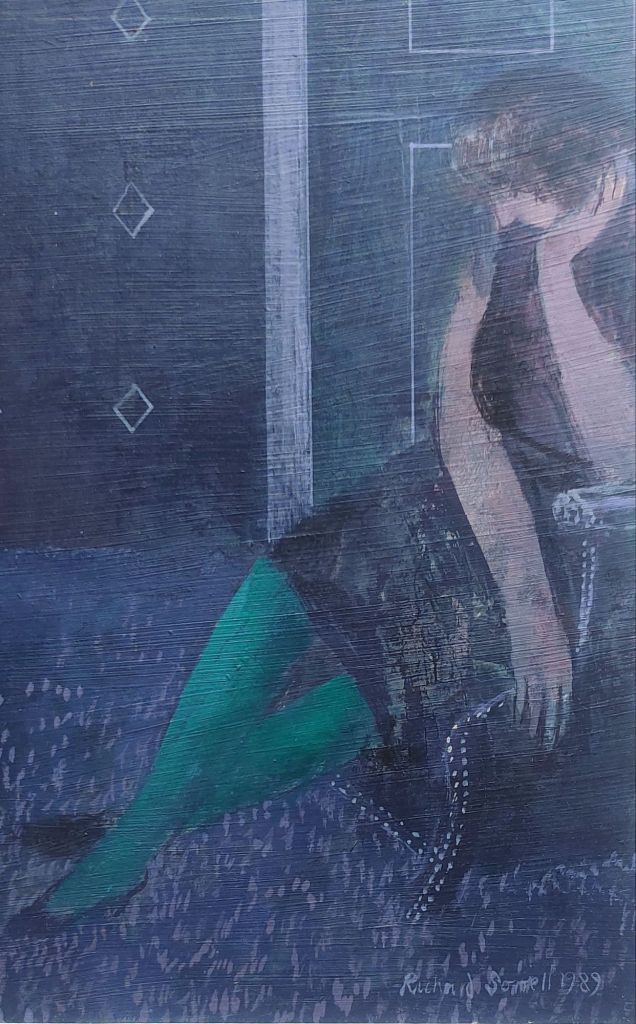
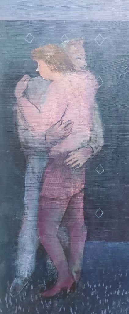
Born to artist parents, Alan and Elizabeth Sorrell, we visit with #RichardSorrell (b. 1948). Sorrell studied at the Walthamstow Art School and the Kingston College of Art. Sorrell works in oils, acrylics, and watercolours. Sorrells’ paintings display figures in action, doing regular everyday things. But these images look somewhat awkward and rough, but it is just this clumsiness that draws one into the image portrayed.
seated lady – section of painting by Richard Sorrell @ 1989
Sorrell invents his paintings, drawing upon memories of ordinary people doing ordinary things to create compositions, which are about people and their interactions. These ordinary goings on, give the viewer an entrance point into the artwork, a recollection from an event or person from their own lives.
couple – section of painting by Richard Sorrell @ 1989
This entrance into the artwork puts the viewer in touch with their own feelings and memories. It makes the artwork approachable, more intimate, and personal.
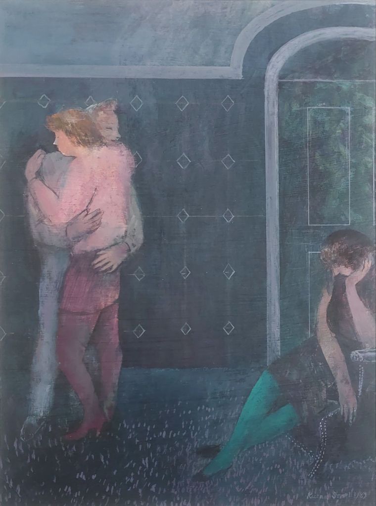
The Last Dance and the Wallflower – acrylic by Richard Sorrell @ 1898
This piece is signed and dated but untitled. For me, when I look at this work, the title that comes to me is ‘The Last Dance and the Wallflower‘. So that is what I will call it. A piece that draws one in and asks a respose from the viewer.
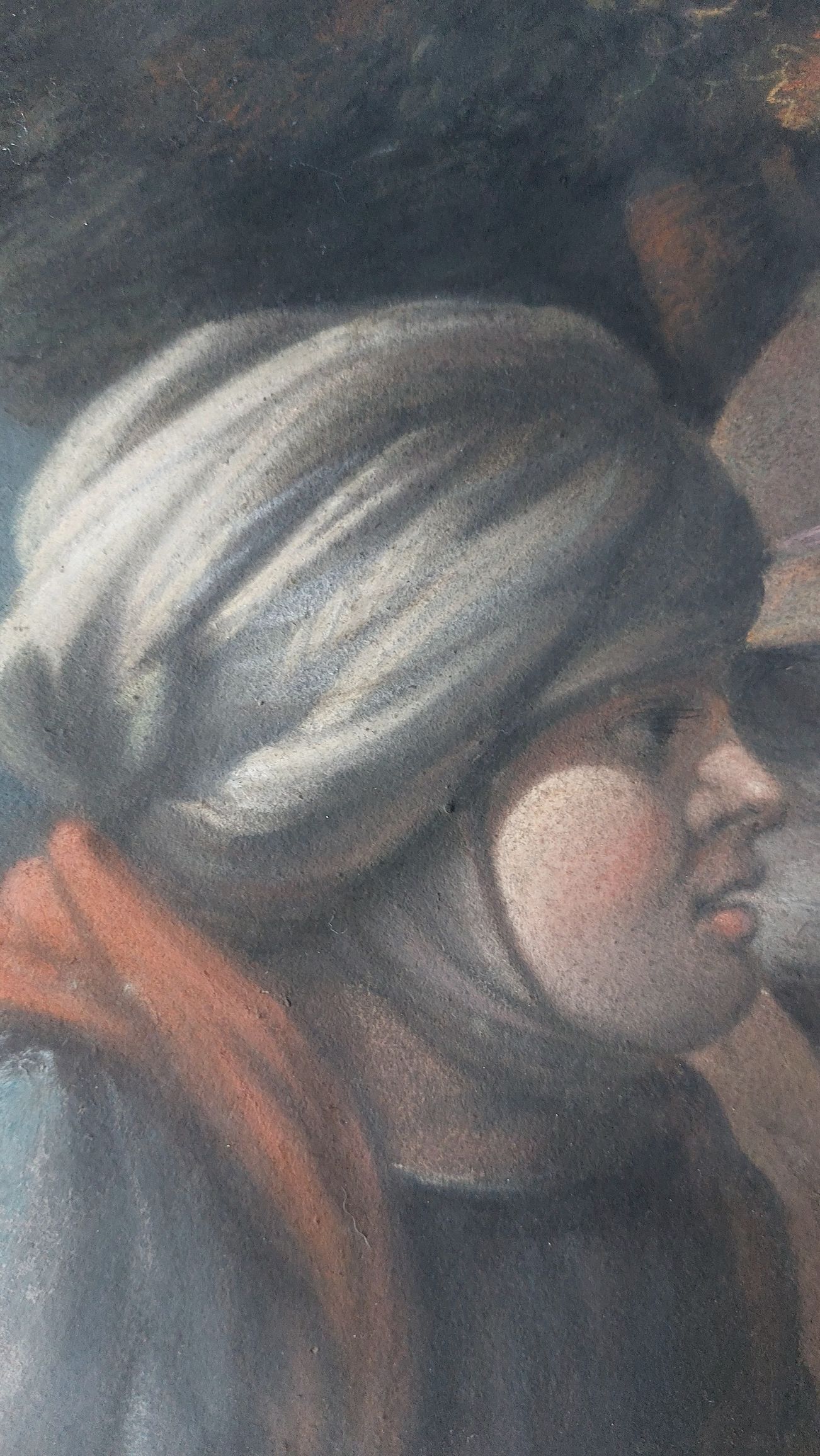
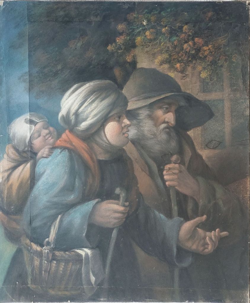
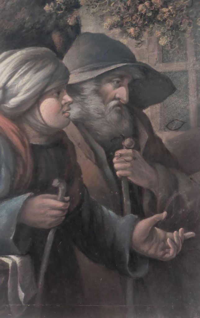
I recently added a pastel drawing to my collection. it was described as after Italian artist Antonio Rotta (1828-1903) and titled Charity to a Family of Beggars. This would mean that it is a 19th-century artwork. As with all pastel works, one must be careful while handling since pastel as well as chalk do not harden or soak into the paper. They are laid on top, which means they can be smudged or rubbed off.
Female beggar
The colours are laid and then rubbed or brushed to blend. The blending is often done with a finger. This blending creates an image with soft undefined edges.
Male beggar
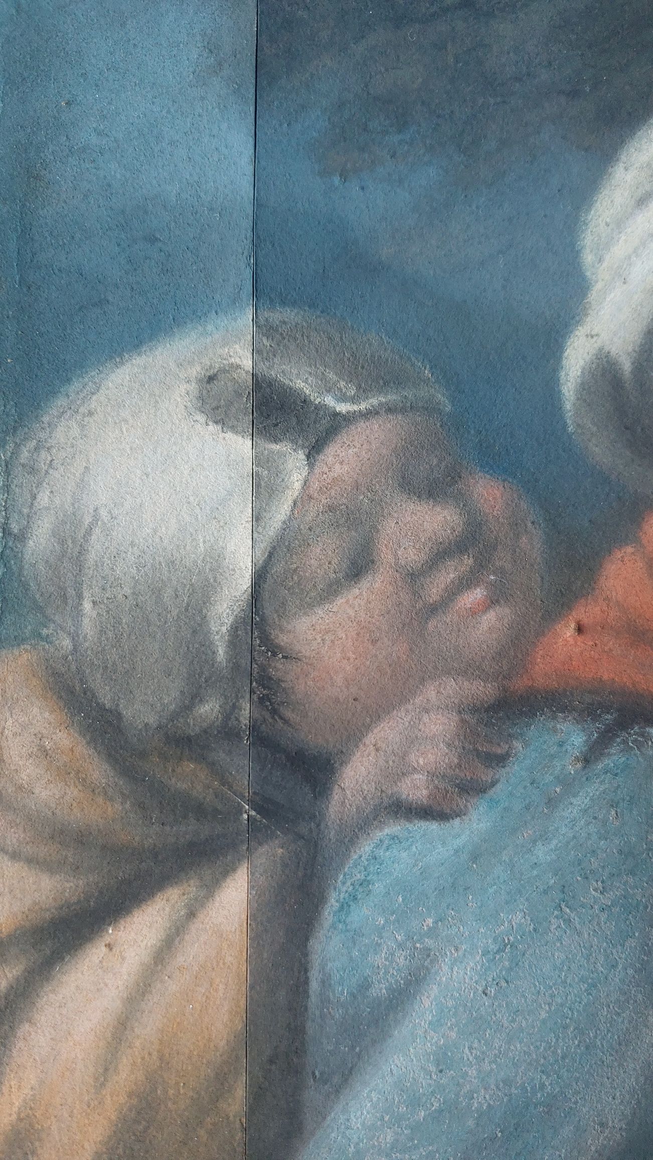
The artwork is made up of several pieces of paper that were laid on a backing sheet. I think this might mean the original artwork was much larger and has been cut down. The edges of the sheets are slowly separating from the backing sheet, as can be seen by the image below.
Child beggar
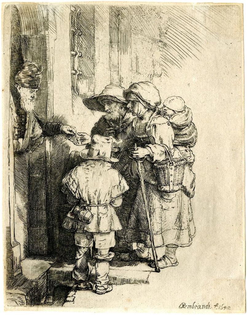
I thought that the image was familiar in some way, and it took me a while to realise that it is reversed and slightly different angle of the family in Rembrandts’ Beggars Receiving Alms at the Door of a House (below)
Beggars Receiving Alms at the Door of a House – engraving by Rembrandt
The pastel work is roughly half to a third of the overall image, but one can easily observe the similarities between the two artworks. Because of this, I do think that the original pastel piece was much larger and a complete copy of what we see in Rembrandts’ engraving.
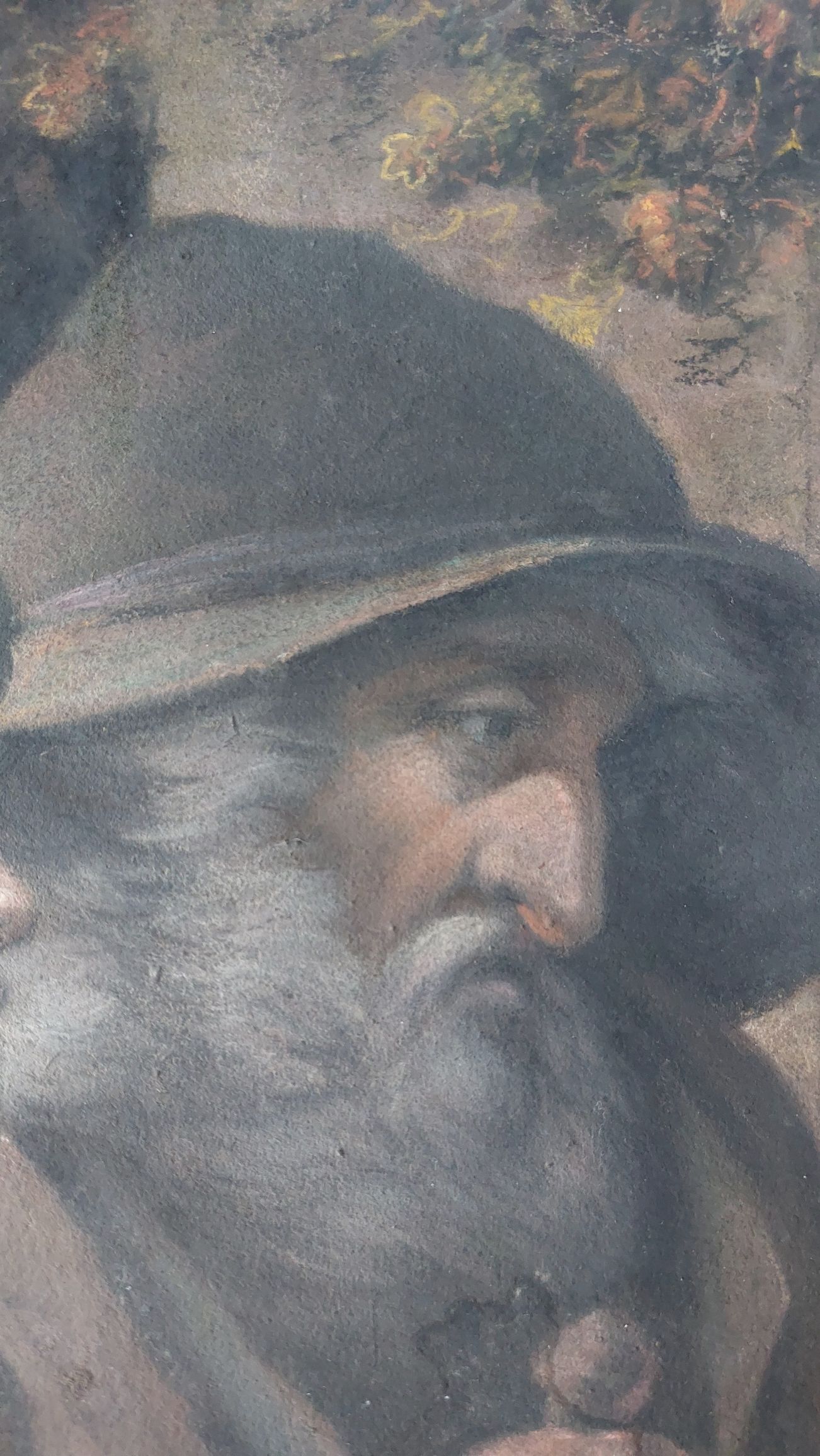
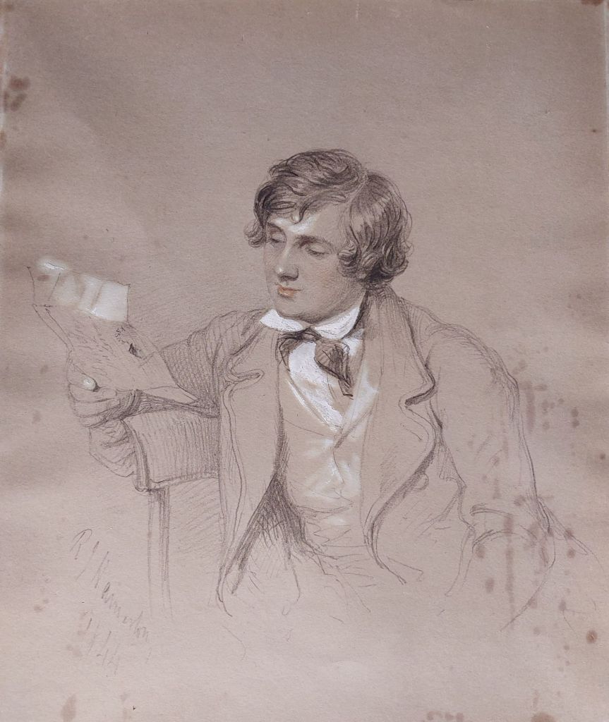
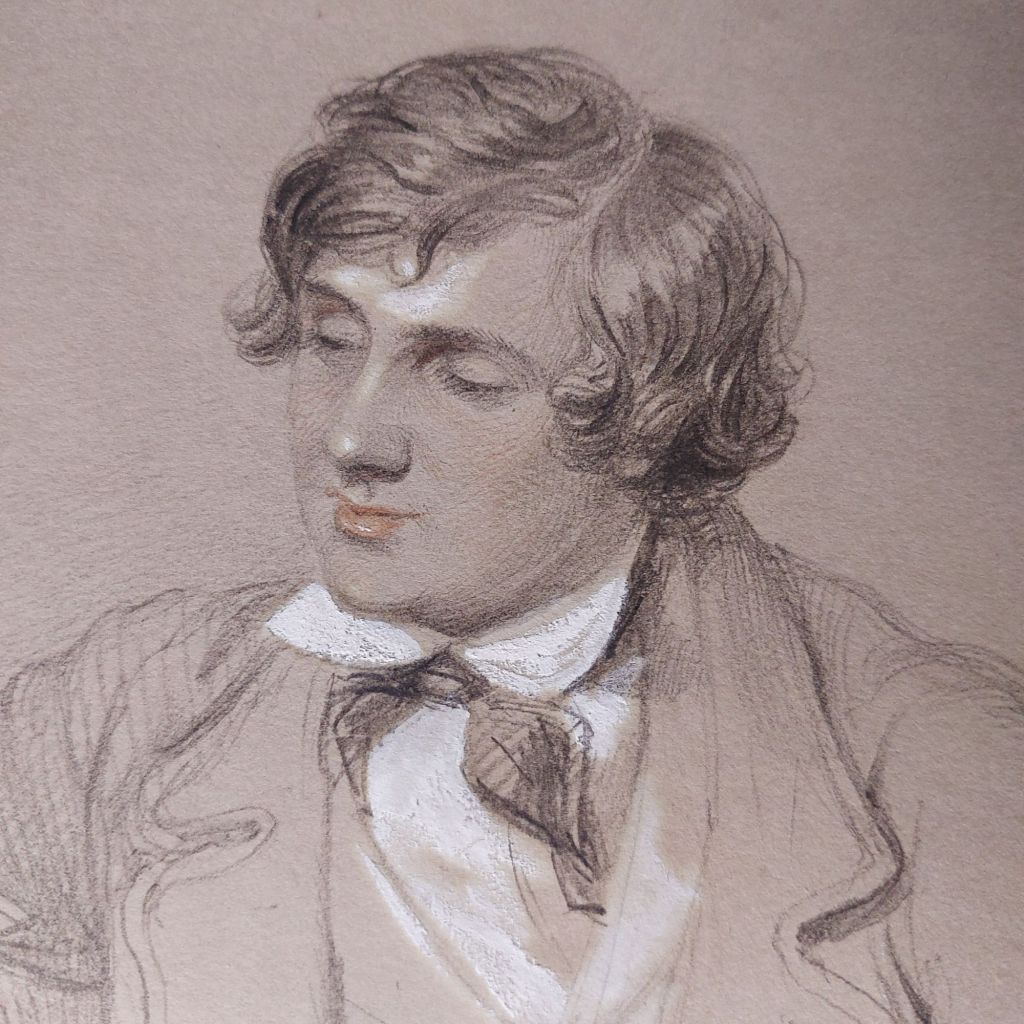
Today, we will look at a sketch that has been in my collection a while, and I have now researched it at more depth. It is by artist #RobertJacobHamerton (1810-1904). Hamerton was an artist/illustrator who worked alongside illustrators like #HablotKnightBrowne and #George Cruikshank. His works appeared in collections, which included Dickens’ works. These works were often published by Bradbury & Evans, who represented (1844-1859) and published many of Dickens’ novels, including Bleak House, David Copperfield, and A Tale of Two Cities.
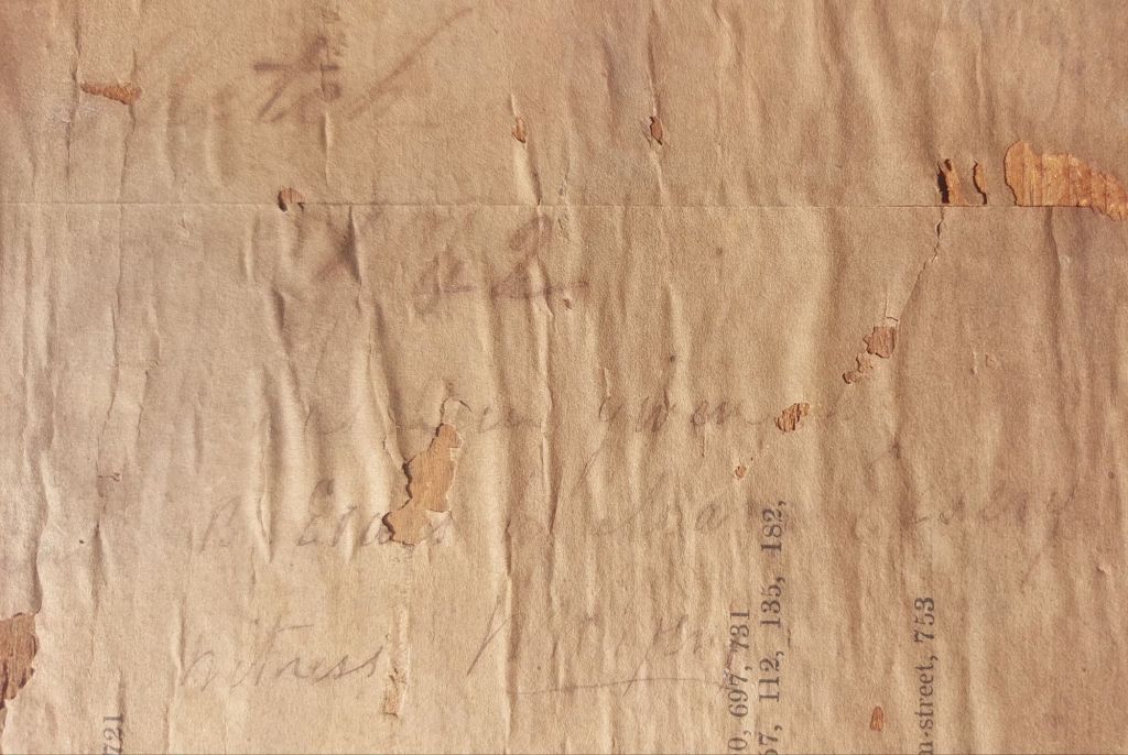
On the back, there is a page from an art exhibition in 1835. On this, only partially readable, is an accreditation which states (I think) Sketch 42 has been given to B. Evans by Joan Essery, witness Mr. Gray.
I believe that the B. Evans named here is none other than Bessie Evans, daughter of Frederick Evans of Bradbury & Evans publishers. I surmise that the witness, Mr. Gray was a wood engraver who worked on Barnaby Rudge. Bessie Evans married Charles Dickens Jnr in 1861. This would make the sketch by Hamerton an image of #CharlesDickens, aged 32 at the time.
Charles Dickens – drawing by Robert Jacob Hamerton @ 1844
We see a young Dickens with long flowing hair, well-fashioned attire, and comely appearance. He was partial to fine dress and colourful waistcoats. Only in later life would come the wild unkempt beard, the intense eyes, the rugged and tanned manly look.
I think there are enough clues leading to fair certainty that this image is of Charles Dickens. A lovely and relaxed view of the then young and emerging writer.
Charles Dickens – drawn by Robert Jacob Hamerton @ 1844
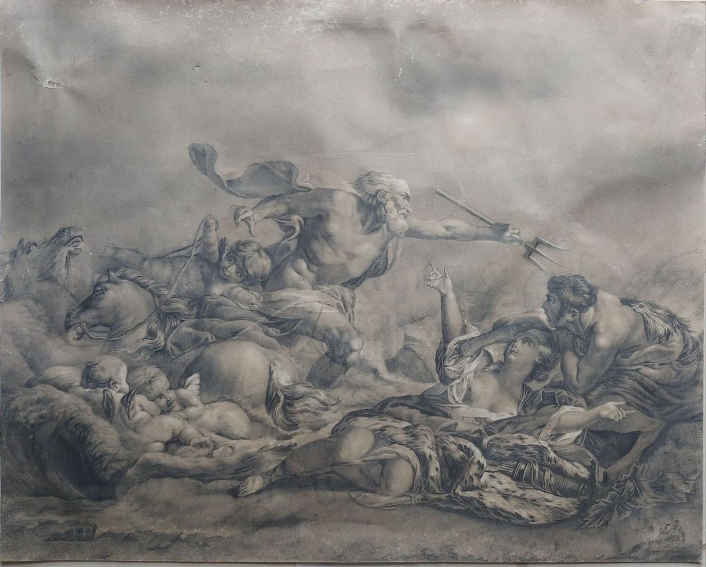
Recently, I purchased a piece from an auction house. It was purportedly a print according to the sale catalogue. I was not completely convinced of this, but the image shown was not good enough to say otherwise. It was in a cheap frame, with no glass, a ripped mount, and fairly abused, but I purchased it anyway. Not till I got it home could I examine it close-up to actually see what I had purchased.
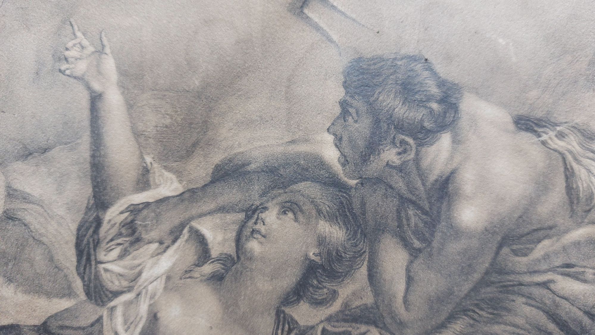
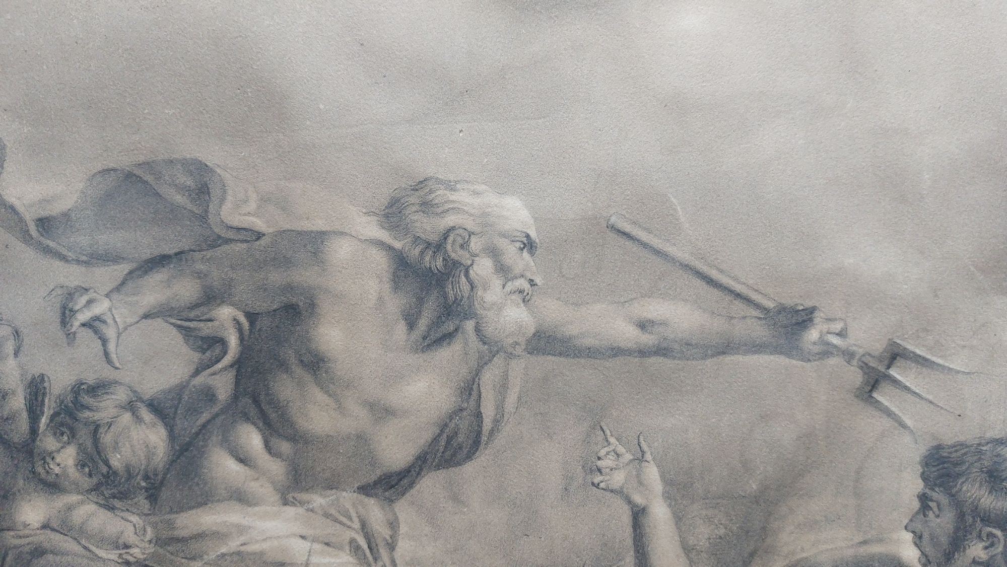
The artwork is actually a drawing. Black, brown, and white chalk (highlighting) with added graphite to add shimmer and definition. The image it displays is of Neptune saving Amymone from a satyr. At this point, I will say that it is a magnificent artwork.
Neptune saving Amymone from a satyr – drawing by François Boucher
This drawing was created by #FrançoisBoucher (1703-1770). Boucher was a painter, draughtsman and etcher. He is renowned for his decorative allegories, idyllic pastoral scenes, and portraiture. He was the most celebrated artist of the 18th century. His talent won him the many honours, including ‘First painter tothe King‘ and patrons such as Madame de Pompadour. He designed theatre costumes and sets. He created scenes used on Vincennes and Sevres porcelain. He produced drawings for tapestries woven by Beauvais and Gobelins.
Amymone and the satyr
The oil painting of this scene hangs in the #MuséedesBeaux-ArtsdeRenne, but this scene was originally created to be a central medallion on a tapestry. One of a series of four (a tenture): ‘Aurora and Cephalus’, ‘Vertumnus and Pomona’, Neptune and Amymone’ and ‘Venus and Vulcan’, all of which are taken from Ovid’s ‘Metamorphoses’. The four images also serve as allegories of the four elements, Air, Earth, Water, and Fire, respectively.
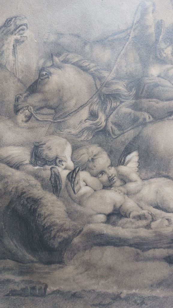
Cherubs and horses
From the images, we see Boucher’s chalk technique at its very best, his draughtsmenship sublime, creating a drawing that displays his mastery of the chalk medium. There is found in many of Boucher’s allegorical images a touch of the erotic, an amorous sensuality.
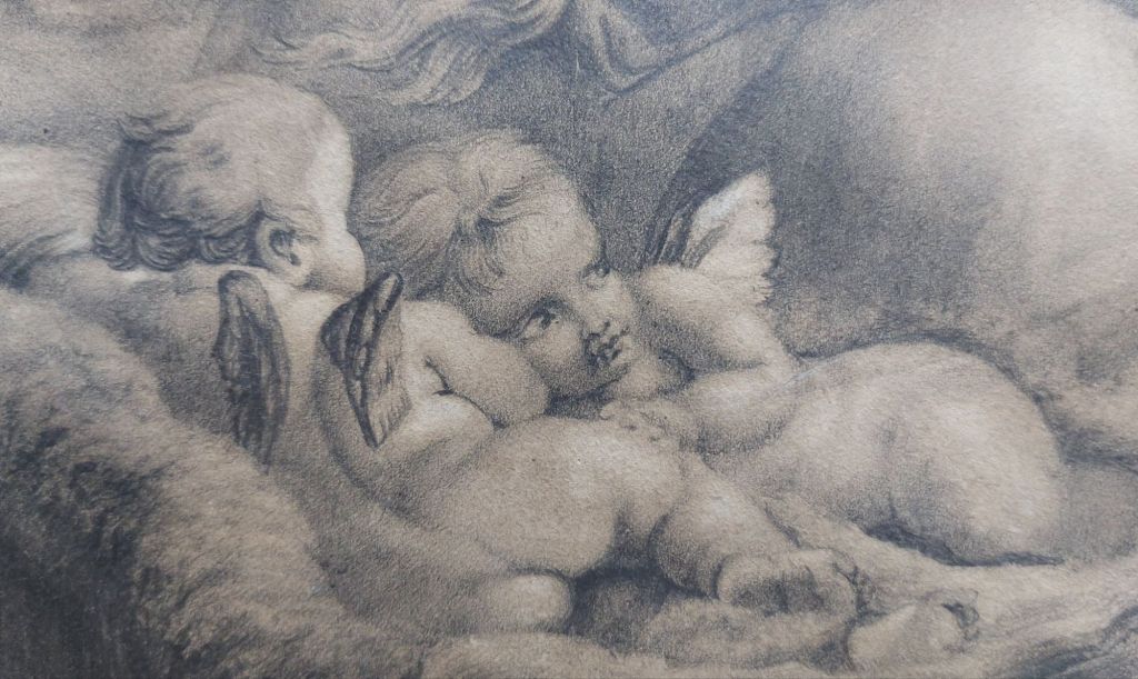
Cherubs close-up
The title of the piece is ‘Quos ego…’ or ‘Neptune apaisant les flots’. Translated itreads ‘Whom I…’ or ‘Neptune calms the floods’, which comes from Virgil’s Aeneid.
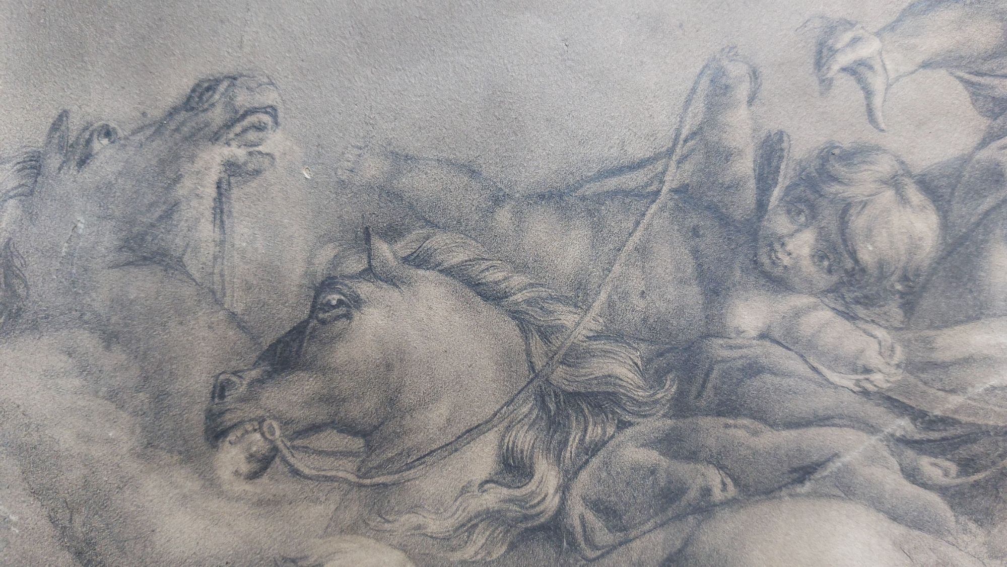
Horses and their driver
In this allegory of Water, we see #Neptune coming to the rescue of the nymph Amymone, who had gone into the drought-stricken wilderness in search of water, only to be set upon by a lustful satyr, trident in hand, poised to slay the satyr.
Neptune with his trident
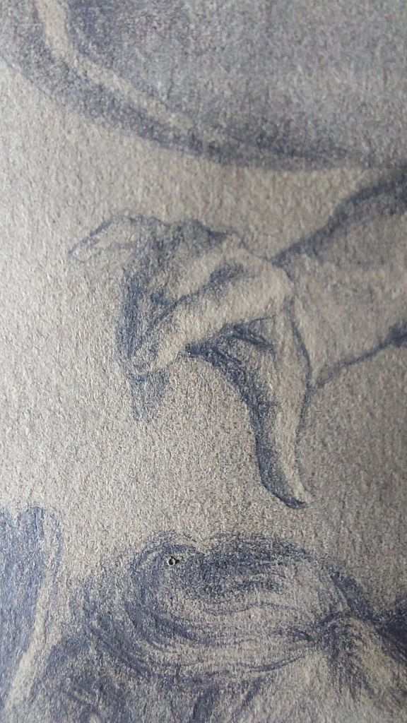
Boucher created his drawings not only as preparatory studies for his paintings and prints but also as finished artworks. The beauty of the hands, the perfection of the physical body, the horses, the cherubs. Need I go on? Everything says a Master has done this.
Hand close-up
I also know that at some point, this piece was in the possession of Danish artist and collector #HubertGeorgesDésiréDupond (1901-1981) since it bears his mark. It’s an amazing piece to have acquired into my collection.
In my collection is a watercolour by #HaroldWorkman (1897-1975). He is mostly known as a painter of landscapes and townscapes in oils and watercolours.
Workman was born in Oldham. He studied at the Oldham School of Art and Manchester School of Art. After his studies, he became a professional painter. Workman regularly exhibited in London (various institutes and venues), Glasgow, Liverpool, Manchester, and in Wales.
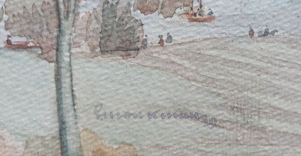
Signature and date on watercolour
As seen above, the watercolour in my collection is signed and dated.
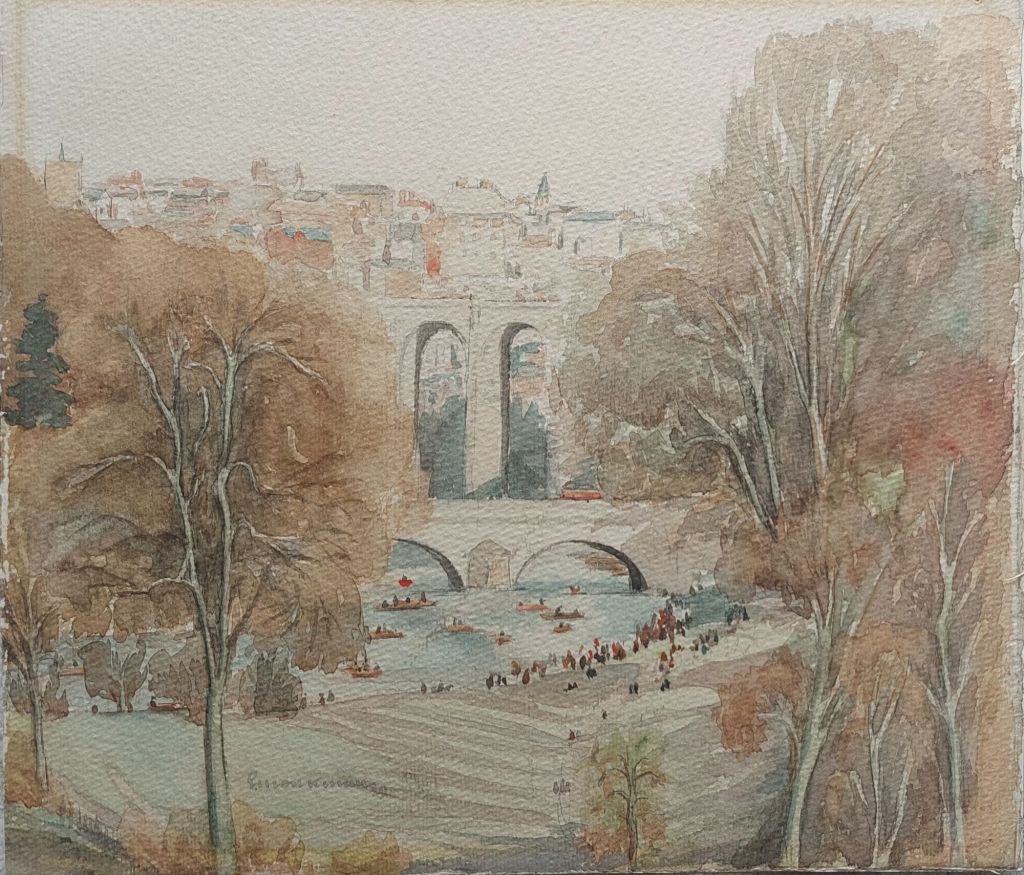
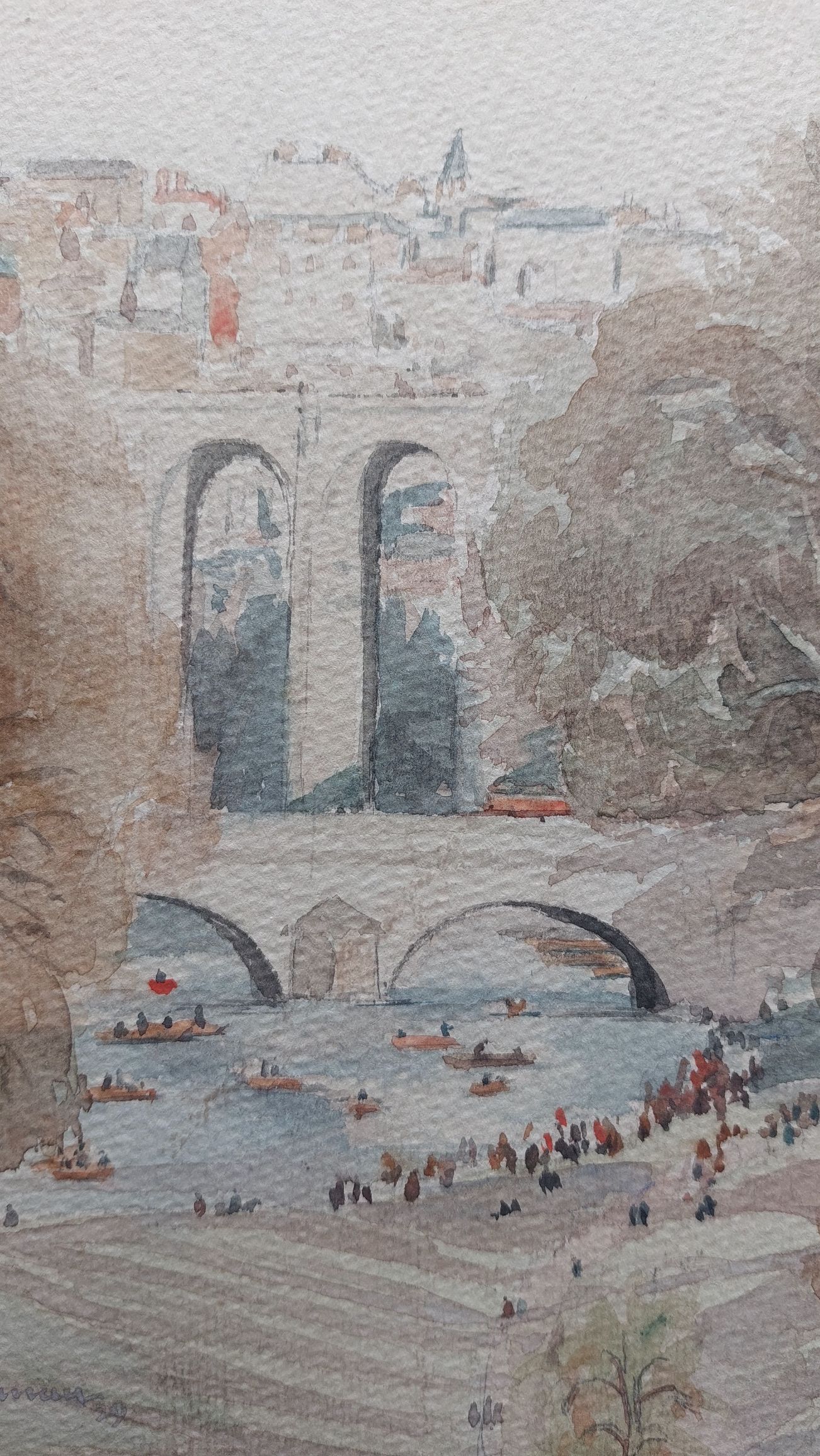
Knaresborough @ 1929 – watercolour by Harold Workman
The painting displays a view of the town of #Knaresborough, as seen in 1929. Within it, we see the Viaduct, High Bridge, the #RiverNidd, and the town from a viewpoint on or near the Harrogate Ringway Trail. It is most likely summers’ day as seen by the numerous people paddling on the river as well as wading at the rivers edge.
Close-up section showing the Viaduct and High Bridge
A nice image, which was created early in Workmans’ career. Possibly a study for an oil painting or more elaborate watercolour. It is a fascinating piece of history and art.