We look at an artist, #RomanIvanovichLiapin, who was born in Leningrad (St. Petersburg) in 1966. His talent was recognised early on, and he went on to study at the Mukhina Leningrad Higher School of Art and Indistry and the Academy of Fine Arts in Rome. He returned to St Petersburg in 2005 and set up his own art school.
Liapin is best known for his work in the genre of urban landscape. Cityscapes and street scenes are expressed with vibrant colours and impressionistic/abstract leanings.
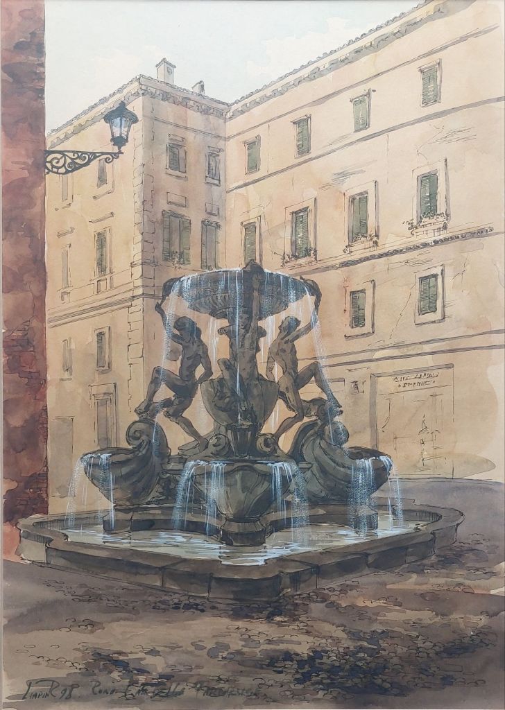
Fontana delle Tartarughe, Rome – ink and watercolour by Roman Ivanovich Liapin @ 1998
The piece I acquired was created in 1998 when Liapin resided in Rome. Ink and watercolour combine to display the #FontanadelleTartarughe in Rome.
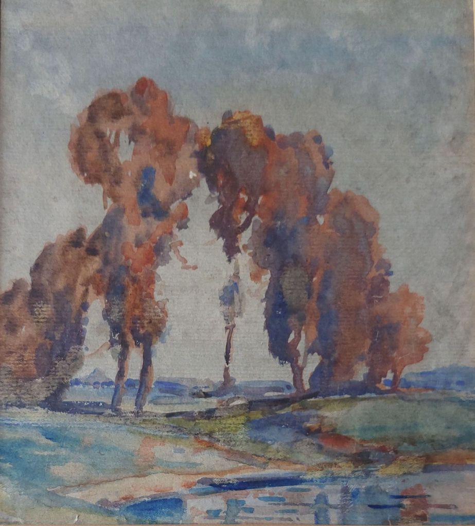
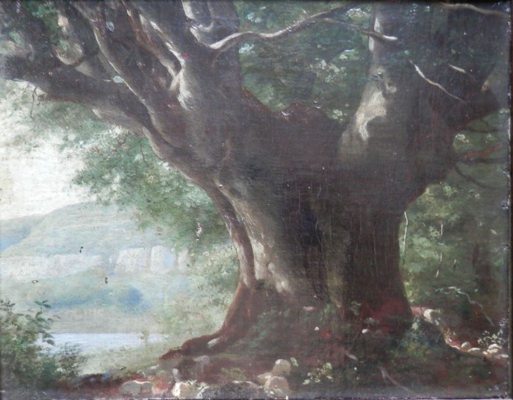
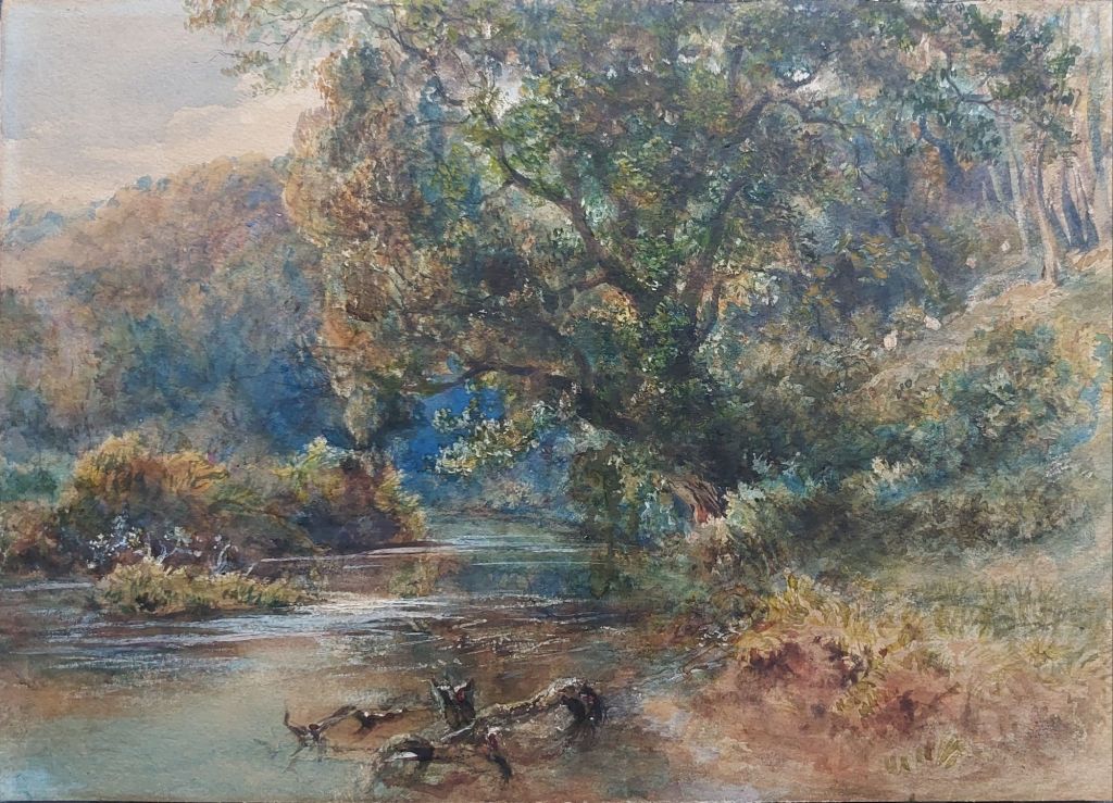
Often, an artist, while painting a landscape, will focus on a single item. Today, we look at three pieces, in which the focal point is a tree(s). Two mediums, varying styles, and all unknown artists.
The Copse – impressionist watercolour by unknown
The first is an impressionistic work. In it, we see an attempt to capture the ever changing light with the layering of vibrant colours,one over the other without purposefully blending.. It was most likely painted en plein air (outdoors).
An Ancient Tree – oil by unknown artist
The second is an oil of an ancient tree that stands majestically near the waters edge. The wide expanse of its trunk/bole giving credence to its age while its gnarled limbs reach in all directions to capture the sunlight.
By the Rivers Edge – watercolour by unknown
And the last is a tree on a riverbank. Leaning precariously yet still appearing well rooted. It is more realistic than the first watercolour but still containing a touch of Impressionism. A wonderful use of colours. I love the mystery which is created as your eye travels along the river up to the blue hazy mist.
Three beautiful artworks, each expressing the wonder and majesty of trees in their own style.
I will preface this chapter by saying that I can not definitively tie the two works to the artist.
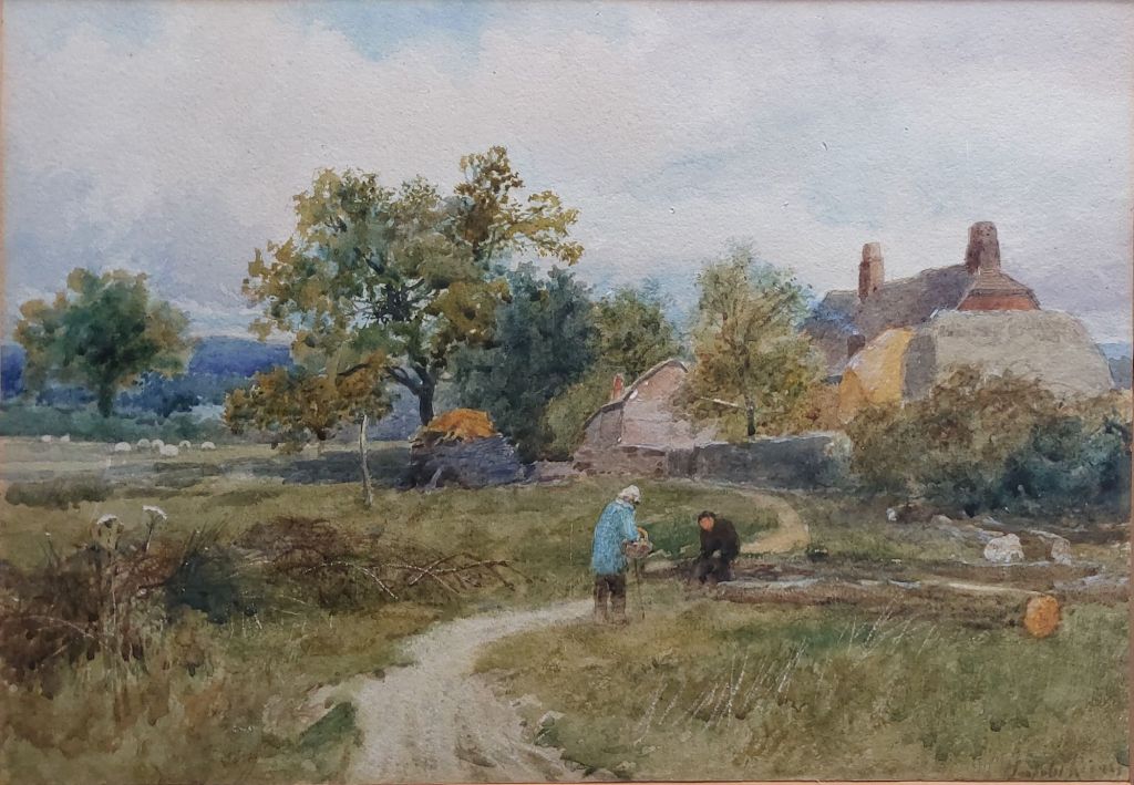
#EdithGranger-Taylor hailed from Grassington, Yorkshire, and her artistic talent was recognised from an early age. As her studies progressed, her studies took her to London and the Royal Academy, the St. John’s Wood Art School and the Slade School of Fine Art in 1919. She main tutor at the Slade Xchool was #HenryTonks. While there, she honed her skills, excelling in the mediums of pastel and crayon. She later studied stage design at the Slade School (1930). Granger-Taylor regularly exhibited her works but became disillusioned with the art world and its bias against female artists and withdrew from it.
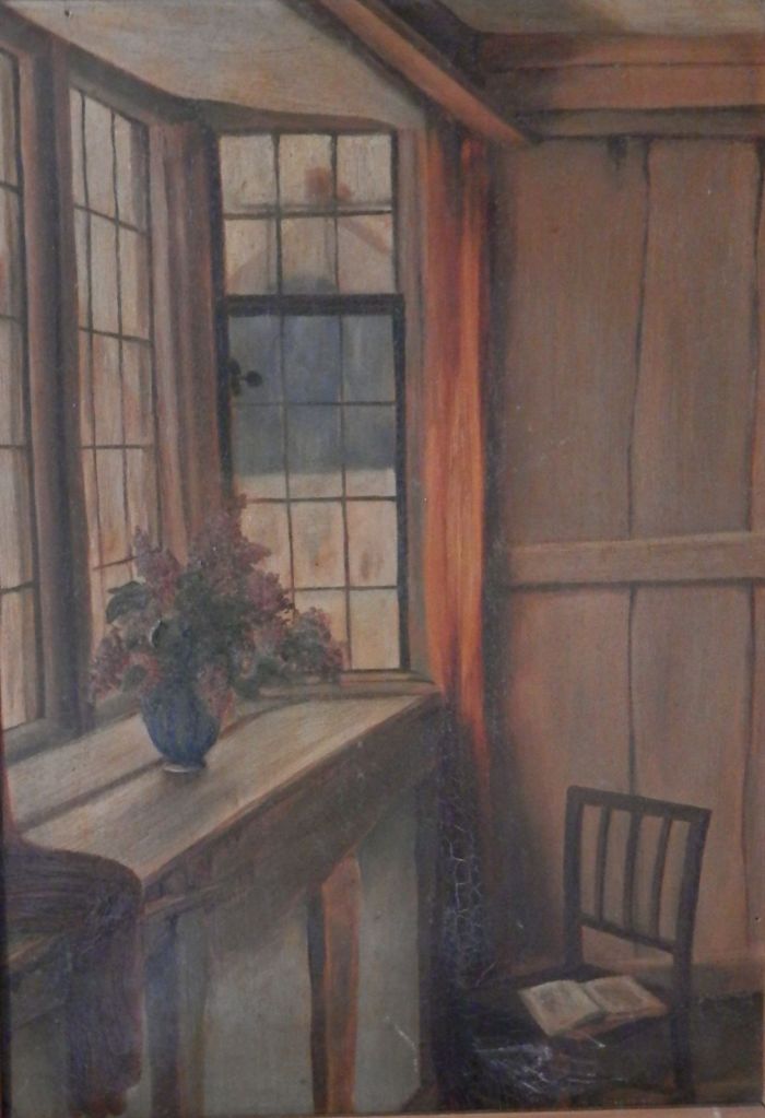
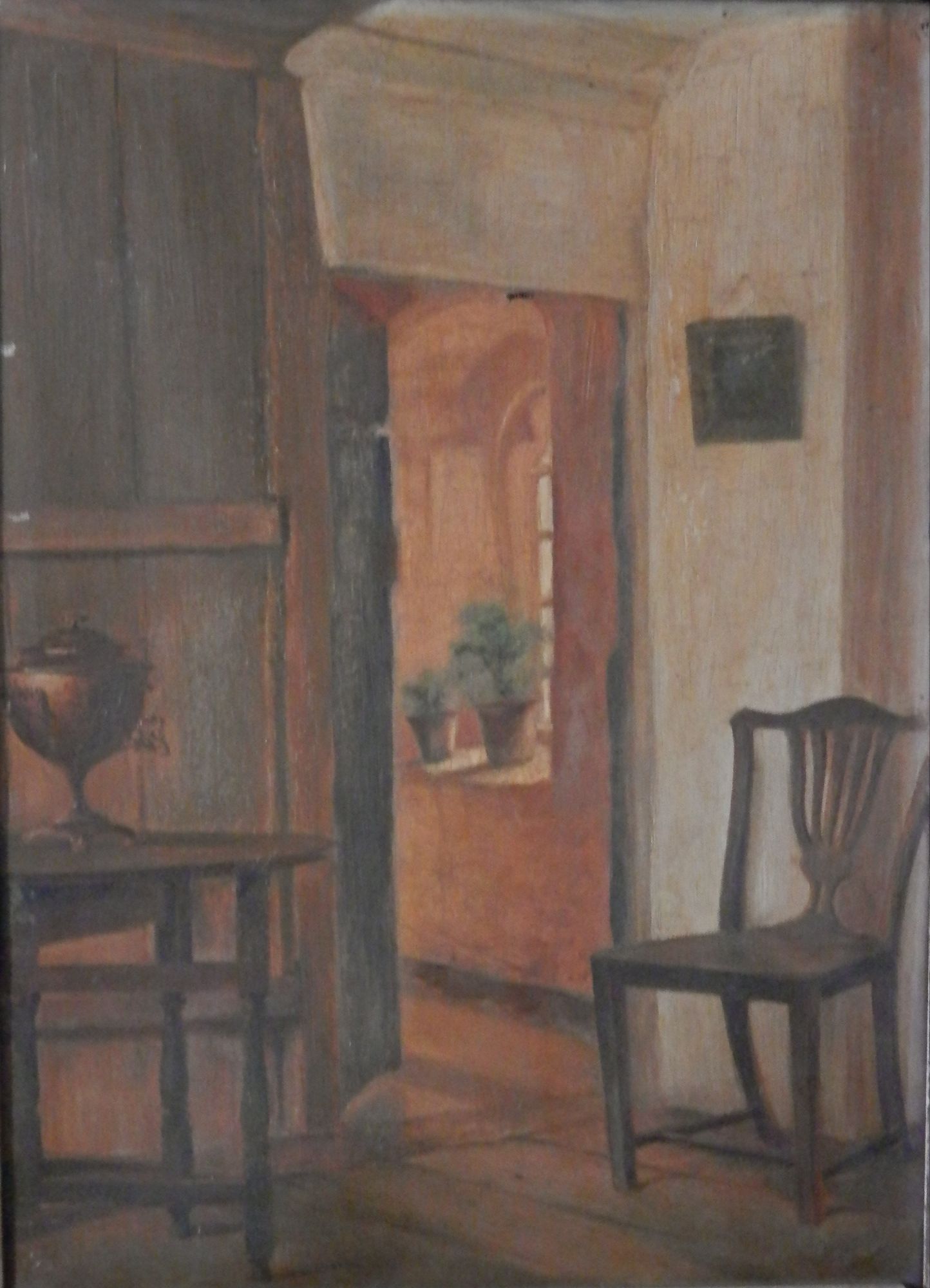
The Interior of The Old George, Norton St PhilipThe Interior of The Old George, Norton St Philip
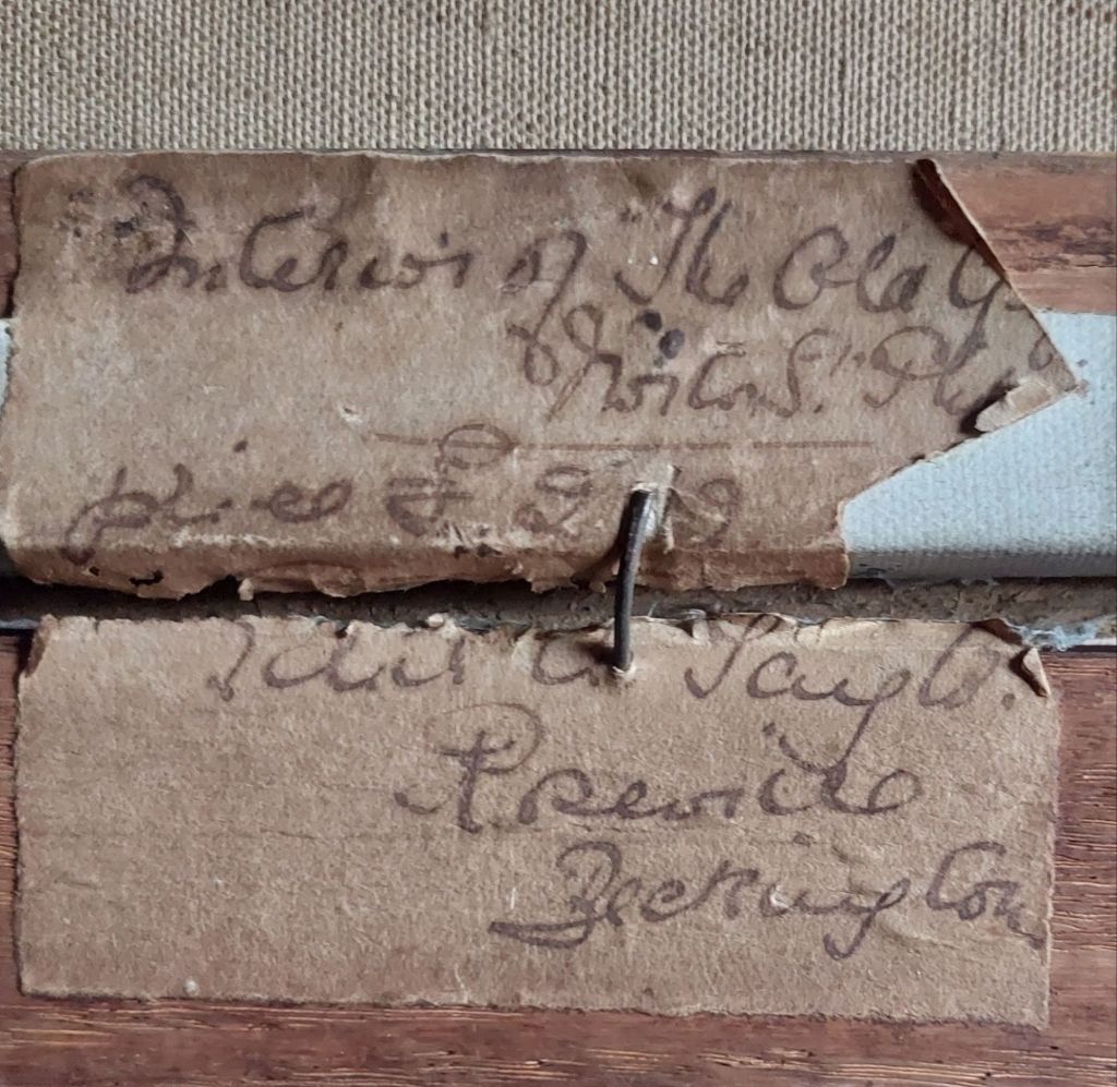
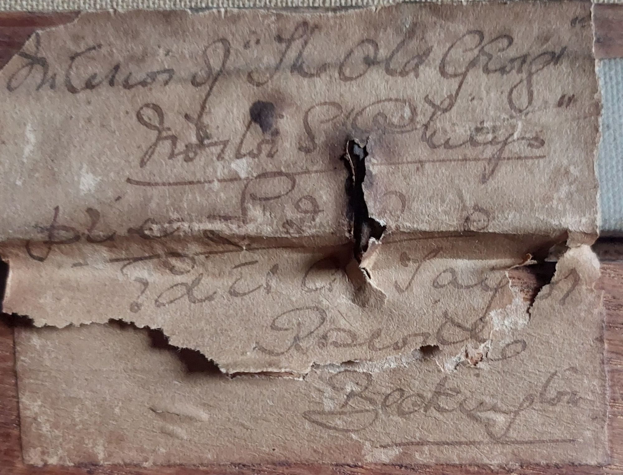
The two pieces display different areas of #TheOldGeorge,NortonStPhilip. They are oils on canvas – not a regular medium for Granger-Taylor. They are undated, but I would date them to 1910 to 1920. Below are the labels that appear on the verso of each picture. The oils display a good artistic eye even with the limited palette of colours.
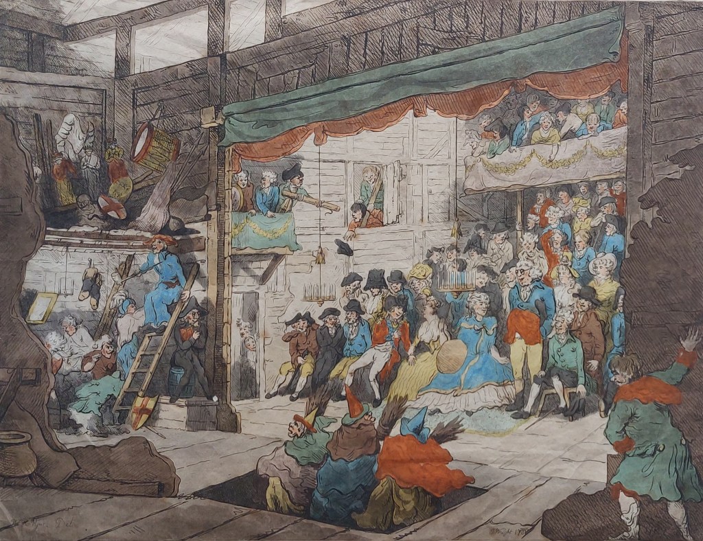
In my collection is an engraving created from a drawing by #WilliamHenryPyne. The engraving was created by #JohnWright in 1788. It portrays a scene from backstage at a theatre performance. Possibly a performance of Shakespeare’s “Macbeth” with the witches emerging from beneath the stage via a trap door.
A rowdy and possibly hard to please audience can be seen. In the wings are wardrobe mistresses, prop storage as well as actors prepared to enter on their cue.
The print has been coloured – not wonderfully done, though – but it does add some interest to the overall image.
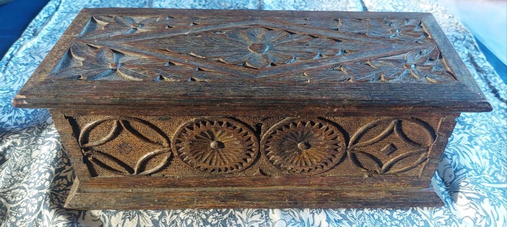
I once again step outside of my regular milieu by picking up a small wooden box ( to add to my collection. In truth, I do consider this little box to be a piece of art due to what has been done to it.
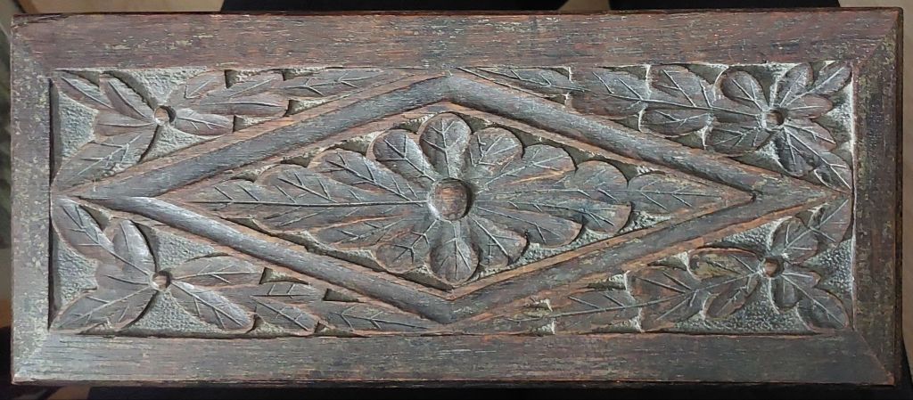
Chip carved oak box from 17th/18th century
The #chipcarved English oak box (possibly Welsh made) is my latest acquisition. I do not0 have great knowledge in regard to this type of art/furniture, so speculation is required on my part. After researching boxes like this, I have come to the conclusion that it was created in the 17th/18th centuries. The lock is not original, neither are the hinges, and a person has added 6 screws on the base to hold the sides. I do not believe this box had a lock at all, and there were certainly no screws.
Front face of chip carved box
The carving on this box is wonderful because oak is quite a fine-grained hard wood and not easily carved. Geometric shapes or roundels decorate this box.
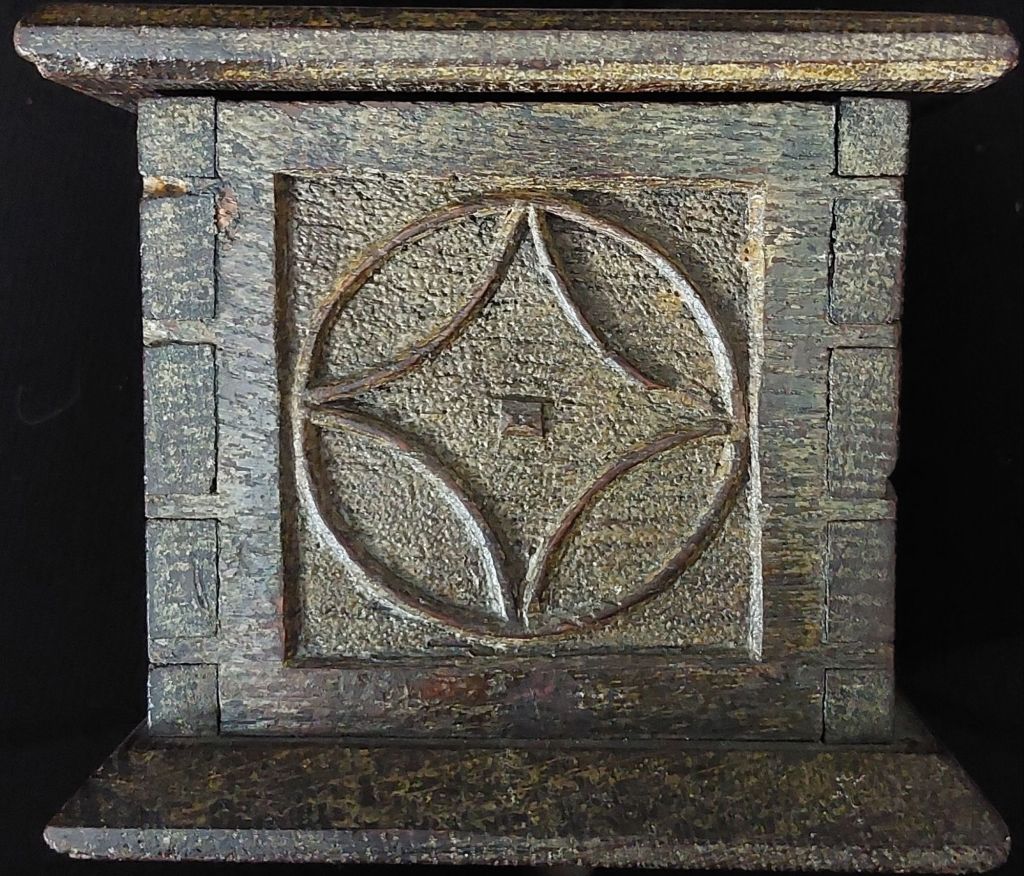
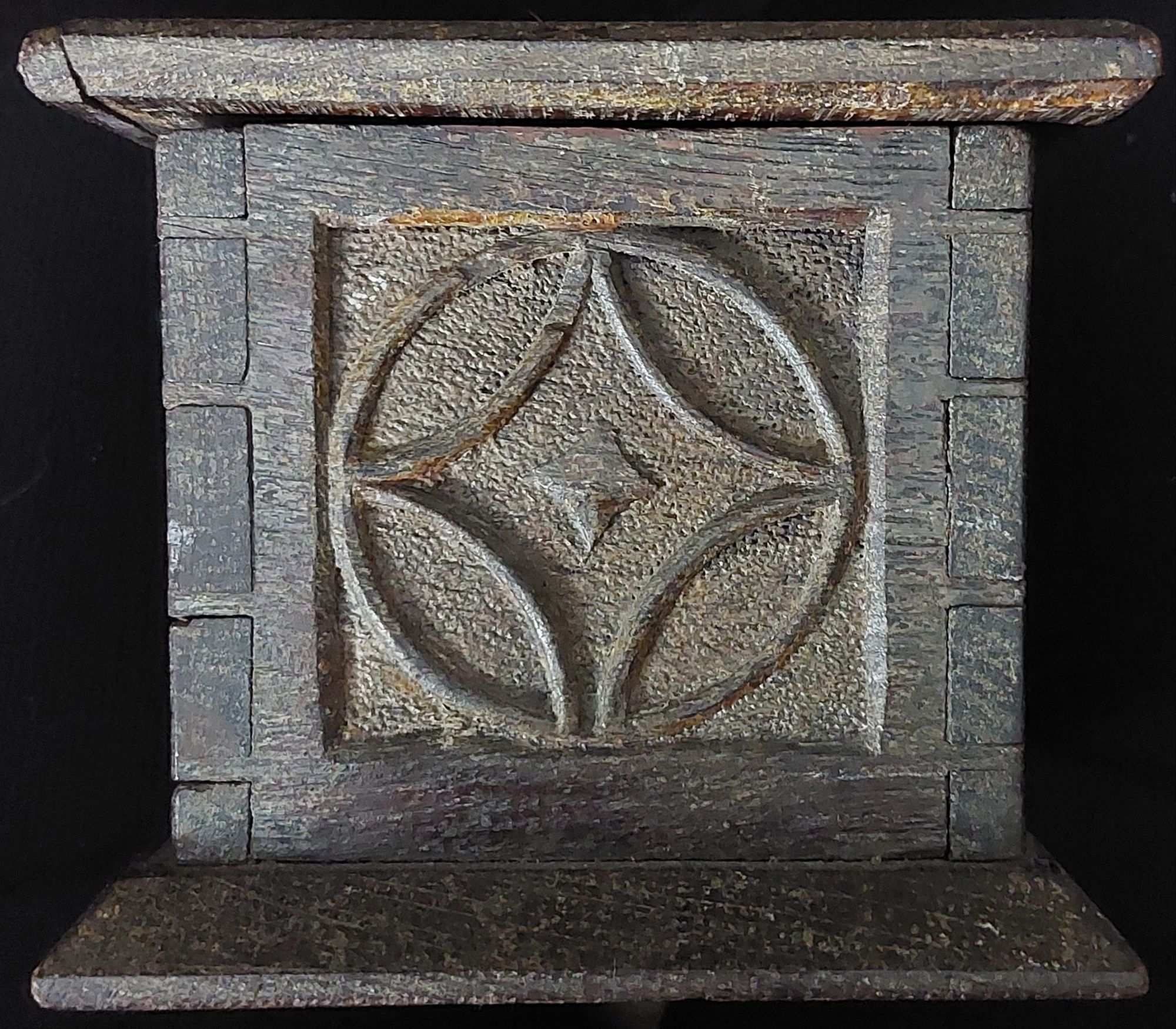
Chip carved box end (R)Chip carved box end (L)
The #dovetail corners are in excellent shape, the chamfered edges to top and bottom nicely planed.
Lid decoration of chip carved box
The lid is decorated with a border, a rhombus/diamond shape with central and surrounding leaf motif – possibly being oak. I thought the back panel was just plain – and looks so – but under close inspection, the design for four roundels can be seen ever so lightly scribed into the wood. It was just never carved. The box was possibly meant to hold documents/keepsakes, but I do know from smelling the interior that at some time, a gentleman has kept tobacco in this box. The measurements of the box are externally 32.5cm x 14.5cm x 12cm or 12 7/8″ x 5 3/4″ x 4 3/4″ – internally 28cm x 9cm x 9cm or 11″ x 3 1/2″ x 3 1/2″. A fascinating item to have picked up.
I acquired a piece of art by artist #HelaineBlumenfeld, OBE. The piece I added to my collection is not a sculpture, which she is most renowned for, but a print. Blumenfeld was born in New York in 1942. She studied political philosophy at Columbia University but moved to Paris to train in sculpture. Her tutor at the Ecole de la Grande Chaumière was the Russian Cubist/painter/sculptor #OssipZadkine. Blumenfeld later studied with #SemGhelardini learning to carve marble/stone. Blumenfeld’s sculptures have a fluidity of form, so we the viewers behold a creation standing between abstraction and reality. Blumenfeld carves in wood, granite, marble, and casts in bronze in the creation of her pieces. She is renowned for her large-scale public sculptures.
Helaine Blumenfeld print @ 1978
Above is the print I acquired. It like her sculptures is fluid. Curves, waves, flowing and melding in form and colour producing a final image of beauty.
Signed and dated 1978, Blumenfeld would have created this shortly after her move to Grantchester, Cambridgeshire, in 1970.
We look at a Victorian artist in this chapter. #LeopoldRivers (1852-1905) was a watercolour painter who studied under his father, #WilliamJosephRivers, who was also a well-known artist. Leopold was born in London and lived in London all his life. His works display rural farm scenes, village scenes, marinescapes, and landscapes from the surrounding counties. Leopold exhibited at the Royal Society of British Artists and the Royal Academy.
The Old Farm – watercolour by Leopold Rivers @ 1890
We see a wonderfully atmospheric image of an aged farmer and his wife on a path leading to their home. A feeling of rest and peace is seen here even though life would certainly not have been easy. The use of light blue and dark brown on the clothing attracts the eye to the figures, but do not be deceived the rest of the work is just as detailed and finely executed. An emotive and beautiful piece to look upon.
Recently, I came across a small watercolour sketch framed under glass with a label on the back.
Label on back
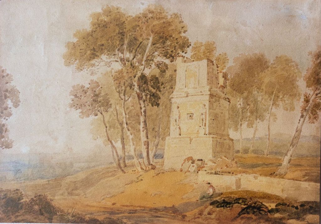
The image looked like a temple, but dating it was optimistic since the sketch was not signed or dated, and the paper looked possibly old enough. I purchased it to add to my small Indian collection. I decided to open the back and see if I might be lucky enough to find more information on the verso of the sketch. To my delight, there was.
Attribution on verso
In pencil on the verso, the sketch is said to be by #WilliamDaniell (1769-1837) and stemming from his Indian tour. Daniell’s tour of India with his uncle Thomas occurred from 1786 to 1794, thus giving us an accurate date. William and Thomas produced ‘Oriental Scenery’ on their return to England. A foundational publication providing the British public a view into Indian architecture, landscape, and culture.
An Hindu Temple, Bengal – watercolour sketch by William Daniell @ 1786-1794
Daniell was a superb landscape painter and printmaker, but was most renowned for his detailed aquatints – 144 of which were used in Oriental Scenery .
To finish a couple of watercolours from 1862 by William Simpson, who also toured India.
Falls of Gairsoppa William Simpson – watercolour @ 1862Jumnotree, source of the Jumna – watercolour by William Simpson @ 1862
I thought we would travel to Spain and the city of Tarragona to visit a Unesco World Heritage Site. The city, originally named Tarraco, was built by the Romans on the road ‘Via Augusta’ that ran from the Pyrenees to Gades (Cadiz). The tower has three levels and two relief carved images on the central level. Once believed to be representations of the Scipio brothers, Publius and Gaeus, the images are actually of the god Attis, deity of death and resurrection.
Tower of the Scipios – watercolour by anon @ 1800 to 1830
The tower was built during the 1st century AD. On the second level behind the reliefs is where the burial chamber is found. It would contain some of the deceased major possessions. Romans were not allowed to bury their dead within a town, so families would build funerary monuments on a road outside of town. The more important the person, the more lavish the monument.
The Romans were not allowed to cremate or bury their dead inside the town. Therefore, we always find them outside the walls and normally alongside a road. The tower was most likely built for two, a husband and wife or two brothers. It is unknown as to who built the tower but certainly was not the Scipio brothers.
The watercolour (over graphite), which I date to the first quarter of the 19th century, has aged well. It is a beautiful scene for an important historical site.
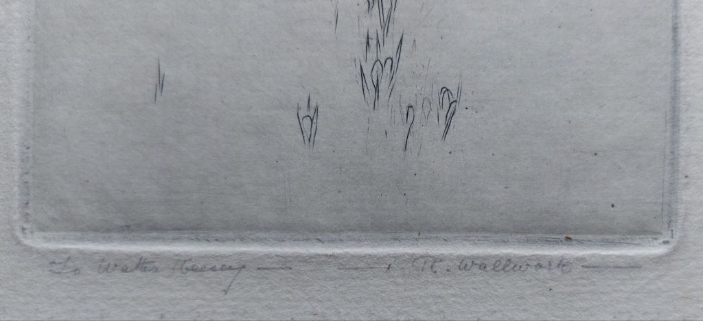
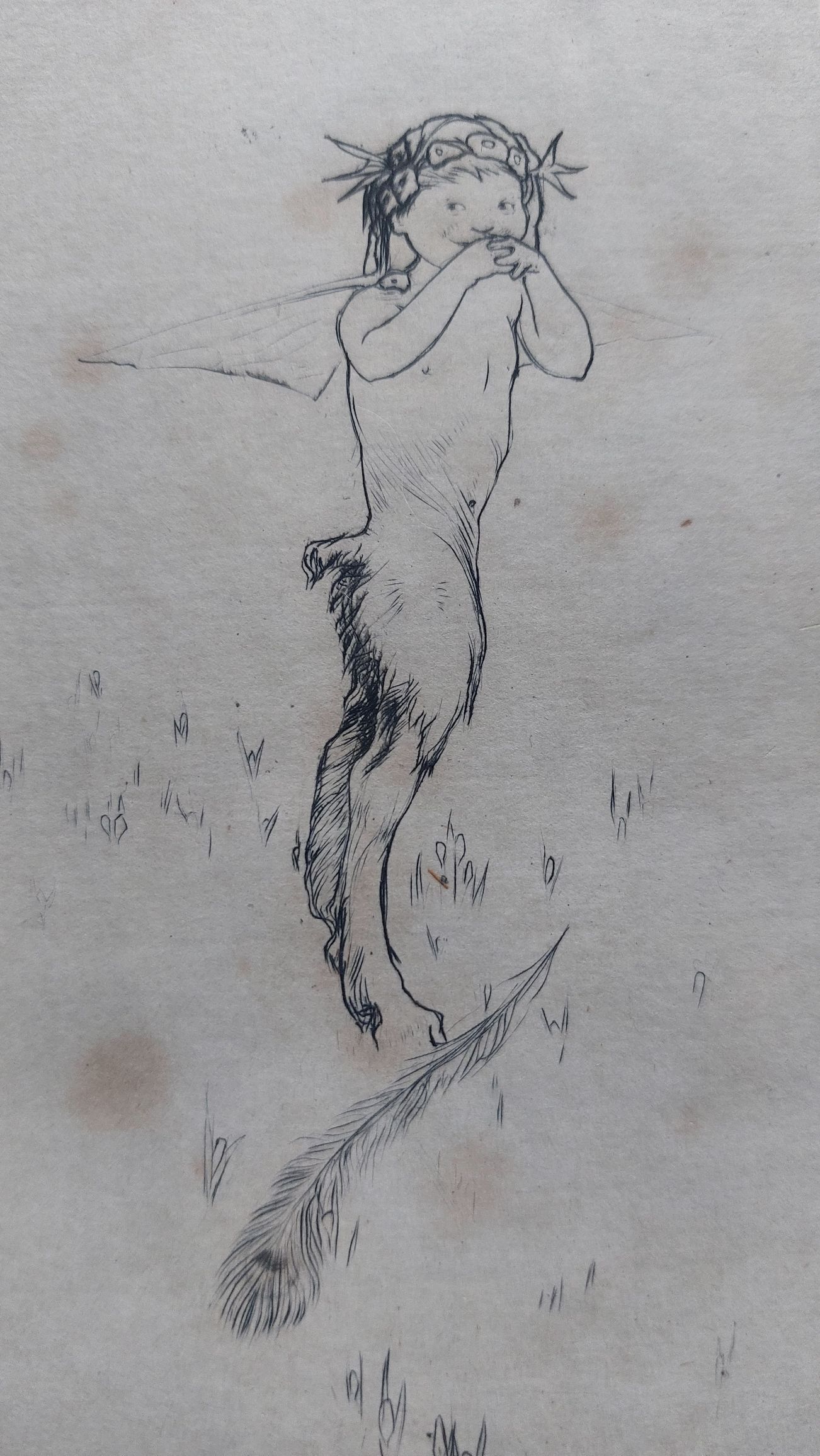
I have in my collection a small engraving which is very playful and fun. It was created by #RichardWallwork (1882-1955). Richard studied art at the Manchester School of Art and then went on to study at the Royal College of Art in London. After his studies, he taught at the Liverpool City School of Art. In 1910, he was convinced to teach at the Cantebury College of Art in Christchurch, New Zealand. He and his wife, Elizabeth (also a fine artist), were well respected and Richard finished his teaching career as director of ghd college.
Dedication and signature below plate mark.
The piece is signed and has a dedication in pencil below the lower plate mark. It is dedicated to #WalterKeesey, who was a student at the Royal College of Art at the same time as Richard. So, I will date it to around 1910.
Mischievous Faun – engraving by Richard Wallwork – dedicated to Walter Keesey @ 1910
A youthful laughing faun with a large feather at his hooves shows that he has been up to mischief. A mischievous and playful piece.