I, at times, wonder what draws me to a piece of art but this week I know full well that it is the sublime skill with pen and ink. Two pieces by artist Peter Nuttall in my collection are the main topic for today.

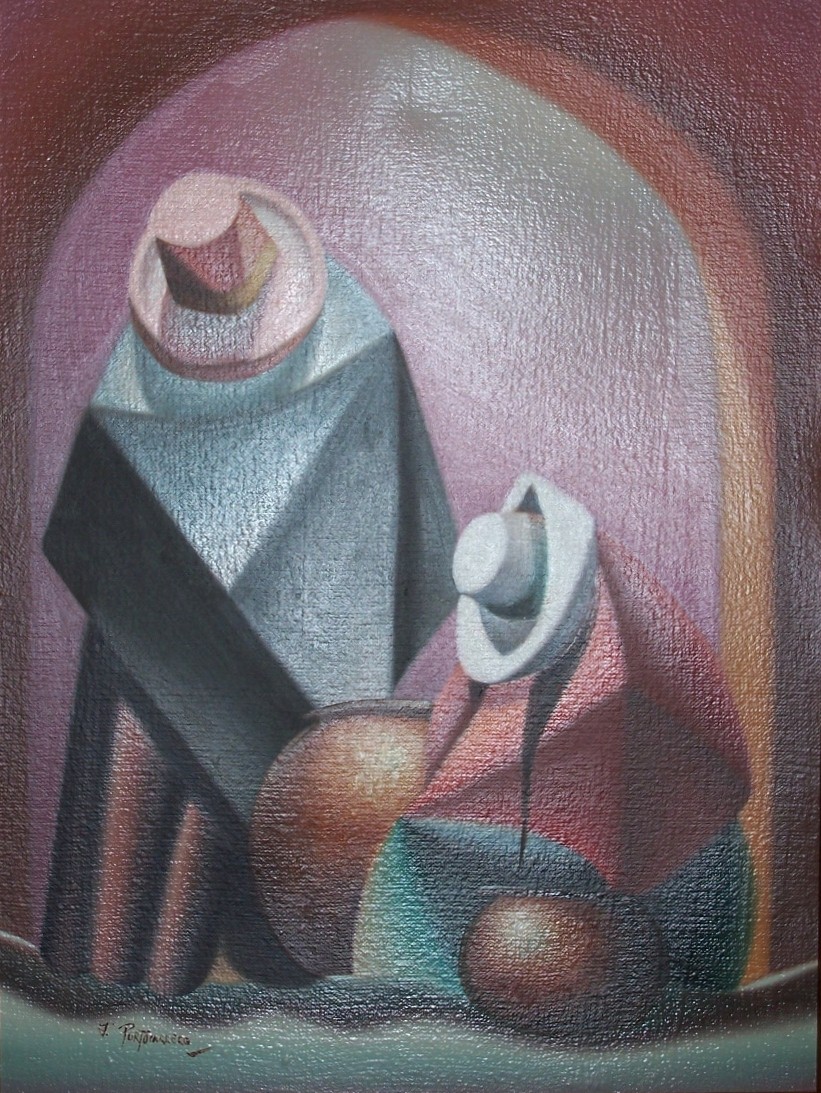
Head of a Girl – pen crayon & wash
Peter Nuttall, 1979
Peter Nuttall (1943 – 2011) was born in Blackburn. He studied at the Maidstone College of Art where he developed his unique drawing style, his distinctive colour palette and his use of mixed media. His art in ways is surrealistic and yet in others is very baroque. Much of his art embodies the spirit of the north of England – he being a Lancashire lad. The earthy tones in his colouring of his works gives the subjects a solidity a firmness as if from rock they are drawn. A beauty expressed in a moment of melancholy. A day dream caught in its’ passing. A reflection of the real and yet with so much depth beneath it.
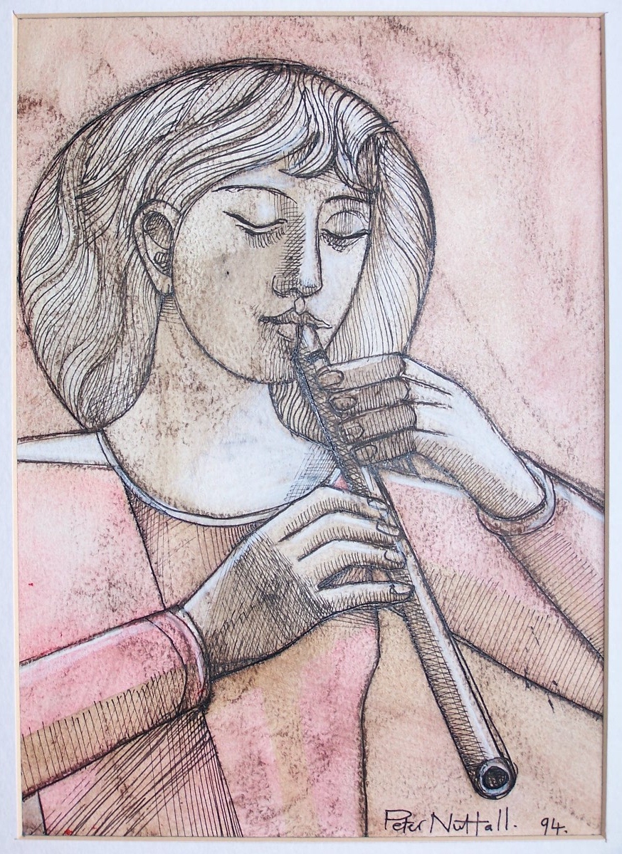
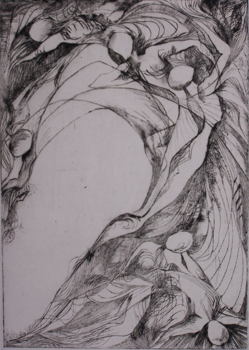
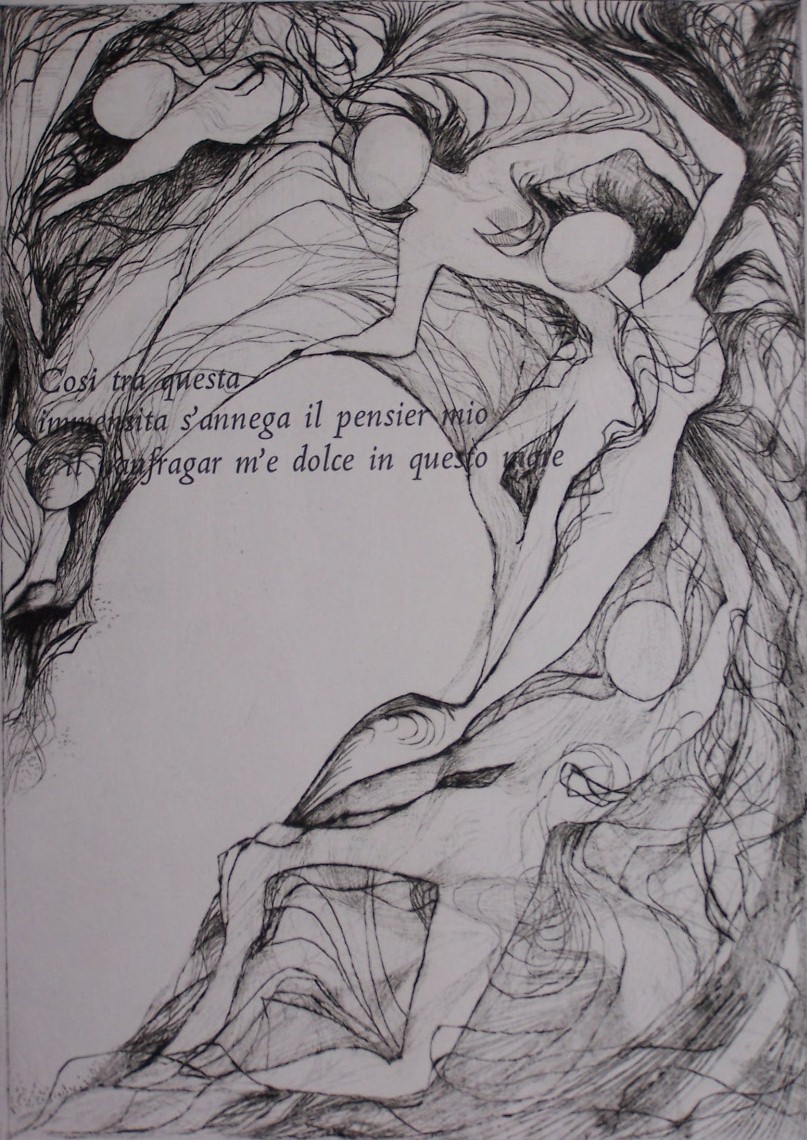
Upon the Flute – pen and ink, crayon, and watercolour
Peter Nuttall, 1994
Surreal in representation and yet a surety of line which harkens to an earlier time. An interpretation of what the artist is seeing and his depiction is of what he is feeling- how these figures have moved him – are expressed here in line and colour. There is beauty here and to depths which we are privileged to see through an artists’ eye.
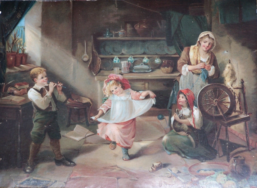
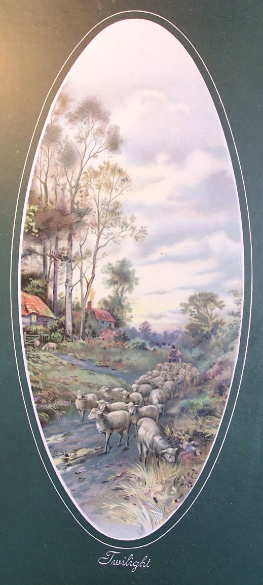
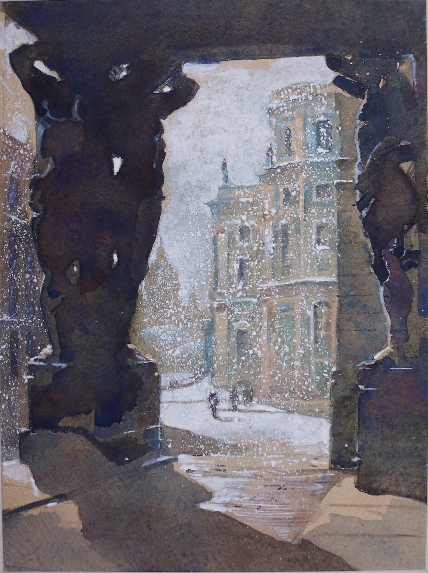
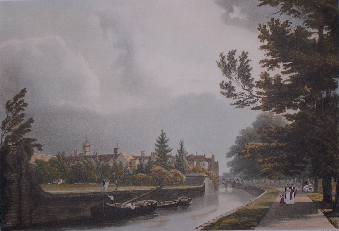
And from 1910, here are two mezzotint engravings published by Virtue & Co., 7 City Garden Row, City Road, London, England. The one on the left is signed in pencil by Frank Sternberg and the one on the right by F. Petitjean. Just over 100 years old and still with wonderful colours. Images of a genteel time – whether truth or myth – to lighten the eye and mind.
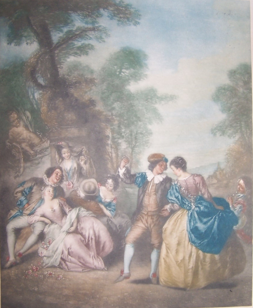
Frank Sternberg =-mezzotint
published by Virtue & Co, 1910
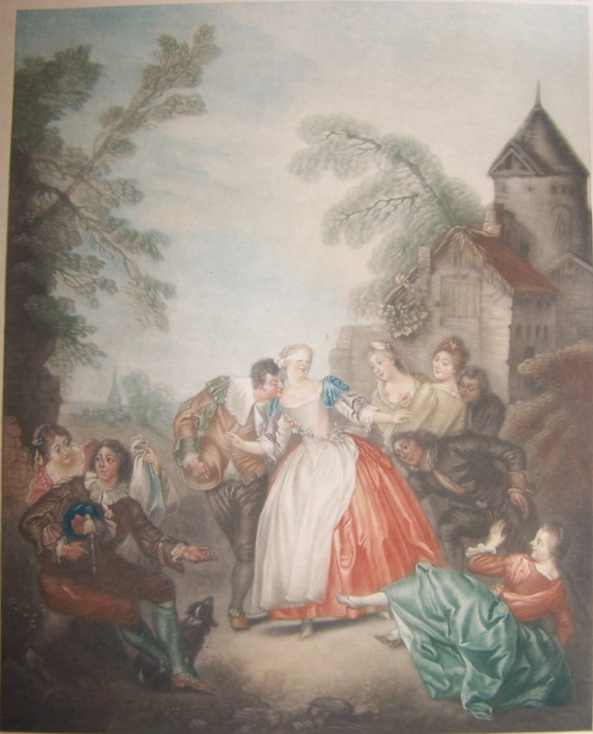
F Petitjean – mezzotint
published by Virtue & Co, 191