John Ewbank and Edward Badham

The artists #JohnWilsonEwbank (1799-1847) and #EdwardLeslieBadham (1873-1944) are this weeks artists.  I acquired graphite drawings created by both of these artists, recently.

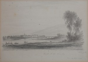
Perth and the River Tay pencil sketch by John Wilson Ewbank @ 1825

Perth and the River Tay
pencil sketch by John Wilson Ewbank @ 1825

This serene view by John Wilson Ewbank is of the city of Perth and the River Tay in 1825.  Ewbank was the son of an poor innkeeper.  He was adopted by a wealthy uncle who lived in Wycliffe on the banks of the River Tees.  It was intended that John enter the priesthood and was educated to that end but he rebelled and ran away.  He apprenticed with Thomas Coulson as an ornamental painter in Newcastle and then Edinburgh.  He also studied under Alexander Nasmyth.  He was a successful painter and teacher.  His sketches from nature were admired greatly as well as were his coastal and marine scenes.  Late in his life he altered his style and painted great events coming from history such as ‘The Visit of George IV to Edinburgh’ and ‘Hannibal Crossing the Alps’.

Edward Leslie Badham studied at the Clapham School of Art and The Slade. He lived and worked in London for a number of years before moving down to St. Leonards on Sea and eventually to Hastings.

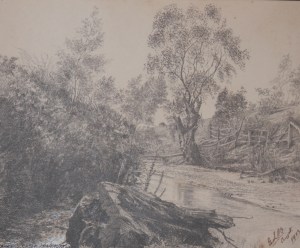
Barkers Creek, Harcourt pencil sketch by Edward Leslie Badham @ 1903

Barkers Creek, Harcourt pencil sketch by Edward Leslie Badham @ 1903

Badham exhibited often and was well respected.  This picturesque scene drawn in 1903 and done only in graphite displays superb finesse and an eye for accuracy.  Drawn in the month of August, one can feel the turn of the year veering into fall.  I love the ancient tree on the far bank – broken yet still striving upward – and the old rail fence.

Two fine drawings from an art that is undervalued these days – the art of the pencil.

Posted in Drawings and Sketches | Tagged , , , , , | Leave a comment

Wilhelm Hass Mapmaker

#WilhelmHass (1698-1764) was a map-maker from Nuremberg.  He furthered the work of #AugustGottliebPreuschen (1734-1803) who developed the printing method called typometry.  #Typometry is a relief printing method using movable type.  The technique was inflexible and the maps looked quite schematic in style.  Everything—text, borders, and topographic features—are set by hand using a variety of text fonts as well as a specially designed cartographic font.  Due to these limitations the technique did not catch on.

 Until the later 18th century, maps were printed in one of two ways: either from a relief block (typically a woodcut where all non-printing areas cut away from the block’s top surface); or from an intaglio plate (typically an engraving, with the map’s lines cut into the surface of a copper plate).
Rempublicam Basileensem typometric map by Wilhelm Haas @ 1776

Rempublicam Basileensem typometric map by Wilhelm Haas @ 1776

In the early 1770s, August Gottlieb Preuschen of Karlsruhe, Germany, invented an alternative to the printing of maps : a 21-character cartographic type font. Preuschen’s idea was realized through the technical skill of Wilhelm Haas, a typefounder in Basel, Switzerland, who perfected and cast the cartographic font and, in 1776, published the first map composed entirely from movable types. Over the next two decades, Haas continued to refine and expand his cartographic font until it contained at least 139 different characters, or “sorts.” These were special symbols, not letters, including 24 designed for depicting streams and rivers, 17 for borders, 14 for roads, 31 for charting military movements, 15 for human habitations, 6 for mountains and forests, and 32 for coastlines. All told, Haas employed his proprietary font to publish approximately two dozen typographic maps.

In setting these maps, Haas’s compositors worked from manuscript maps drawn on gridded paper. By breaking the complex cartographic image into small units, the compositors were better able to translate the image into small blocks of type metal. In doing so they faced two principal problems. First, the twists and turns of rivers and roads could be approximated but not rendered exactly, as could be done through engraving. Second, great care was needed to “lock up” these disparate assemblages of movable types so that they would not shift during printing.
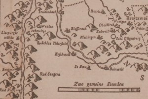
Rempublicam Basileensem typometric map by Wilhelm Haas @ 1776

Rempublicam Basileensem typometric map by Wilhelm Haas @ 1776

Type fonts are designed so that each sort has the same height, or “body size.” As long as each horizontal row of movable type contains sorts of the same height, a page consisting of several thousand small rectangles of metal type will “lock up” easily. Because Haas’s cartographic font contained sorts with a range of body sizes, which could not be arranged into uniform rows, it was necessary to painstakingly add filler material to the irregular gaps between types. In essence, the process was more like assembling a mosaic than setting type.

Haas’s cartographic font could claim several advantages over copperplate engraving: maps could be prepared more quickly, revision was easier, and unlimited impressions could be taken. But decided disadvantages remained for the prospective map publisher: only a limited level of accuracy could be achieved, and a large initial investment would be necessary to purchase the requisite types. Soon, however, the invention of lithography (and later, wax engraving) gave cartographers a far easier method for reproducing maps accurately, and Haas’s font was never adopted by other map publishers.
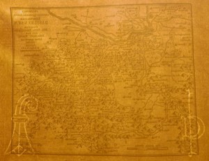
Rempublicam Basileensem typometric map by Wilhelm Hass @ 1776

Rempublicam Basileensem typometric map by Wilhelm Hass @ 1776

The map that I acquired has two other marks which should be mentioned.  A close inspection of the paper reveals that it is a ‘laid’ paper upon which there are two watermarks.  These marks are created by weaving or sewing a wire into the paper mould in the appropriate shape.  Watermarks are still used today to identify paper-makers.  On the left we see a #Bishop’sCrozier – the watermark for the Swiss canton paper-makers of Basel (Basle).  On the right is the watermark of the #Gallizianis family of paper-makers from Basel.  A fine map with an interesting heritage and rare if my research is correct.
 

Posted in Printing | Tagged , , , , , , | Leave a comment

La Madonna Della Sedia

#LaMadonnaDellaSedia (La Madonna Della Seggiola) was painted by Italian renaissance painter Raphael in 1514.  It is housed in the Palazzo Pitti collection in Florence. It depicts Mary embracing the child Christ, while a young John the Baptist watches on adoringly.

La Madonna della Sedia etcher unknown after Raphael

La Madonna della Sedia etcher unknown after Raphael

I acquired this drypoint etching recently.  It has been trimmed slightly so no credit is given to the artist who created this artwork.  It is an amazing piece of work.  Containing drypoint, line engraving , cross hatching, and stipple work this artist has produced a work of astounding beauty. This etching has also been coloured by hand.  It emulates the warm colours that Raphael used in the original.

The sheet size is 365mm (14 3/8″) x 437mm (17 1/4″).  The circular print is 317mm (12 1/2″).  So, this is no small endeavour by the artist.

La Madonna Della Sedia etcher unknown

La Madonna Della Sedia etcher unknown

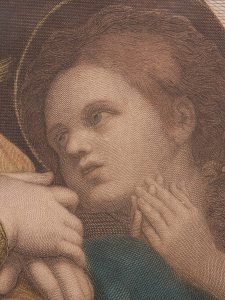
So that you might appreciate the wonderful technique of this artist, I include a couple of close-ups of segments of the work.  I love the superb fine line engraving giving way to stipple work which contrasts with the soft richness of the drypoint etching.  There is such life in the faces and Mary’s eyes appear to be looking right at you.  The adoration in the face of the child John as he looks upon the Christ child and his mother is palpable.  If you increase the size of the pictures you can appreciate the finesse involved in this work.  I hope you enjoy the supreme artistry involved in this work as much as I do.

La Madonna Della Sedia etcher unknown

La Madonna Della Sedia etcher unknown

Posted in Etching | Tagged , , , , , | Leave a comment

John Coney Etcher

This weeks focus is English etcher, #JohnConey (1786-1833).  He was born in London and like many an artist his talent was noticed at an early age.

Rue de Puit a la Chaine, Abbeville etched by John Coney @ 1843

Rue de Puit a la Chaine, Abbeville etched by John Coney @ 1843

He was apprenticed to an architect to begin with where he honed his art and although this profession was quite a safe route to take Coney did not follow it.  He began to make drawings of the interior of Westminster Abbey and other Gothic buildings which he sold to dealers and private customers at somewhat inadequate prices.

Rue des Changes, Abbeville etched by John Coney @ 1843

Rue des Changes, Abbeville etched by John Coney @ 1843

In 1815, Coney published his first works – 8 views of Warwick castle – interior and exterior.  These were noticed by publishers for their excellence and he was soon employed to draw and engrave cathedrals and abbey churches of England.  These works were for William Dugdale’s ‘Monasticon’ and consumed the next fourteen years of Coney’s life.  Coney then set out on a project engraving ancient cathedrals and public buildings in France, Holland, Germany and Italy.  This project was only partially successful and so in 1831 he started a similar project ‘Architectural Beauties of Continental Europe.

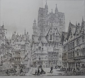
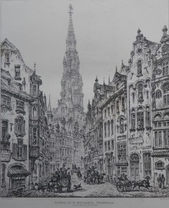
Tower of St Michael's, Brussells etched by John Coney @ 1843

Tower of St Michael’s, Brussells etched by John Coney @ 1843

This project consisted of 28 large plates of wonderful edifices in France, the Low Countries, Germany, and Italy along with 56 vignettes.  The five images in this chapter come from the my copy of #BeautiesofContinentalArchitecture published by M. A. Nattali in 1843.

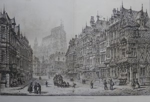
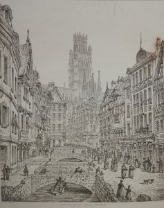
Tower of St Ouen, Rouen etched by John Coney @ 1843

Tower of St Ouen, Rouen etched by John Coney @ 1843

These five plates as well as the others in the publication display Coney’s expert architectural skills and the ease of his imbuing his works with richness and depth.  Finesse and intricate richness are the expressions which give these etchings a beauty to behold and admire.

Cathedral Church, Antwerp etched by John Coney @ 1843

Cathedral Church, Antwerp etched by John Coney @ 1843

Posted in Etching | Tagged , , , , , , , , , | Leave a comment

From a Poet Priest to an Adulteress Muse

Two people who in different ways either created or caused to be created beautiful art.  We visit with #GeorgeHerbert and with #JaneBurdenMorris.

George Herbert was born into an artistic and wealthy Welsh family.  Herbert received a fine education culminating at Cambridge.

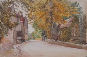
St Andrews, Bemerton, Wiltshire church and rectory of George Herbert by William Botham @ 1830?

St Andrews, Bemerton, Wiltshire church and rectory of George Herbert by William Botham @ 1830?

He had intended to go into the priesthood but was persuaded to enter politics for a while before taking holy orders.  Herbert wrote religious poetry throught out his life but his time at Bemerton was his most prolific.   Herbert’s poems have endured in various ilks such as popular hymns, including “King of Glory, King of Peace”, “Let All the World in Every Corner Sing” and “Teach me, my God and King”.  His biographer wrote that he composed “such hymns and anthems as he and the angels now sing in heaven”.  Herbert suffered ill-health all his life and he died at the early age of 39 from consumption (tuberculosis).  The quaint  watercolour on the left shows the ivied walls of St. Andrew’s Church, Bemerton on the right and the rectory on the left.

On the other side of the economic divide, we meet Jane Burden.  Born in Oxford to a stableman and  a laundress, her early life was one of poverty and privation.  Jane was a beautiful young woman and at 18 she was discovered by #DanteGabrielRossetti and #EdwardBurne-Jones.  She sat regularly and often for Rossetti and Jones and through them she was introduced to #WilliamMorris.

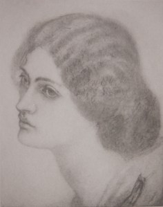
Jane Burden Morris drawn by William Morris etched by Emery Walker @ 1858

Jane Burden Morris
drawn by William Morris etched by Emery Walker @ 1858

William and Jane married in 1859.  Being little educated in youth, Jane set about to her learning as was befitting the wife of a rich gentleman’s wife.  Jane had a keen intelligence and loved to read.  She became proficient in French and Italian as well as becoming an accomplished pianist. Her manners and speech became refined.  Jane may have been the model for the heroine in the 1884 novel Miss Brown by Vernon Lee.  The heroine upon which was based the character of Eliza Doolittle in Bernard Shaw’s play Pygmalion and the later film ‘My Fair Lady’.  She also became a skilled needlewoman who would be later renowned for her embroideries.  Her affair with Rossetti began several years after her marriage to Morris and lasted in some form or other for 17 years.  She also had an affair with Wilfrid Scawen Blunt.  A beautiful woman who was the model for ‘Queen Guinevere’ by Rossetti  and Morris’s ‘La belle Iseult’.  A woman who inspired those around her to great feats of beauty.

The image above is taken from William Morris’s drawing which now resides in the British Museum.  The drawing was folded in two – so is creased badly across the face and has a stain on the face a well.  #EmeryWalker was asked to etch the image and has done a very fine job in doing so.

Posted in Etching, Watercolour paintings | Tagged , , , , , , , , , | Leave a comment

Poetry and a Tale Illustrated

We begin with a connection to last weeks chapter and go from poetry to a story of a time past and a city devastated.

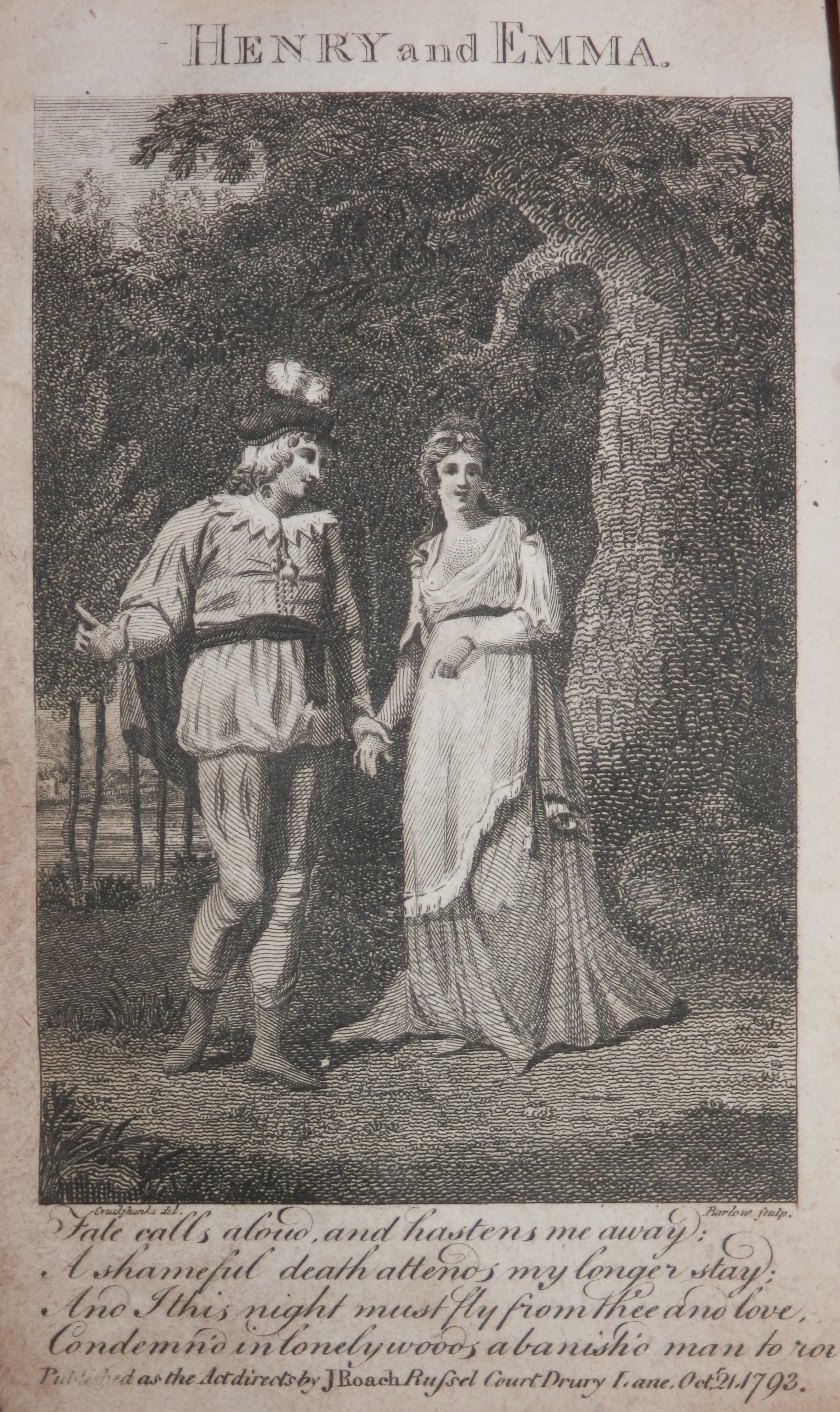
Henry and Emma - drawn by Isaac Cruikshank - etched by Barlow @ 1793

Henry and Emma – drawn by Isaac Cruikshank – etched by Barlow @ 1793

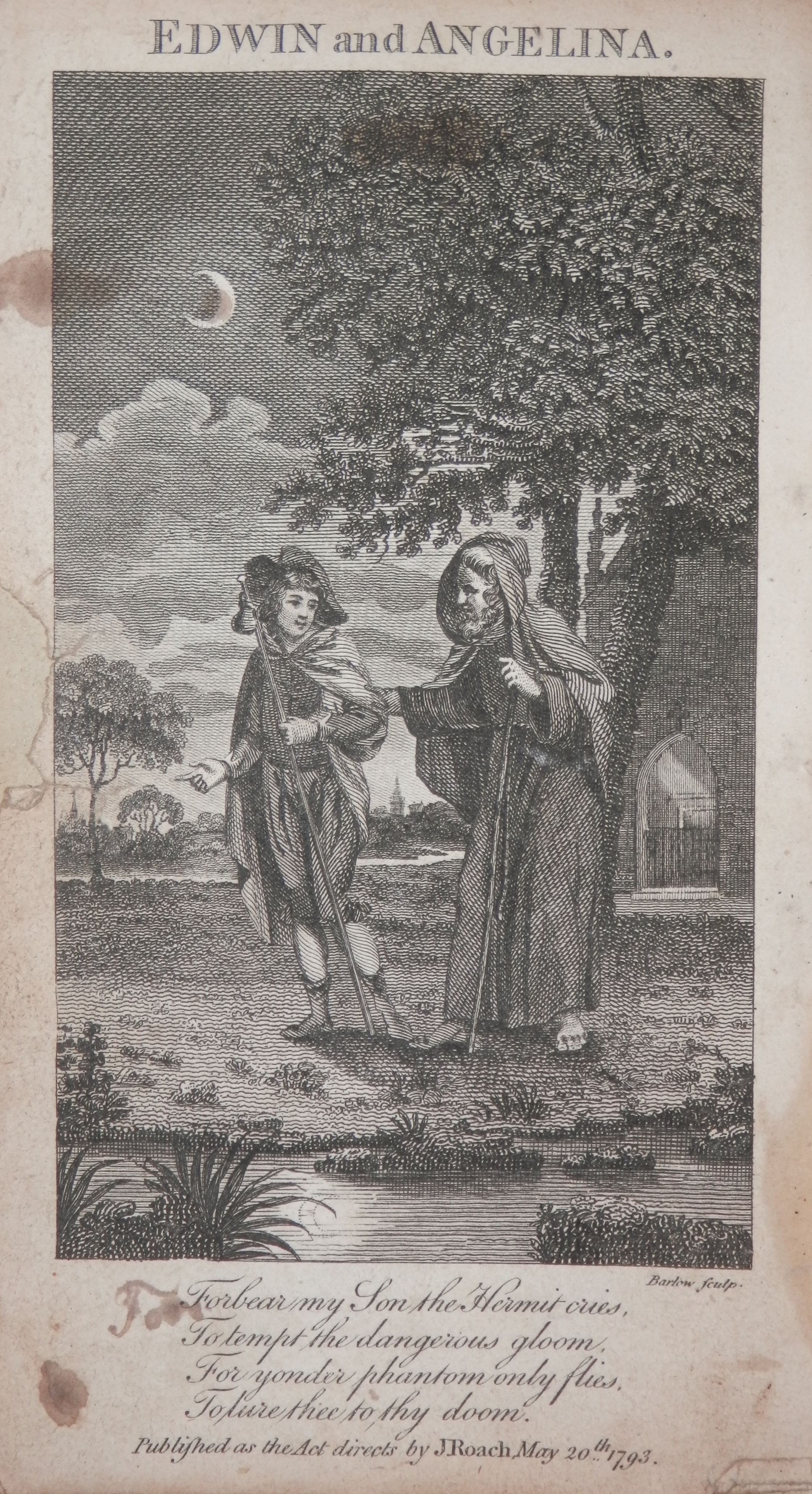
Last week’s illustrations by William Blake were from a poem titled ‘The Grave’ written by Robert Blair.  I have a copy of the poem in a book called ‘Beauties of the Modern Poets of Great Britain’.  It was compiled and printed by #JohnRoach in 1794.  In the book are several fine illustrations and etchings by Barlow.

Edwin and Angelina - etched by Barlow @ 1793

Edwin and Angelina – etched by Barlow @ 1793

Henry and Emma by#MatthewPrior and Edwin and Angelina by #OliverGoldsmith and of course Robert Blair are just a few of the many poets and writers which are included in this volume.  Fine poetry and wonderful engravings – what more could one ask for.

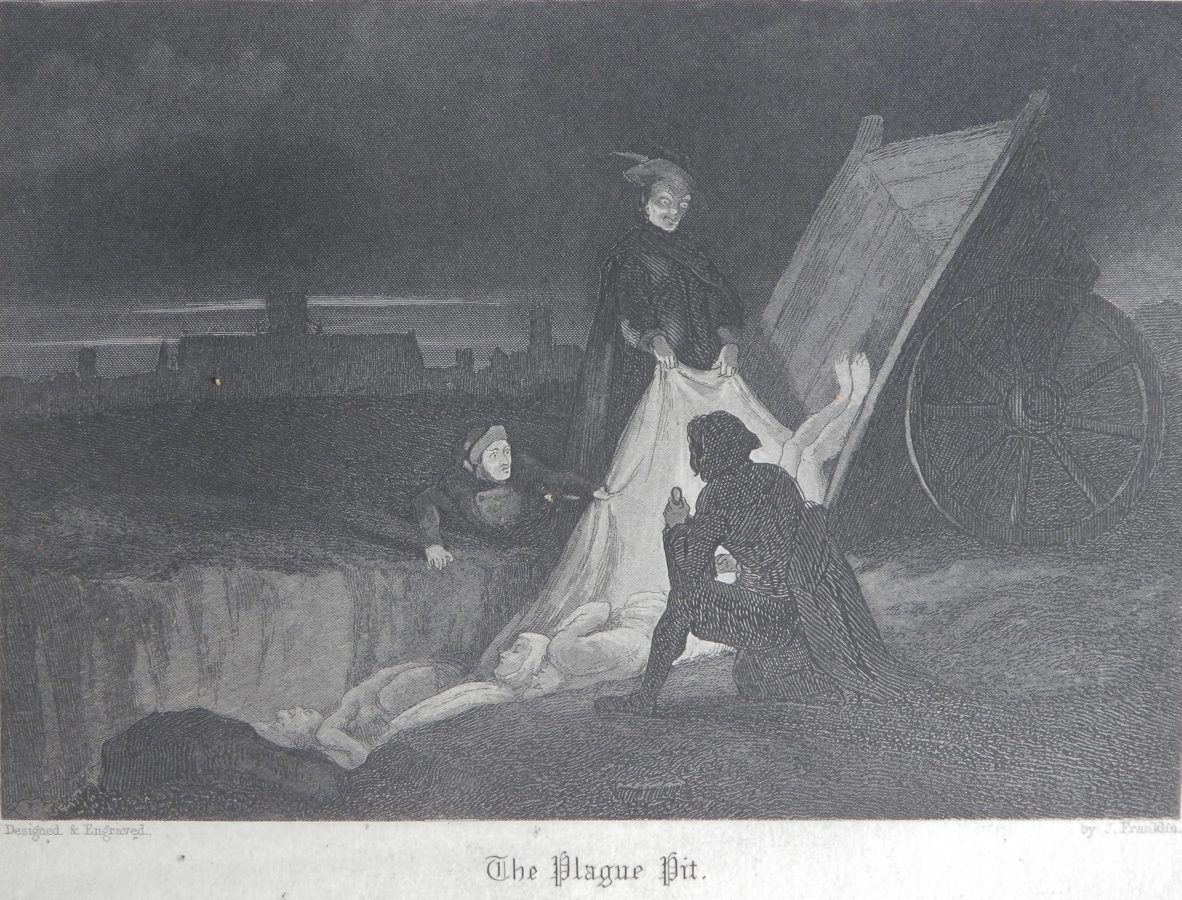
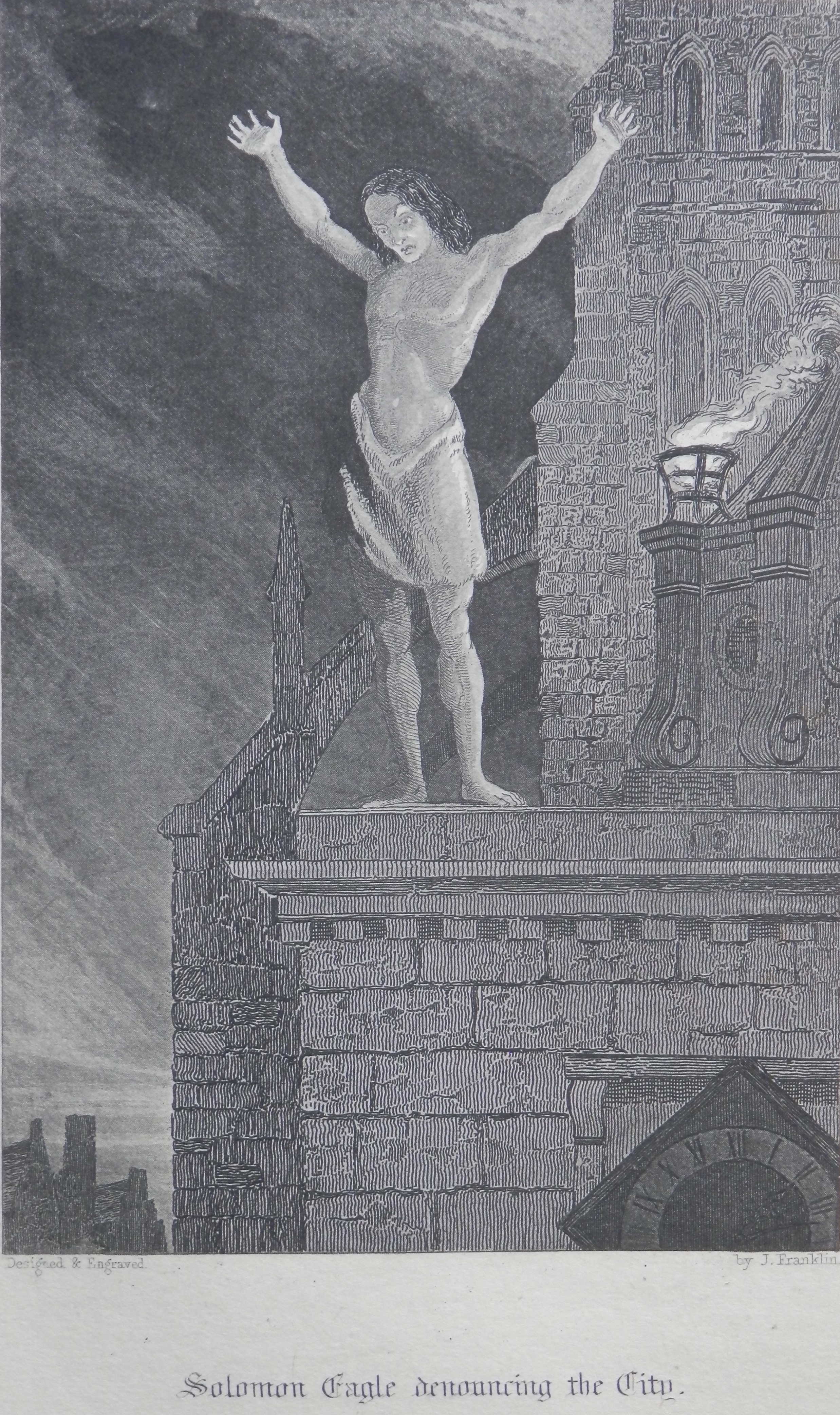
But if one were to want more – how about a tale of old London titled Old Saint Paul’s: A Tale of the Plague and the Fire.  It was written by #WilliamHarrisonAinsworth in 1841 and contains illustrations by John Franklin and Hablot K Browne (Phiz – as he is also known).

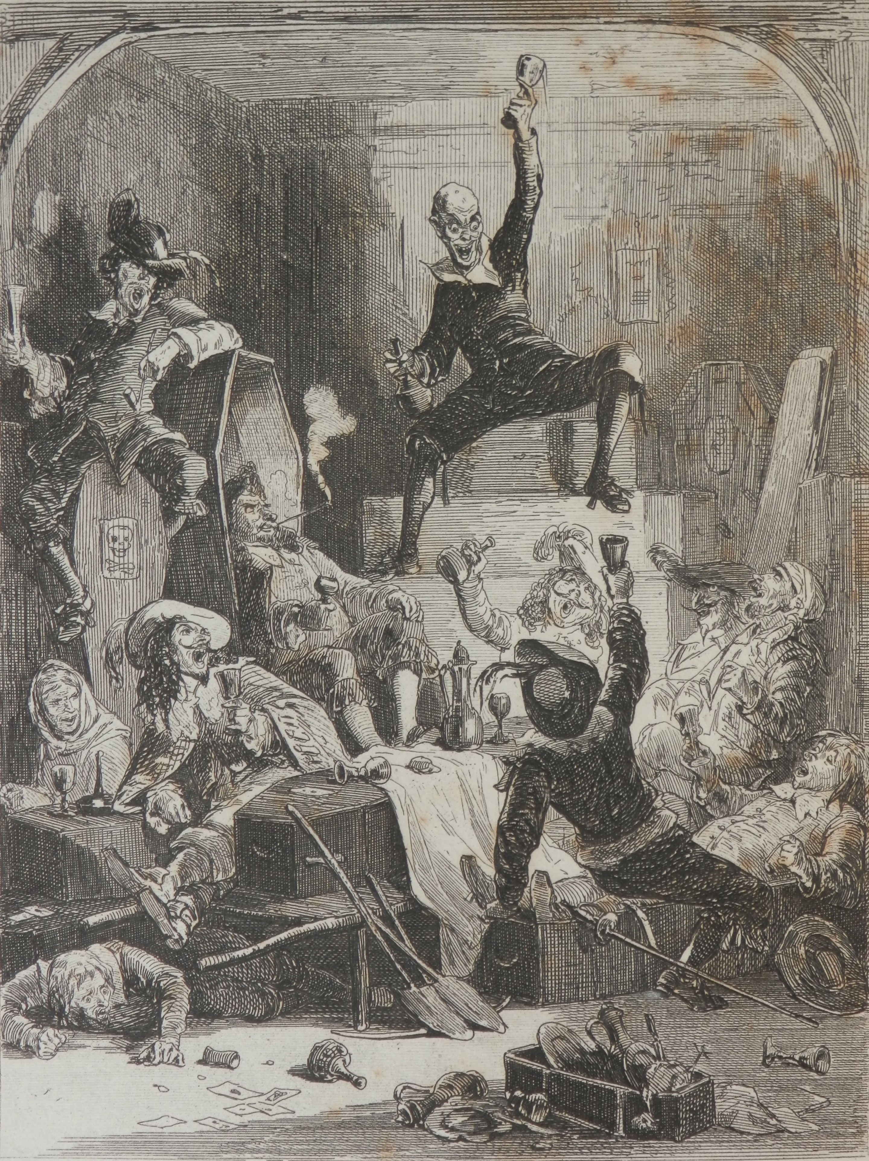
Drink the Plague etched by Hablot Browne (Phiz) @ 1841

Drink the Plague etched by Hablot Browne (Phiz) @ 1841


The Burning of St. Pauls etched by John Franklin @ 1841

The Burning of St. Pauls etched by John Franklin @ 1841

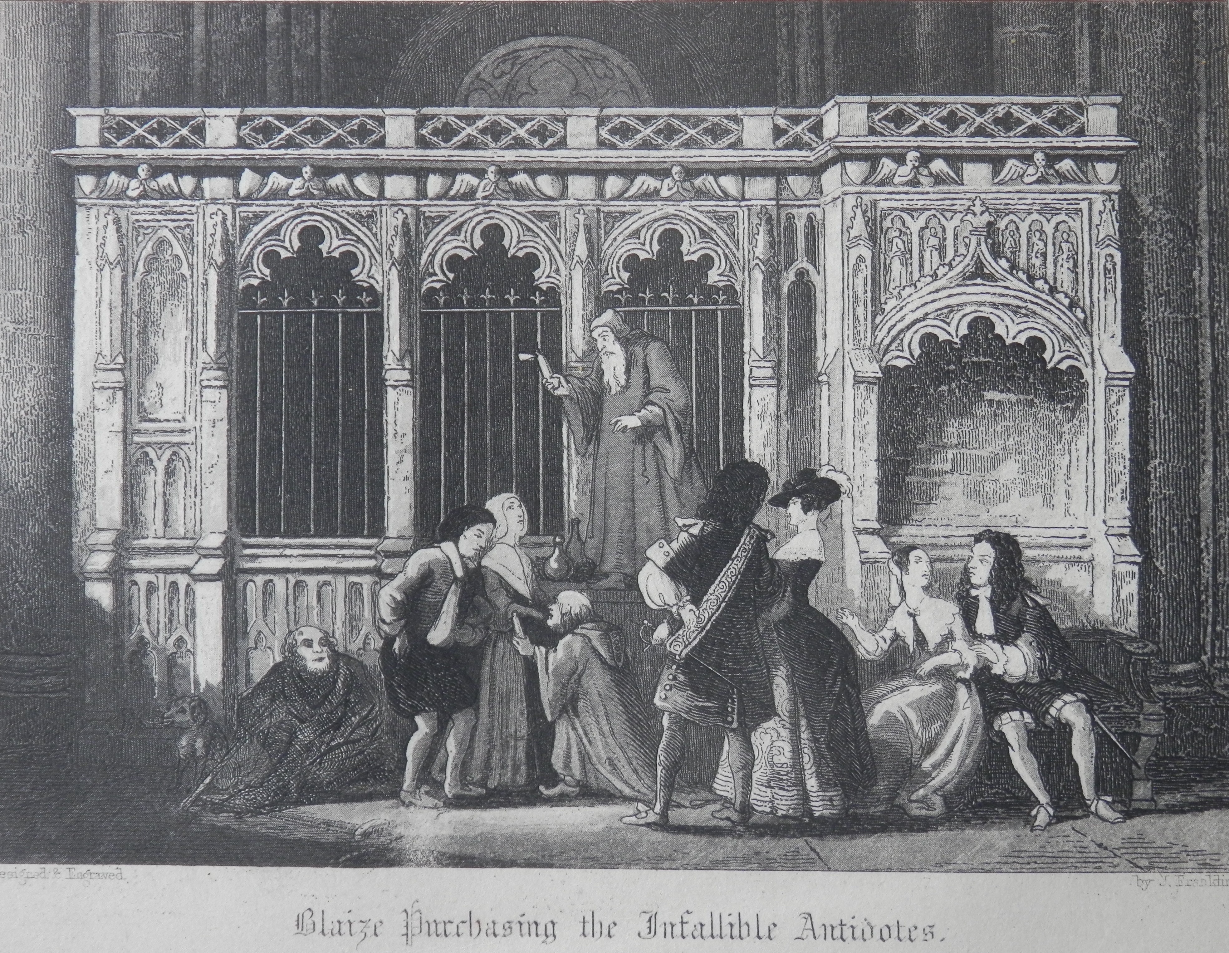
The novel is an historical romance that describes both the ‘Great Plague’ and the Great Fire’ of London.  #OldSaintPaul’s was serialised by The Sunday Times.  Ainsworth was one of the first writers to appear in a national paper in such a manner.  The original edition of the book was not illustrated but the edition which was was not illustrated by George Cruikshank (friend to and illustrator of many of Ainsworth’s books and the son of Isaac Cruikshank).  Cruikshank was asked to illustrate the book but turned the opportunity down due to many prior commitments.  He thought Ainsworth would wait till he was able to do the drawings before publishing.  Ainsworth did not and this set the pair at odds.  Cruikshank claimed that he was the source of many of Ainsworth’s works including Old Saint Paul’s which were then stolen.  Even so, the illustrations are dark, foreboding, atmospheric, eerily descriptive – just as they ought.

Blaize Purchasing the Infallible Antidotes - etching by John Franklin @ 1841

Blaize Purchasing the Infallible Antidotes – etching by John Franklin @ 1841

The Plague Pit - etched by John Franklin @ 1841

The Plague Pit – etched by John Franklin @ 1841

Solomon Eagle denouncing the City - etched by John Franklin @ 1841

Solomon Eagle denouncing the City – etched by John Franklin @ 1841

Posted in Etching | Tagged , , , , , , , , | Leave a comment

William Blake Juxtaposed

 Born into a middle class family, #WilliamBlake (1757-1827) was poet, painter, and printmaker. Receiving little recognition during his lifetime, Blake is now considered a foundational figure in the history of the poetry and visual arts of the Romantic Age.  Blake’s artistic talent was recognised early and he was apprenticed to engraver James Basire for seven years.  At the end of his apprenticeship, aged 21, he became a professional engraver.  During his tenure with Basire he was employed to copy images and monuments from the Gothic churches in London and especially Westminster Abbey.  Blake experienced ecstatic visions while working in the Abbey, he saw Christ and his Apostles and a great procession of monks and priests and heard their chant.  Blake claimed that Ezekiel, Solomon, Merlin, his deceased brother, and many other historical and imaginary figures sat and conversed with him as he produced his illustrations of them.

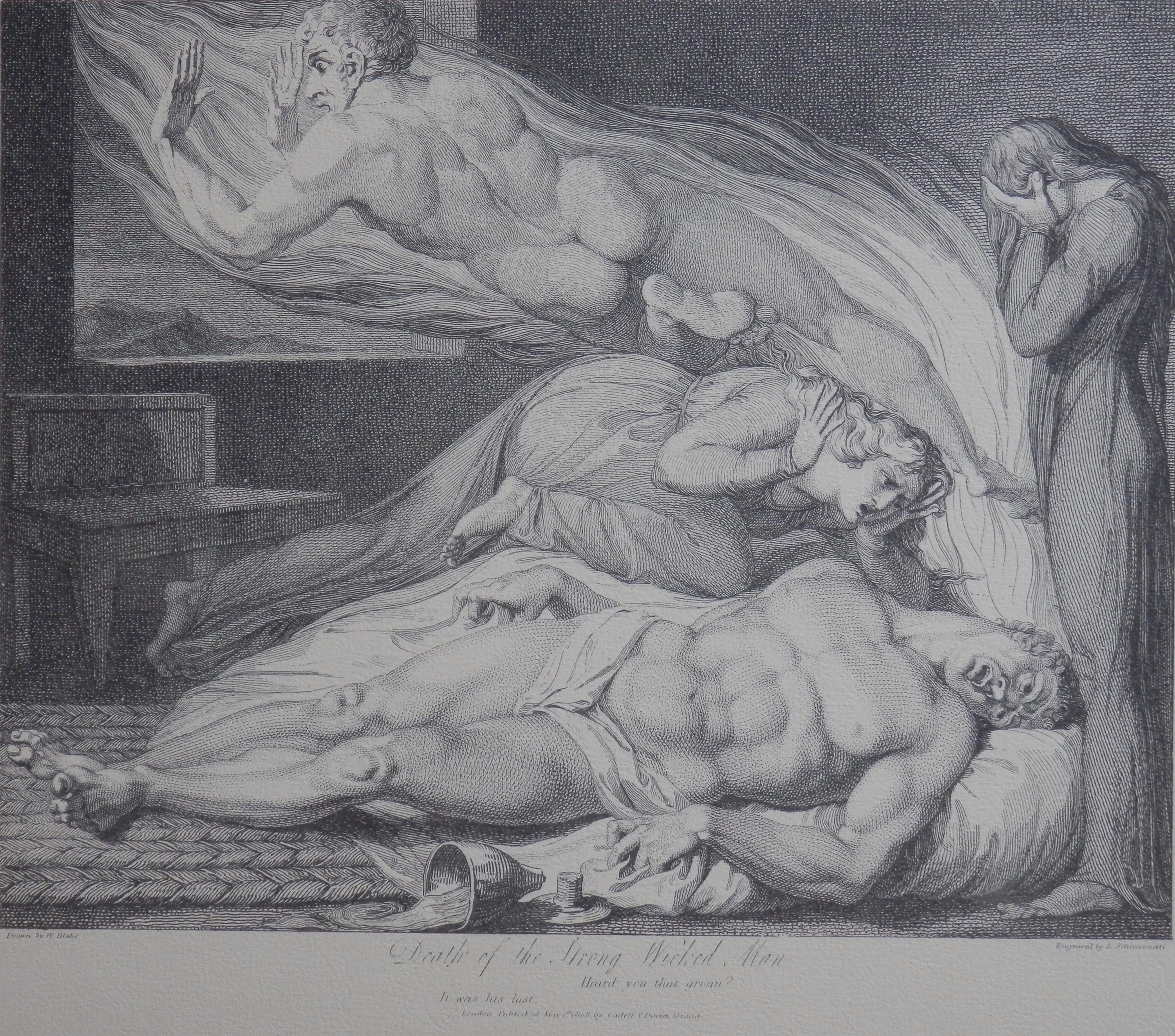
Death of the Strong Wicked Man by William Blake etched by L Schiavonetti

The engravings are by #LuigiSchiavonetti from Blake’s drawings for ‘The Grave’.  A poem penned by Robert Blair in 1743.

The powerful limbs and body of the young man heave in agony, fingers clench, toes curl, interminable excruciating torments of mind and body, depict the fearful image of the Strong and Wicked Man in the pangs of Death. His masculine soul is hurried through the window in flame to a land beyond.  His daughter hides her face in grief while his wife frantically rushes forward, as if resolved to share or halt his fate.  

Death of the Good Old Man drawn by Willia m Blake etched by L. Schiavonetti


  While here are perfect repose, a strong hope, and heavenly rewards.  Peace lies upon the old man’s visage, his hand upon the gospel, the bread and the wine having been received his soul devoutly ascends to eternal bliss. His affectionate children are seen in supplication, prayer and thanksgiving.  No fear or desperation clouds their countenance. How great is the happiness of the Good Man in the Hour of Death.  

Perhaps never were two subjects more happily conceived, and beautifully contrasted, than this and the former.  Exquisite evidence of Blake’s capabilities as creative and visionary.  William Blake genius, visionary, prophet, insane – all pieces of the whole – but what a whole.

Posted in Etching | Tagged , , , , , , , | Leave a comment

The Brumby

This story travels 100 years into the future from last weeks watercolour and is about a book which connects not only this country but one down under.  ‘The Brumby’ is the title of a book written by #MaryElwynPatchett.  A brumby is a free-roaming feral horse found all across Australia.  Originally published in 1958 by the Lutterworth Press, it is the Puffin edition from 1964 that is the topic this week.

The Brumby cover for Puffin edition 1964

The Brumby cover for Puffin edition 1964

Puffin produced a very fine cover (pictured on the left) for their publication of #TheBrumby.  I have found one site which attributes the artwork to #BarringtonLionelDriscoll.  Usually called Barry Driscoll, he was a British painter, wildlife artist, and sculptor who started as a book illustrator.

Mary Elwyn Patchett was born in Australia and grew up on a cattle station in Texas, Queensland. An independent child, her time was spent with her pets and the animals from the bush.  It is this world which she drew on for her books.  She moved to England in 1931 and worked for the BBC Children’s Hour.  Her books were translated into many languages, and she was considered to be the most widely read Australian children’s author of her time.  Her books are excellent reads and she does not back away from the harsh realities of the Australian bush.  ‘The Brumby’ is the first book in her pony series.

The Brumby watercolour signed & dated December 1964

The Brumby
watercolour signed & dated December 1964

This is the watercolour which I bought earlier this week.  It is, I believe, the original artwork for the cover of the Puffin edition.  They only used half of the image as you can see.  A detailed work of no little skill.  The overall image is as impressive as the cropped version.  It is signed in the lower right corner as well as dated but the signature does not appear to be that of Barry Driscoll.  To me it looks more like ‘Leonard’.  On the back there is a message which reads ‘Leonard Peters – typographic department – time – six weeks making approx. hours up to 100 hrs work’.  Typography is the setting of text so Mr Peters is not likely the artist.  Although there is one site which gives Barry Driscoll credit, I have not been able to confirm that anywhere else.  Be that as it may, the work is finely executed and it is no wonder so many people are impressed with the cover of the book.   Barry Driscoll specialized in animal subjects and established an international reputation as a wildlife artist and it may just be that he is the artist responsible for the cover.  The internal illustrations were done by Juliet McLeod – a well respected and renowned equine artist.

Posted in Watercolour paintings | Tagged , , , , | 1 Comment

Bayard’s Cove

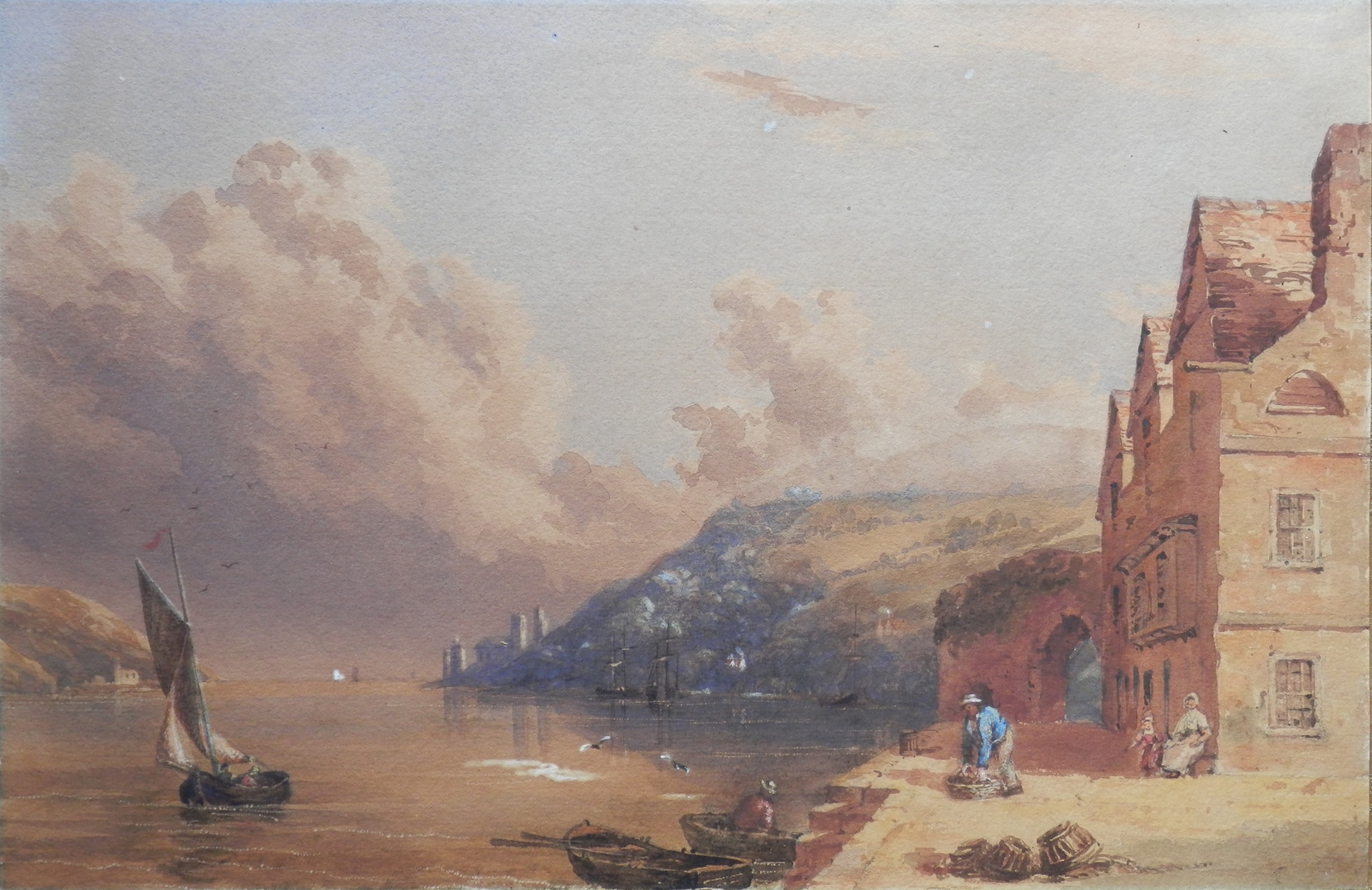
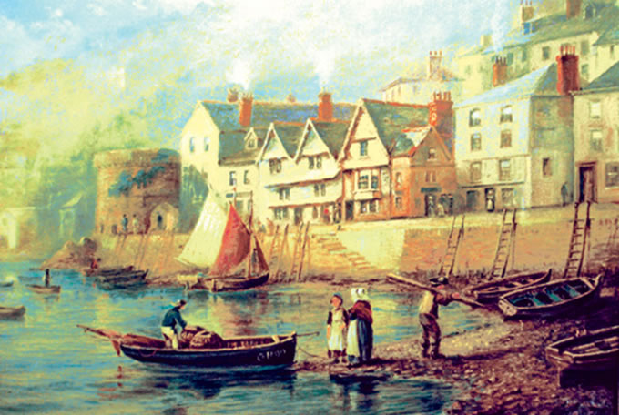
This chapter is about a picture which I talked about two weeks ago in a post called ‘Art Unsigned’.  I have continued to research the watercolour and have found new facts and some interesting proofs which arise in regards to the new information and the image itself.

Bayard's Cove, near Dartmouth Harbour in the manner of Samuel Prout 18th C

Bayard’s Cove, near Dartmouth Harbour
in the manner of Samuel Prout 19th C

I identified this watercolour as #DartmouthHarbour but it is in fact a short way down the River Dart from the harbour and is actually called #Bayard’sCove.  Bayard’s Cove is Dartmouth’s oldest wharf.  It’s cobbled quayside is where the Mayflower and the Speedwell moored in 1620 as the Pilgrim Fathers made their way to the New World.

So, I have identified the place more exactly.  I also estimated the date of this painting to be 1860 and this I did from the tower of St Petrox Church.  It is one of those distant towers at the mouth of the river.  The tower in my picture does not have a steeple on top of the tower.  The steeple was removed around 1855 and thus my estimate for the images age.  My readings tell me that the tower did not have a steeple when originally built and was a crenellated like a castle tower.  The steeple can be seen in Samuel and Nathaniel Buck’s etching of 1765.  My picture is certainly not earlier than that.  The other age proof comes from the right hand side of the painting.  We see the side of the three story building – windows on each floor and an arched access above them with a chimney rising just to the right above.

Bayard's Cove by W H Way @ 1890

Bayard’s Cove by W H Way @ 1890

All the images I have found of this site have an extension coming off the end of the building towards us the viewer as seen in the painting by W H Way -1890.  It is set back a foot or less from the corner of the building so the windows and arch are not there and the chimney has also been moved to the right down the side of the building.  It means that my estimate is possibly correct and that my painting is the earliest image of Bayard’s Cove I have yet come across.

Posted in Watercolour paintings | Tagged , , , , , , , | Leave a comment

Still-life

Still-life art is the presentation of inanimate objects and it is amazing how beautiful those simple objects can be.

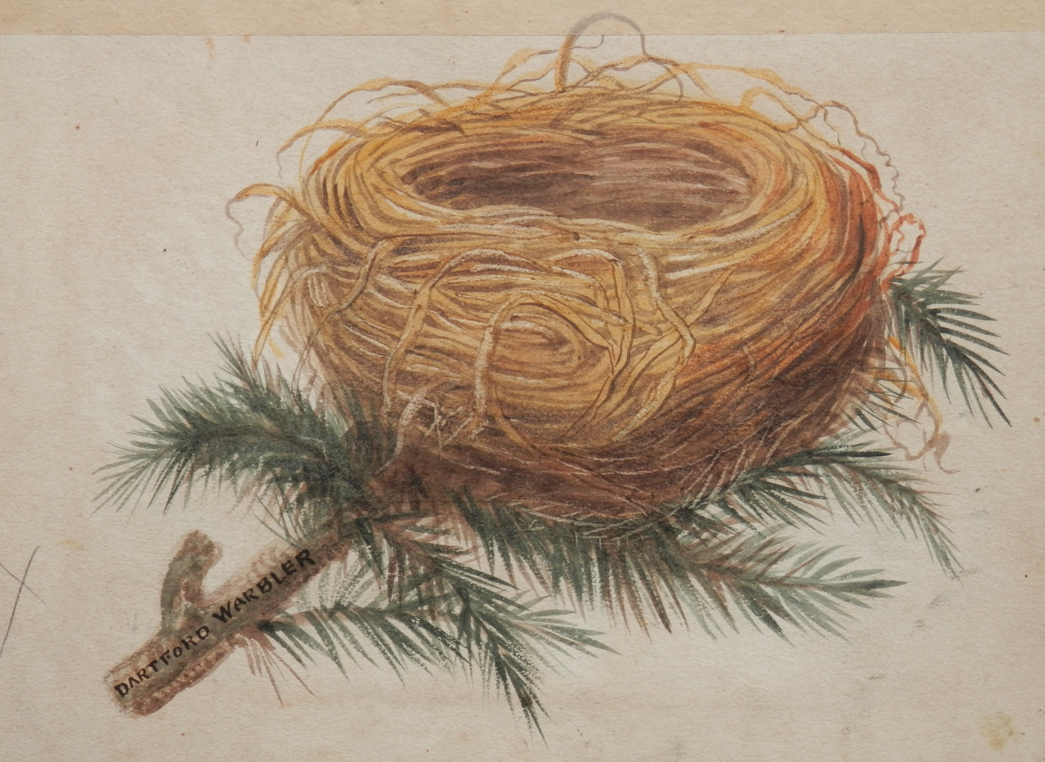
Dartford Warbler after Francis Orpen Morris & Alexander Francis Lydon @1855

Dartford Warbler after Francis Orpen Morris & Alexander Francis Lydon @1855

Black Redstart Nest after Francis Orpen Morris & Alexander Francis Lydon @ 1860

Black Redstart Nest after Francis Orpen Morris & Alexander Francis Lydon @ 1860

Two finely executed watercolours by an unknown artist.  I believe that they might have been painted for #FrancisOrpenMorris and his work ‘A Natural History of Nests and Eggs of British Birds’.  The #DartfordWarbler nest is very much like the engraving which was produced for the publication.  The book was published in 1850 and was the first of a number of very popular publications.  The Rev. F. O. Morris worked with publisher Benjamin Fawcett and engraver Alexander Francis Lydon.  The publications ranged from : A History of British Birds, A Natural History of Nests and Eggs of British Birds, A History of British Butterflies, A History of British Moths and The County Seats of  the Noblemen and Gentleman of Great Britain.  

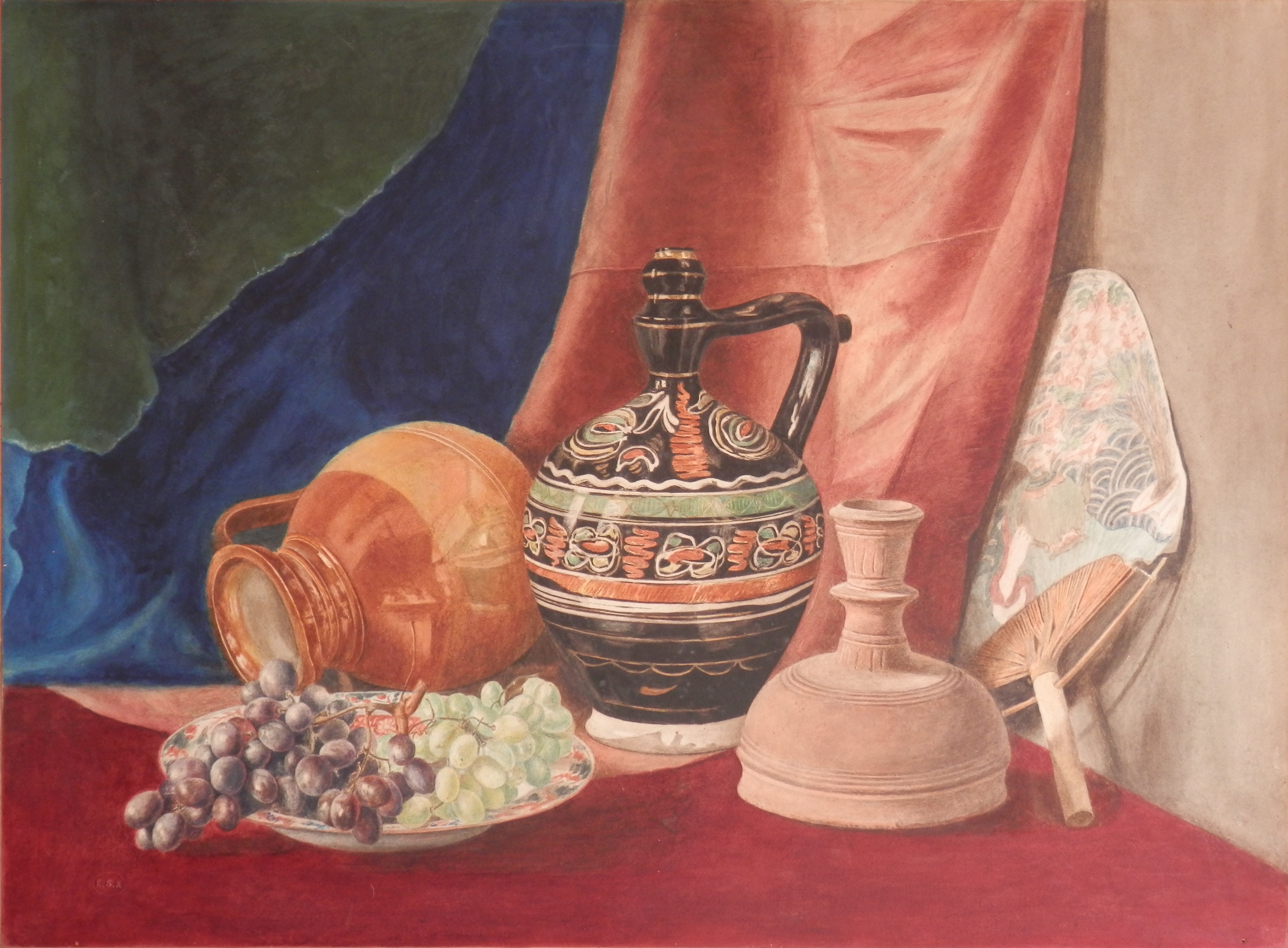
Still-life by Edward Sharard Kennedy

Still-life by Edward Sharard Kennedy

#EdwardSharardKennedy was a genre, portrait, and still-life painter.  He was born in 1837 in Sussex and died in 1900.  I can find little information on Edward Kennedy other than that he was active as an artist from 1863 to 1890.  He often did not sign his works rather he used a small embossing stamp to imprint his monogram ESK on the artwork.  It can be found in the lower left on this painting.

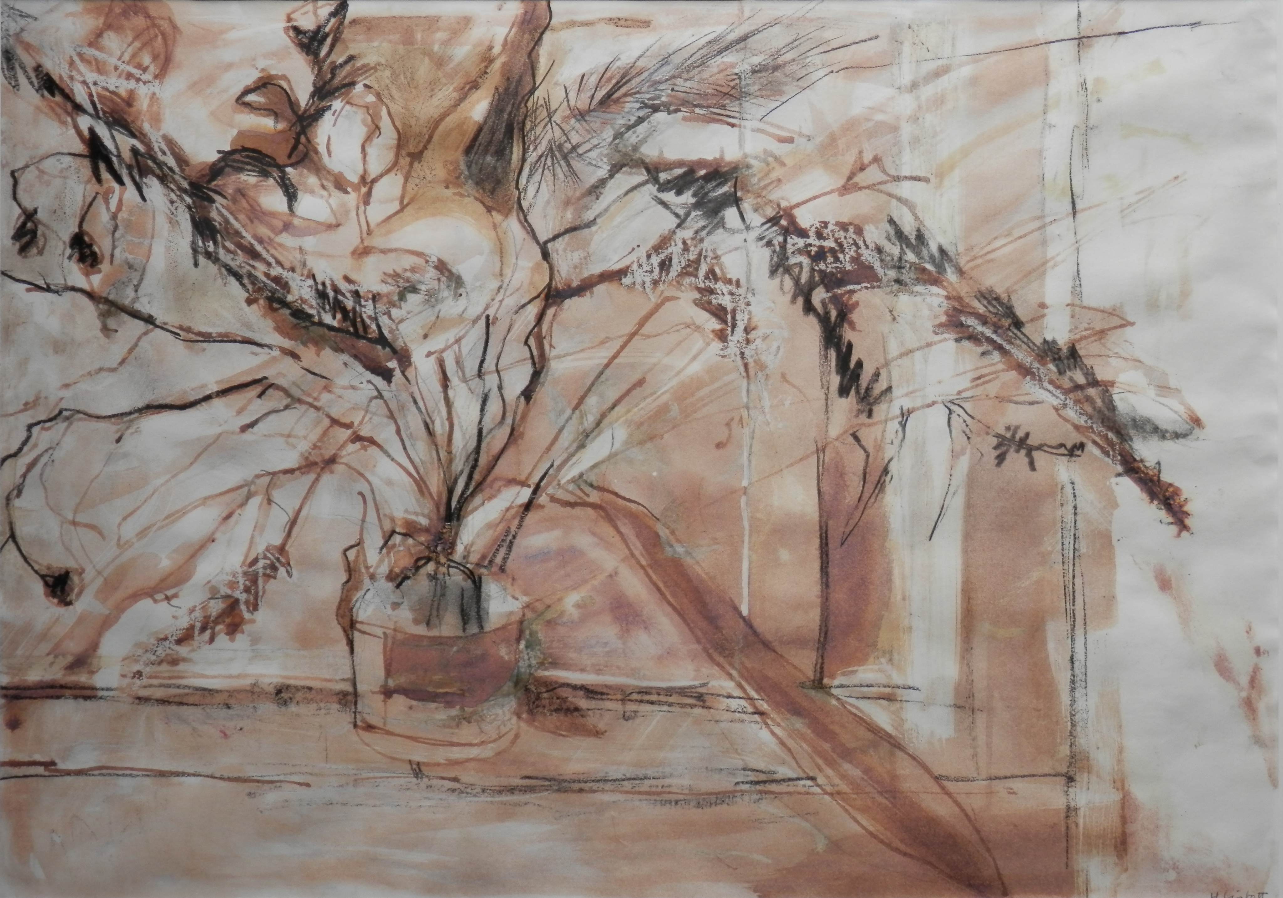
And finally to a piece by H. Lintott.  Possibly #HenryJohnLintott (1877-1965).  He was born in Brighton, studied at the Royal College of Art in London, worked at the Edinburgh College of Art, and died in Edinburgh.  His son Sir Henry Lintott was High Commissioner to Canada.

Plant Study signed H. Lintott (Henry John Lintott?)

Plant Study signed H. Lintott (Henry John Lintott?)

Posted in Watercolour paintings | Tagged , , , , , , , | Leave a comment