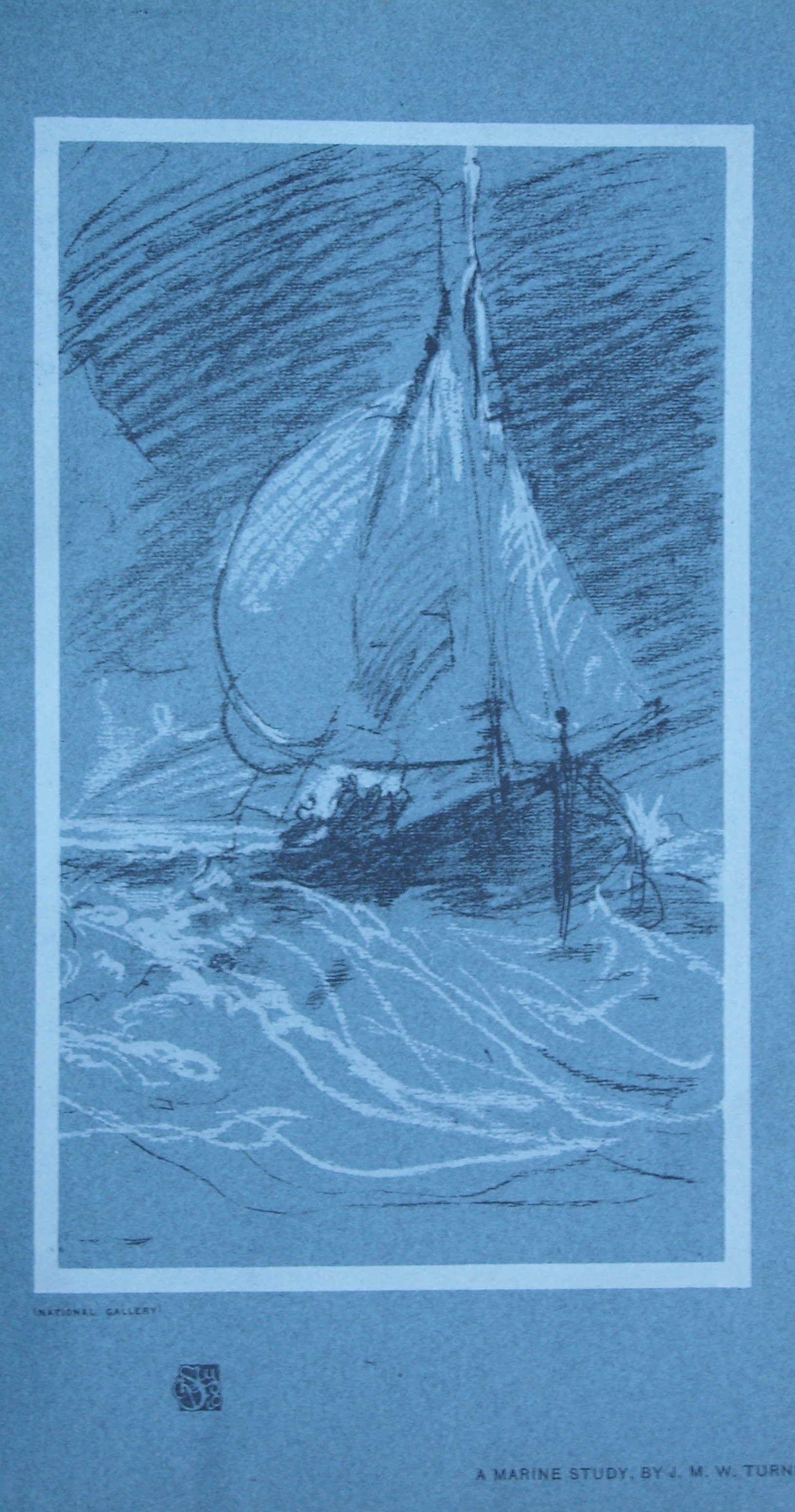
Most of the Bibles produced today are text only. Of course the font and print used is chosen to ease reading but only a few versions are illustrated. In years past many versions were illustrated by famous artists and etchers. The images you are about to look at were drawn by #JMWTurner and etched by E. & W. Finden. They are taken from the Imperial Illustrated Bible circa 1870.
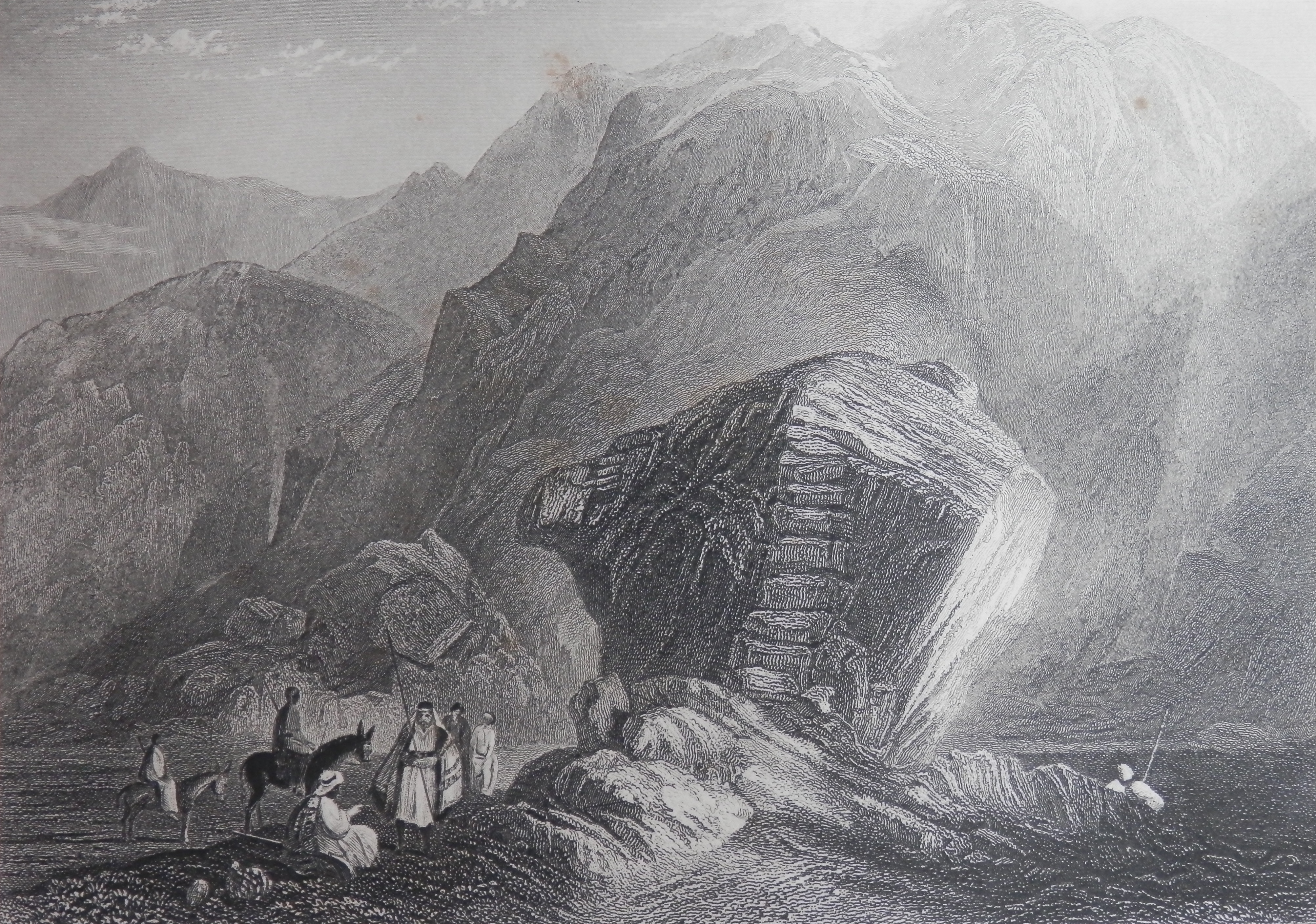
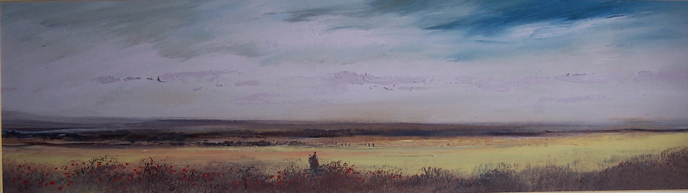
The Desert of Sinai
drawn by JMW Turner
E Finden sculpt
This family Bible presents the text of the King James version (first published 1611) along with 55 sepia-toned steel-engraved plate illustrations coming from the most dramatic moments in Scripture. One even sees two small pin holes which helped to align the plates while printing on each of the pages.
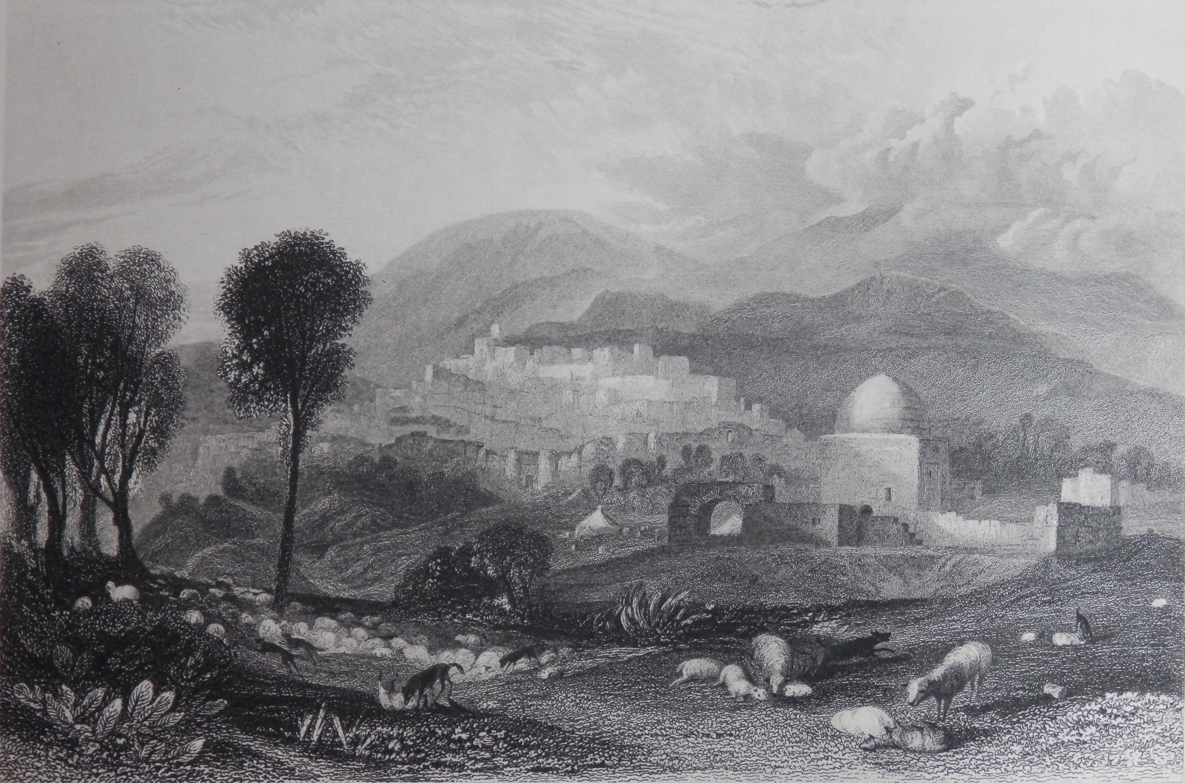
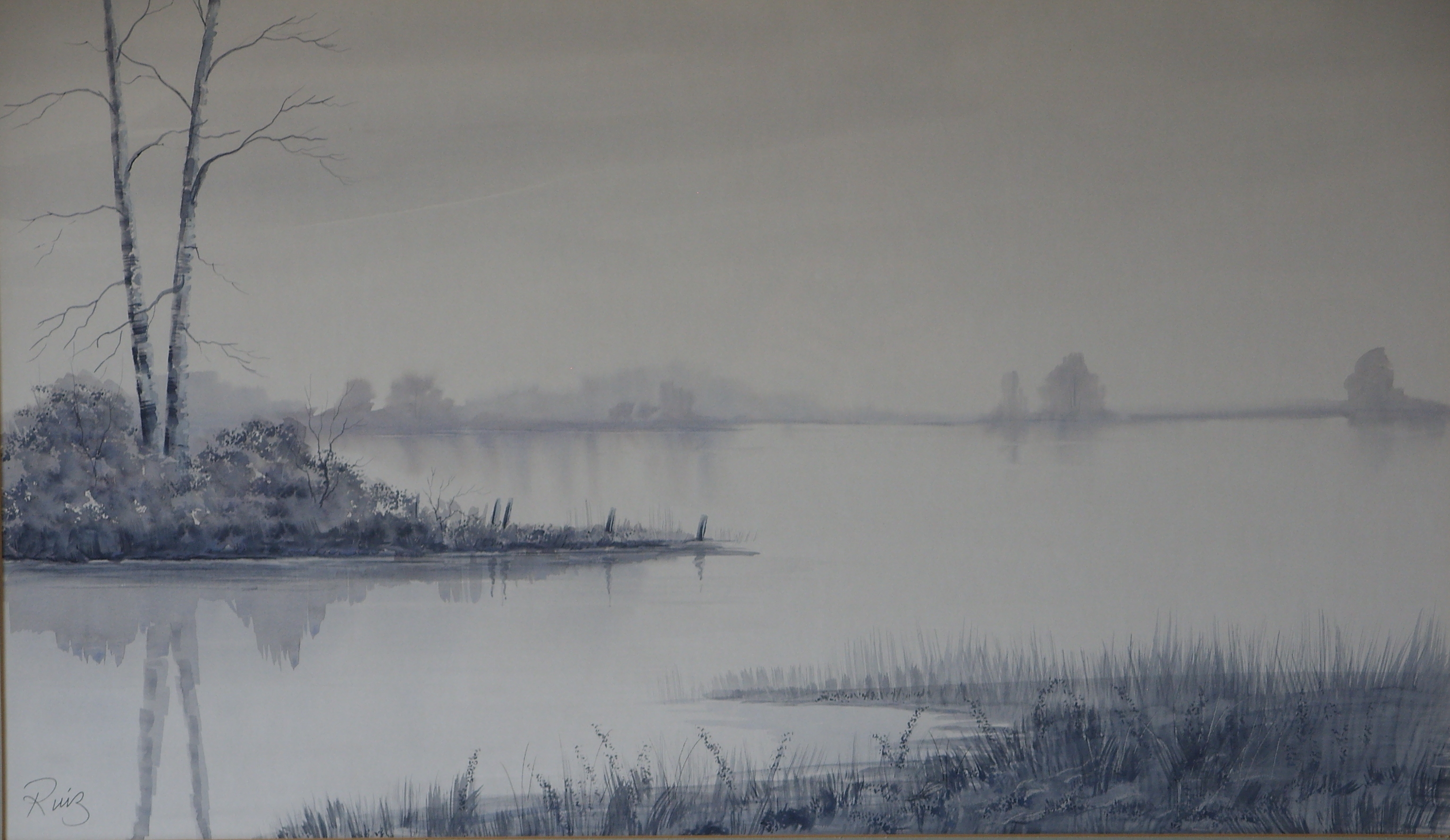
Ramah, Rachel’s Tomb
drawing by JMW Turner
W. Finden sculpt
I wonder whether Turner considered that his drawings of the #HolyLand and vicinity would be used in printings of the Bible itself. His drawings from the Holy Land are comprehensive and were originally done for a publication called ‘Landscape Illustrations of the Bible’. Turner had never travelled to the Holy Land, but he used the pencilled drawings of a number of individuals, including Sir Charles Barry, architect of the Houses of Parliament. Turner painted 26 watercolours for the book, fourteen of which came from Barry’s drawings. Turner’s originality blossoms forth from a stylish imitation of the Grand Style.
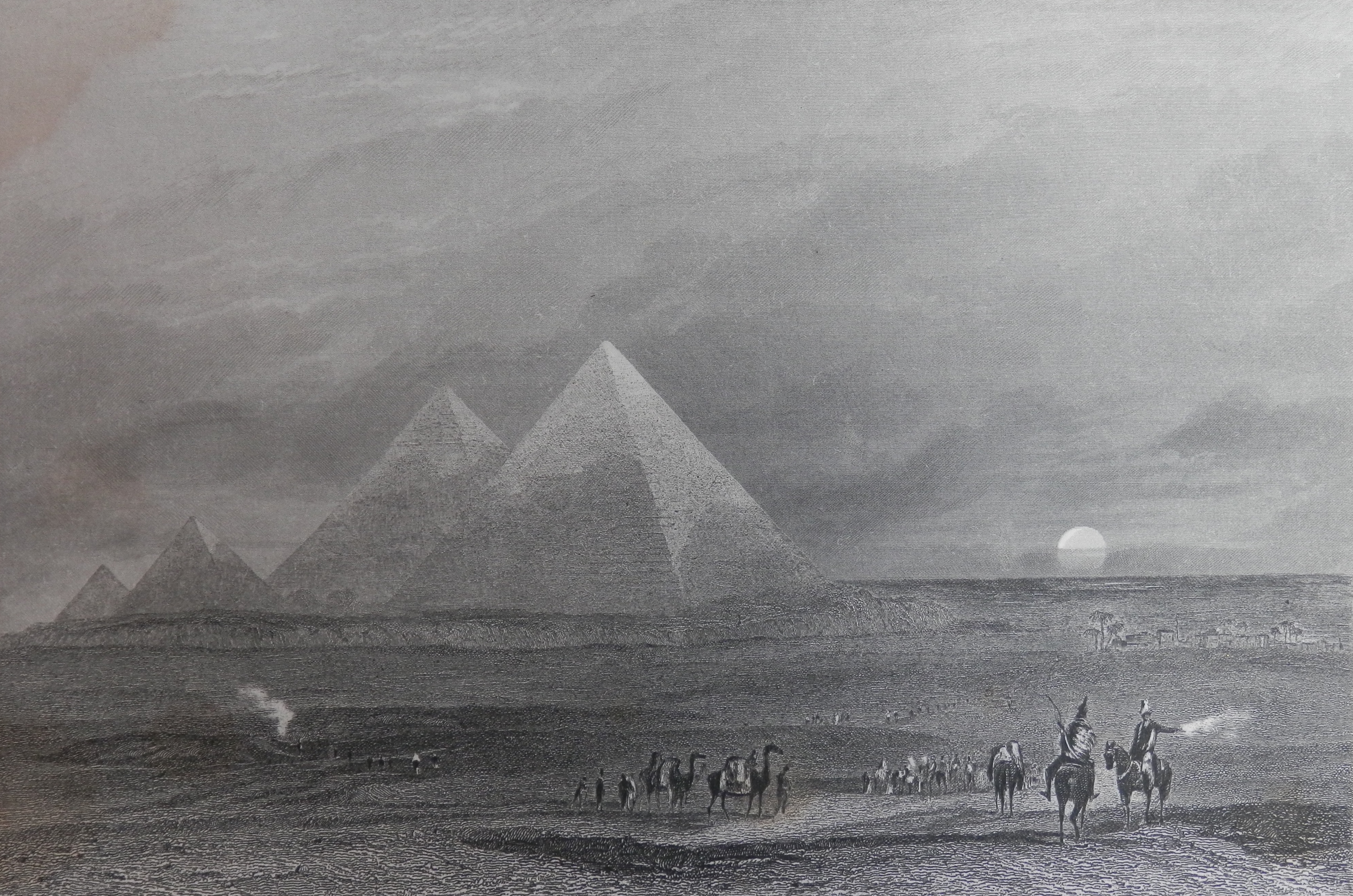
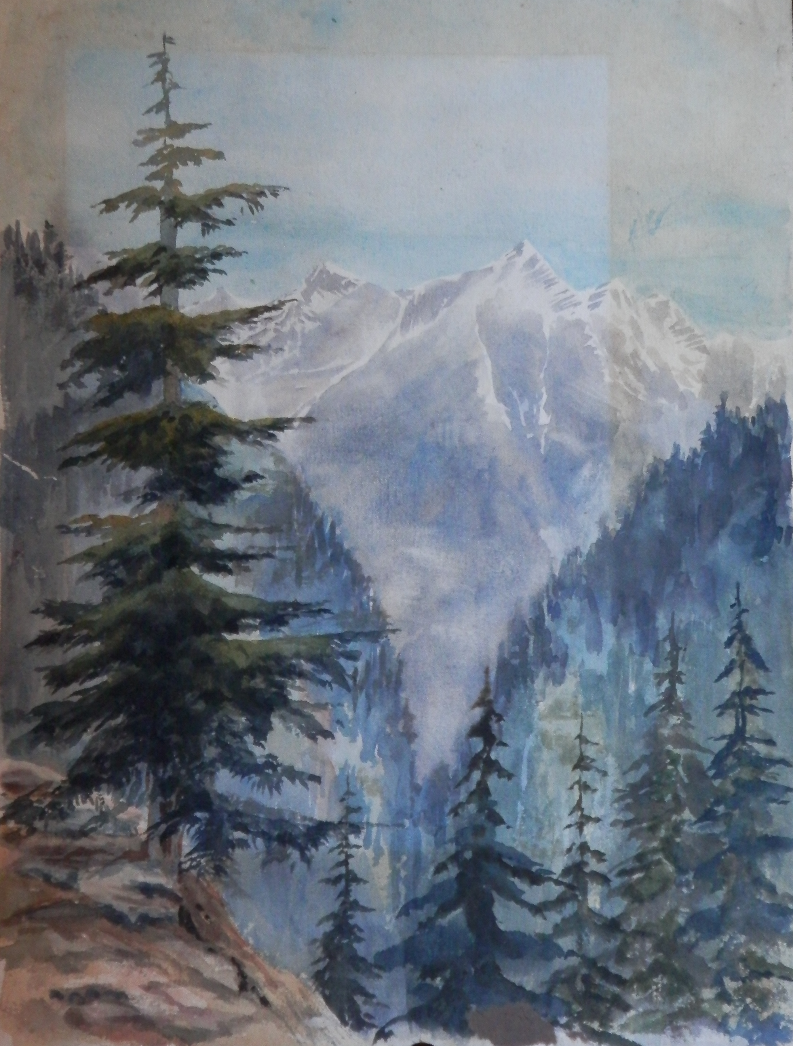
The Pyramids of Ghizeh
drawn by JMW Turner
E Finden engraving
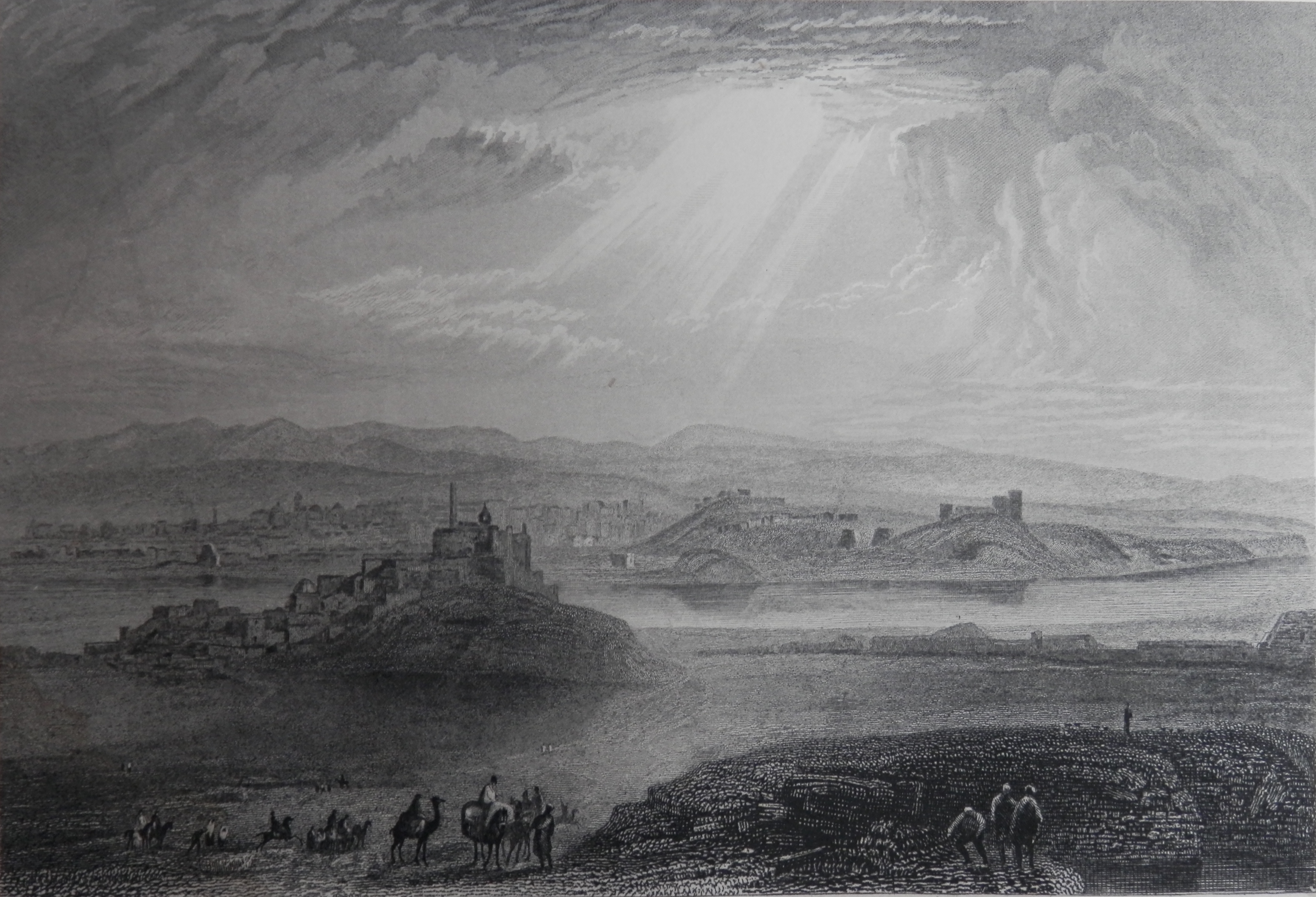
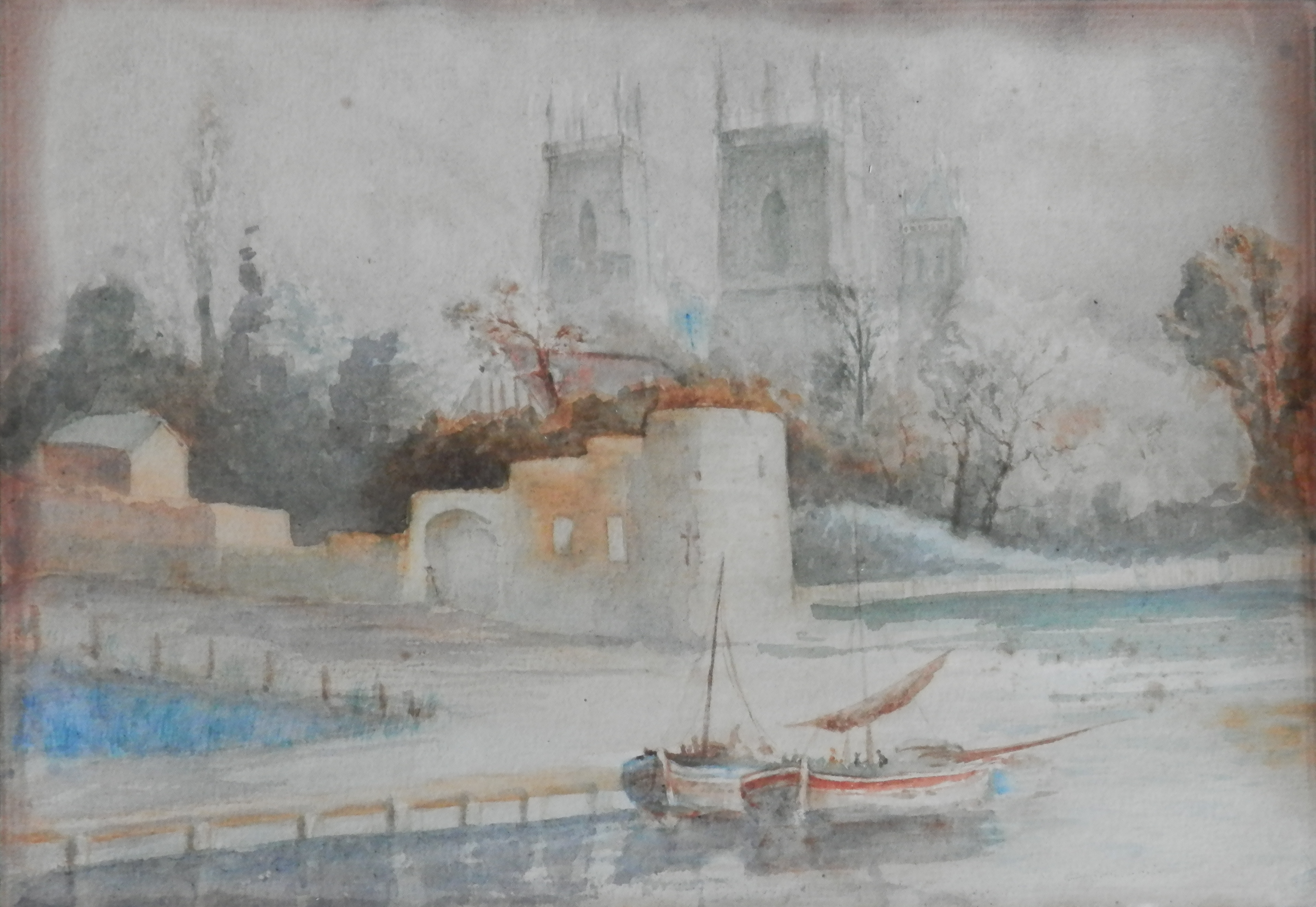
Nineveh
drawing by JMW Turner
W Radcliffe engraving
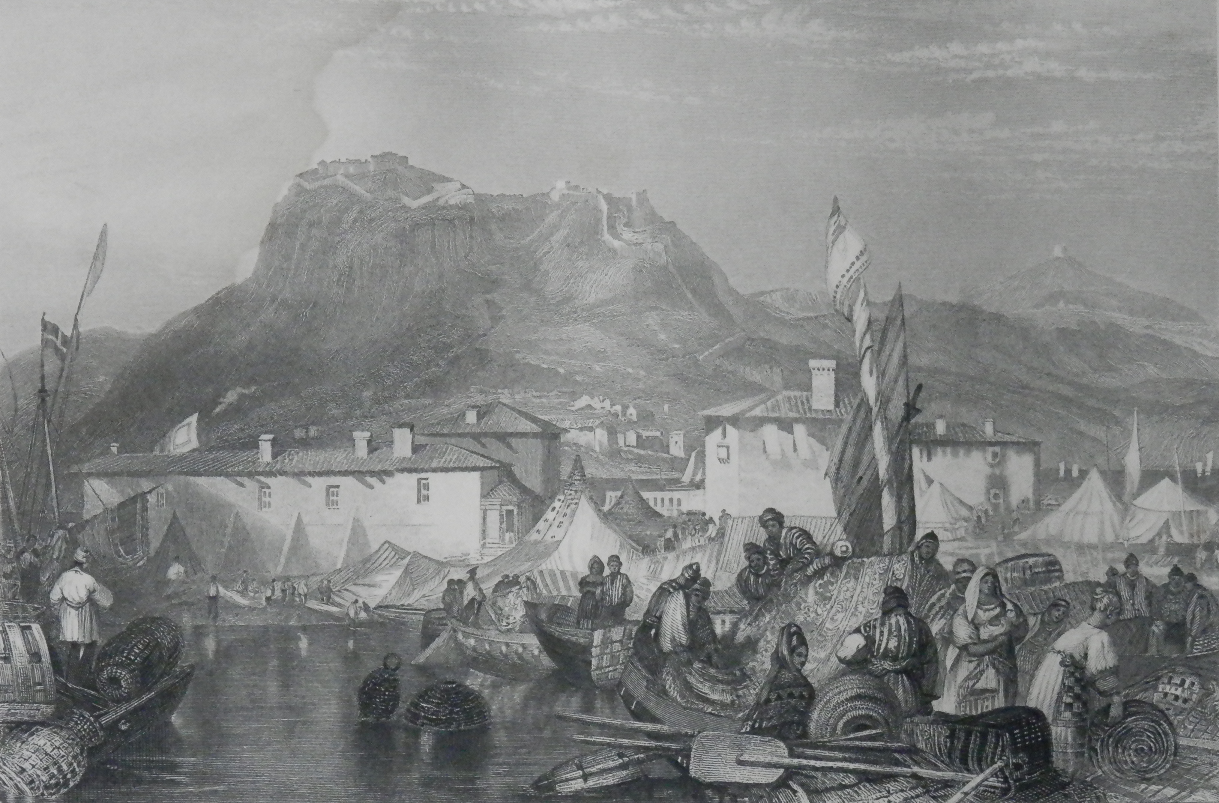
Corinth – Port of Kerkries
drawing by JMW Turner
E Finden engraving
I hope you enjoy these images. Turner was truly an artist of sublime skill.