Caroline Crossland and Asun Balzola

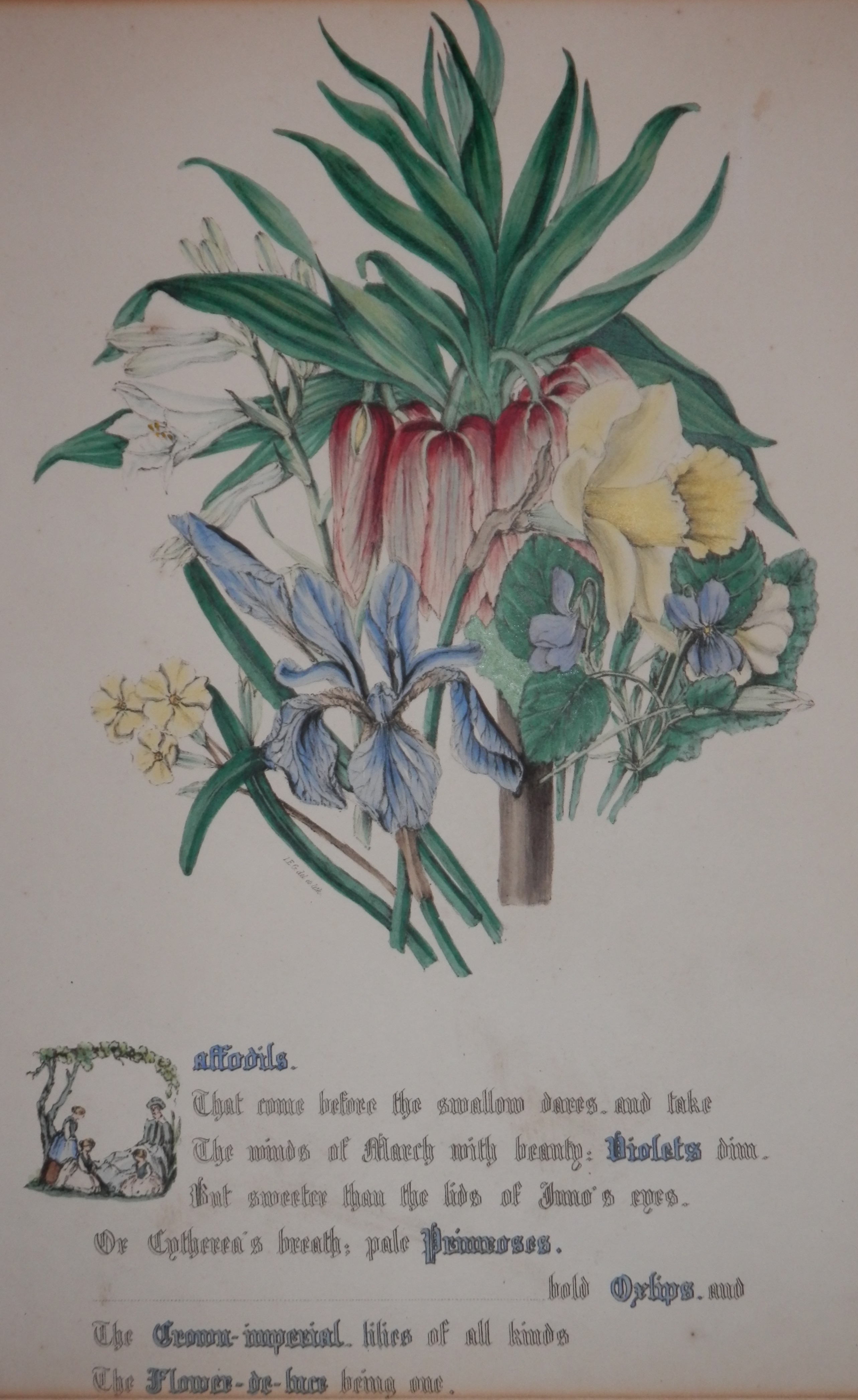
One could be forgiven if recognition of the names in the title were to elude oneself.  You might have had a better chance if you were a young child, for both #CarolineCrossland and #AsunBalzola are children’s book illustrators.  I came across a piece by each artist this week and added them to my collection.

The Yak - handcoloured linocut by Caroline Crossland @ 1987

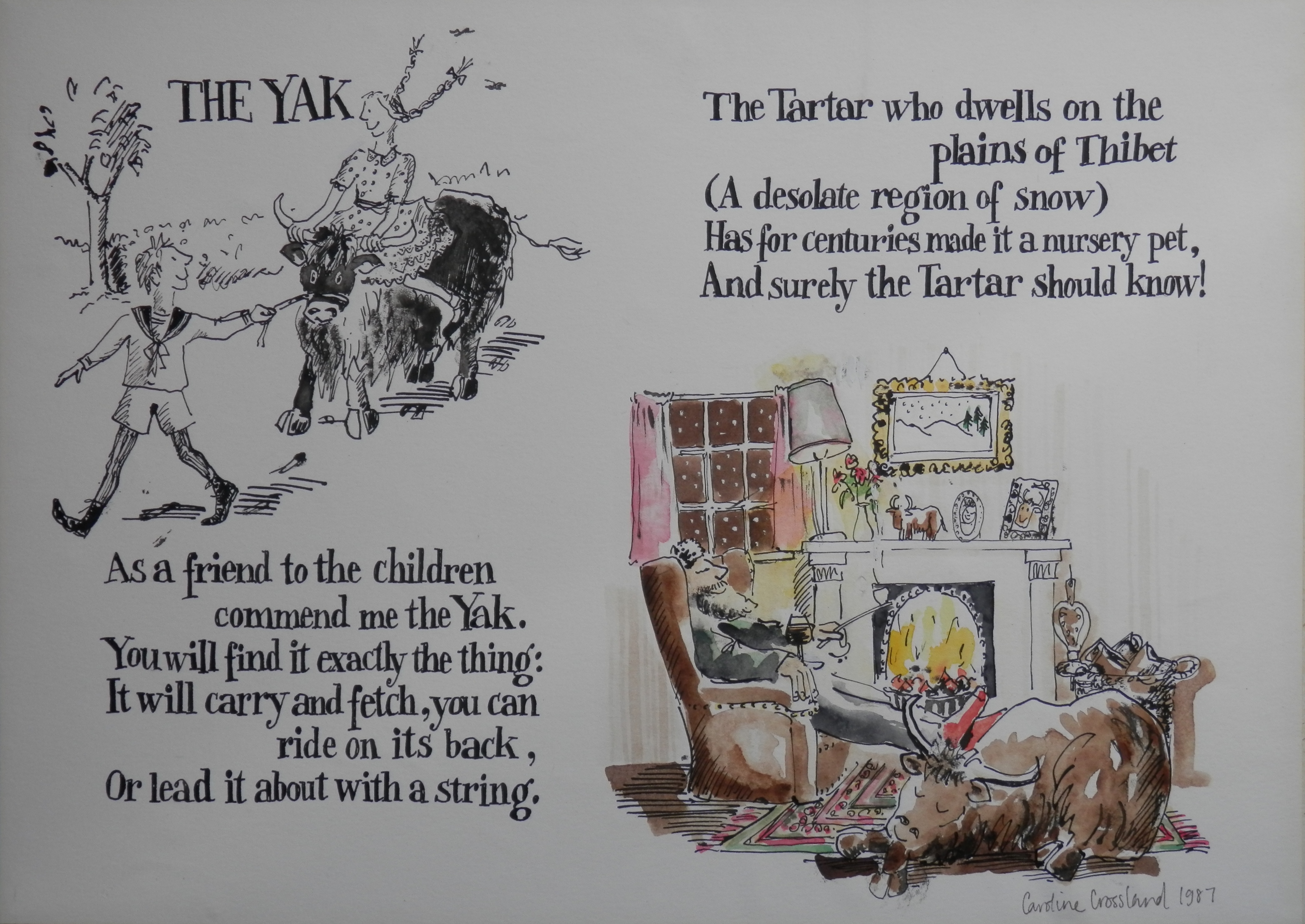
The Yak – hand-coloured linocut by Caroline Crossland @ 1987

Caroline Crossland has illustrated many children’s books as well as creating her own individual works.

We see two verses of the ‘The Yak’, a poem by #HilaireBelloc (1870-1953).  I have not found that Caroline illustrated the complete ‘The Bad Child’s Book of Beasts’ by Belloc.

There is a wit and light-heartedness to her illustrations.  Combined with the warm tones she uses , one is drawn into the image not wanting to miss any part of it.

'Bran' illustration by Asun Balzola @ 1992

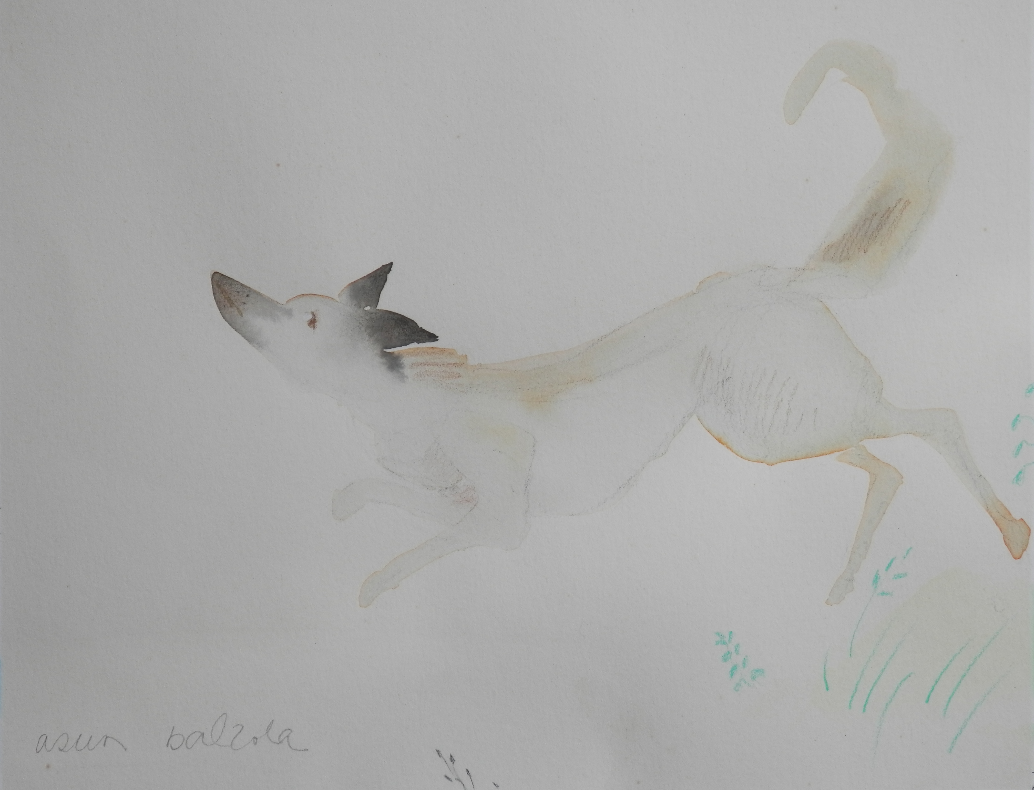
‘Bran’ illustration by Asun Balzola @ 1992

We travel to Spain, the homeland of Asun Balzola (1942-2006) who is our next artist.  She was a self-taught illustrator, writer, and translator who after a severe car accident studied painting and graphic arts in Madrid.  Asun won the 1965 Lazarillo Prize for her illustrations as well as winning the 1978 and 1985 Spanish National Illustration Prize.  She has worked with most of the publishers in Spain and various book printers in Europe and America’

Her illustration style uses colour blotches and thick lines.  The image we see is of ‘Bran’.  It was published by Collins in 1992.  This watercolour sketch is used on page 14 of the book.

Posted in Lino/woodcuts, Watercolour paintings | Tagged , , , , , , | Leave a comment

Jane Elizabeth Giraud

#JaneElizabethGiraud (1810-1868) is a name that few will know but she deserves to be well-known.  She was a well respected artist and lithographer in her day.  Even to the the point of being appointed lithographer to the queen.  This meant she was an artist of sublime and supreme skill.

Daffodils from The Flowers of Shakespeare by Jane Elizabeth Giraud 1845

Daffodils from The Flowers of Shakespeare by Jane Elizabeth Giraud 1845

The Flowers of Shakespeare along with The Flowers of Milton are her two best known publications.  In #TheFlowersofShakespeare each elegant botanical print is combined with a Shakespearean quote.  In this case a quote from The Winter’s Tale – Act IV scene III.  Portrayed in stylish lettering and enhanced with a single capital letter resembling earlier illuminated manuscripts.  Each iteration of a flower comes with it’s coloured letters to emphasize.  So here are daffodils, violets, primroses, oxlips, crown-imperial and flower-de-luce.

Red and White Rose from The Flowers of Shakespeare by Jane Elizabeth Giraud @ 1845

Red and White Rose from The Flowers of Shakespeare by Jane Elizabeth Giraud @ 1845

Art and literature in unison.  Rose red (Lancaster) and rose white (York) entwined in image and history.  From King Henry VI – Act II scene IV – the quote foretells the deaths of many in the coming civil war.

The plates were hand-coloured and published by Day and Haghe, Lithographers to the Queen.  With works such as these, it is no wonder Britain was the place to be for lithography.

Posted in Lithographs | Tagged , , , , , , , , , , , | Leave a comment

Rothenburg Etching

As I slowly collect pieces, I find that my appreciation for etching an ever growing thing.  This week I acquired six etchings by the same artist.  The etchings are signed but I have yet to decipher the signature.

Roeder Gate, Rothenburg ob der Tauber etching by Fritz Botel @ 1920

Roeder Gate, Rothenburg ob der Tauber etching by Fritz Botel @ 1920

The only etching which is titled is of the #RoederGate, #Rothenburg.  The etching is signed in the lower right  and titled on the lower left.  Although not dated and no watermarks exist on the paper, I estimate the creation date to be around 1900.

I, also, guess that all the images are from German towns and cities.

Rothenburg ob der Tauber has a well-preserved medieval old town and is a destination for tourists from around the globe. The #RoedertorTower stands at the east end of the old city and it along with the town hall tower are the only two accessible towers in the town.

Picturesque Rothenburg has appeared in print (Elizabeth Peters – Borrower of the Night) and film too.  It was a primary location for Chitty Chitty Bang Bang as well as Harry Potter and the Deathly Hallows Part 1 & 2.

Celle Altes Rathaus etching by Fritz Botel @ 1920

Celle Altes Rathaus etching by Fritz Botel @ 1920

Celle Castle etching by Fritz Botel @ 1920

Celle Castle etching by Fritz Botel @ 1920

I will not say too much about the five other etchings done by this artist except that they are well executed .  Precise and accurate architecturally.  I just wish I knew where the sites of these other etchings are today to compare.

Since posting this chapter I have found the artist.  His name is #FritzBotel (1896-1959).  I’ve not found too much information on him but he is certainly a talented etcher.

Kalandgasse, Celle etching by Fritz Botel @ 1920

Kalandgasse, Celle etching by Fritz Botel @ 1920

St Mary's Curch and Town Hall etching by Fritz Botel @ 1920

St Mary’s Church and Town Hall etching by Fritz Botel @ 1920

St Mary's Church from Kalandgasse etching by Fritz Botel @ 1920

St Mary’s Church from Kalandgasse etching by Fritz Botel @ 1920

Posted in Etching | Tagged , , , , , , , , | Leave a comment

The New London Magazine

#TheNewLondonMagazine was founded in the 1730’s and ran as a ‘monthly repository of knowledge, instruction, and entertainment’ for many years.  It’s monthly publication relied on numerous correspondents who provided curious and ingenious essays in prose and verse.

Rubens drawn by Vandyke - etching from The New London Magazine 1793

Rubens drawn by Vandyke – etching from The New London Magazine 1793

The book I obtained has the monthly magazines for the year 1793.  It was at this point in the magazines history that they altered their format in printing.  They went from two columns per page to a single long line printing.  This did allow for more information to be put on the page.  Some providers of articles were, at times, somewhat effusive – more than the space allowed.  They also guaranteed to their readers that the copper-plate engravings would continue but would be of superior quality.  In regards to this end the best artists of the day were engaged to produce the engravings.

St Michael's Mount, Cornwall from The New London Magazine 1793

St Michael’s Mount, Cornwall from The New London Magazine 1793

It is, for me, a sad thing that the artists are not credited in any way in regards to their works.  Evenso, the engravings are of a very good quality.  There were normally two engravings per monthly publication and each engraving was tied to an article in that month.  I would like to convince you of the quality of the magazine and the easiest way to do that is by displaying a few more images.

Ruins of Caithness from The New London Magazine 1793

Ruins of Caithness from The New London Magazine 1793

A View of Plymouth from The New London Magazine 1793

A View of Plymouth from The New London Magazine 1793

The King and Death from The New London Magazine 1793

The King and Death from The New London Magazine 1793

I have found a copy online which is for sale which claims to be whole and has all 22 engraved plates.  There are 24 plates in my book and I know I am missing the frontispiece to the whole ( I miss the frontispiece and the last page of the alphabetical index of articles).  Aged and just slightly incomplete the book remains a fine example of printing and interesting read.

Posted in Etching, Printing | Tagged , , , , , , , | Leave a comment

Parian and Wood Sculpture

#Parian is a type of bisque porcelain.  It is named after the Greek island of Paros which is known for the fine textured marble of the same name.  Created by Thomas Battam in 1851, it was first produced and sold by William Copeland and Thomas Garrett.  It was developed further around 1845 by Minton and was used mainly for busts and figurines.

Parian Nude

Parian Nude


Parian Nude close-up

Parian Nude close-up

Initially parian was used to produce relatively high quality pieces but as more and more manufacturers began producing works with it, quality suffered and it lost some of its’ desirability.  Parian with its’ marble-like beauty captured the Victorians.  It allowed the middle class to possess pieces of high art.  The woman sits with a fishing net across her thighs as she looks at an oyster clasped in her hand.

And to a piece of #rosewood , I believe, carved a long time ago.  A beautiful carving of a fisherman done in China.  With hat across his back and catch hanging at his side, he looks to have had a satisfactory day.

Peasant Fisherman carved rosewood - Chinese

Peasant Fisherman carved rosewood – Chinese


Peasant Fisherman in Rosewood - Chinese

Peasant Fisherman in Rosewood – Chinese

The wood of the carving has age so that it has split up the torso of the fisherman.  I like the use of glass eyes for the fisherman and the fish.

Both pieces stand around ten inches in height.  Both display artistry and finesse in craftsmanship.  I seldom buy ceramics or sculpture but both of these caught my fancy for whatever reason.


Posted in Ceramics/Pottery, Sculpture | Tagged , , , , , , , , , , | Leave a comment

St. Mary’s Church, Sompting

The watercolour of today’s chapter was acquired at the same time as last weeks topic.  It once again is unsigned and undated but I estimate this painting and the last to be roughly the same age .  The church at Sompting, West Sussex is a very unique building indeed for atop it’s Saxon tower sits a Rhenish Helm.  The only example of a Saxon tower with four-sided pyramid-like gabled spire.  A Grade 1 listed building defined as being of “exceptional interest” and greater than national importance.

St Mary's Church, Sompting, Sussex artist unknown @ 1800+

St Mary’s Church, Sompting, Sussex artist unknown @ 1800+

The tower was most likely re-roofed in 1762 at which time the overall height was decreased by some 25 feet.  Testing has suggested that the roof timbers date from 1300 to 1330 which means that the roof we see today was built by the Knights Hospitallers who took possession from the Knights Templar in 1310.

The painting may be by Octavia Dodson as with last chapters topic which places the age of the painting around 1880.

Once again the architecture is well imaged and the use of warm earth tones imbue a warm and welcoming feel to the presentation of place.

Posted in Watercolour paintings | Tagged , , , , | Leave a comment

Anne of Cleves

#AnneofCleves (1515 – 1557) was the fourth wife of King Henry VIII and was the luckiest of the eight. The union was urged by Henry’s chief minister Thomas Cromwell as a politically astute alliance.  The consummation of the marriage was declared to never have occurred, as a result she was not crowned as queen consort. The marriage lasted roughly six months and ended in annulment. Thomas Cromwell argued against the cessation and for this he was charged with treason and beheaded on the same day that Henry married his next wife, Catherine Howard.

Anne of Cleves' House, Southover, Lewes, watercolour by Octavia Dodson? @ 1880

Anne of Cleves’ House, Southover, Lewes, watercolour by Octavia Dodson? @ 1880

Following the annulment of the marriage, Anne was accorded a generous settlement by Henry including Richmond Palace, Hever Castle, AnneofCleves’House in Lewes ( history has it that Anne neither lived nor visited her house in Lewes) and other properties.  She was thereafter referred to as ‘the King’s Beloved Sister’ and eventually became a dear friend to Henry.  Anne lived to see the coronation of Queen Mary I, outliving the rest of Henry’s wives and was not yet 42 when she passed.

The watercolour displays Anne’s house in Southover, Lewes as we look down High Street toward St. John the Baptist Church.  It is attributed to Octavia Dodson – who lived in the late 19th and early 20th century.  It is not signed, nor dated so I am estimating the age from other images I have seen in my research.  It may be even earlier than my estimate but not likely as early as Sussex’s most famous artist James Lambert – this of course would negate the attribution.   Even so, a nicely executed and architecturally accurate representation of Anne’s house.

Posted in Watercolour paintings | Tagged , , , , , , | Leave a comment

Peter Gilman and Julia Cassels

For me #PeterGilman (1928-1984) is a local artist.  He was born in Surrey and lived in Bedfordshire.  Peter specialised in marine and landscapes in oil, acrylic, and watercolour.   He loved to paint in situ outdoors enjoying the companionship between painting and nature in all seasons.  He travelled East Anglia, Hertfordshire, Bedfordshire and along the Thames finding his inspiration to create his art.

Hertfordshire 'Autumn' oil by Peter Gilman

Hertfordshire ‘Autumn’
oil by Peter Gilman

A warmth emanates from the earthy colours and the broad sky radiates a feeling of wide openness.  To some who come to live in the fens, this breadth of sky provokes a feeling of loneliness and singular smallness.  To other this wideness is exuberance and freedom.

To an artist who works mostly with charcoal, ink, mixed media, watercolour and bronze.  #JuliaCassels brilliantly imbues her subjects with movement, power and character and she has established a reputation as an highly-talented wildlife artist.  While living in Africa, Julia, worked with the Maasai people.  Her love of the African bush, its character and wildlife, is clear in every stroke of her paintings.  Vitality and energy flow from her sketches – a jumble of lines and shading.

Following by Julia Cassels

Following by Julia Cassels

Travels across Africa, Central America, and eastern Asia have shaped the rhythm, shape and rich colour of Julia’s work.  Her subjects are portrayed as if unaware that they are being drawn and painted.

Two artists portrayal of the world around them.  Varied, distinct and beautiful in so many ways.

Posted in Drawings and Sketches, Oil Paintings | Tagged , , , , , | Leave a comment

John Knapp Fisher

Born in London, #JohnKnappFisher spent much of his youth in the Kentish countryside.  His father was professor of Architecture at the Royal College of Art.  John spent a great deal of time painting and drawing alongside is father.  Studies in graphic design and typography were followed by National Service.  John worked for a time in exhibition design and there followed set design for the Theatre Royal Margate and Castle Theatre Farnham.

All Saint's Church, Ramsholt, Suffolk watercolour by John Knapp Fisher @ 1963

All Saint’s Church, Ramsholt, Suffolk
watercolour by John Knapp Fisher @ 1963

He left the theatre business and went to live with his wife on a boat in East Anglia.  He did this for 5 years and painted full time.  The family then moved to Carmarthenshire in Wales.  John opened his studio gallery in Croesgoch on the St David’s peninsula, Pembrokeshire in 1967.  He is best known for his depictions of the coast of Pembrokeshire, West Wales.

The image to the left is that of All Saint’s Church, #Ramsholt in Suffolk.  It has a unique round tower with buttresses on the north; south and west.  It stands tranquil overlooking the River Deben with it’s beautifully tended churchyard full of flowers in the summer.  Painted in 1963, this would have been created when John lived on his boat in East Anglia.

John painted mostly in watercolour and oils.  He developed a style he called ‘dark and light’ with an eye for simple straight forward presentation of image.  John painted from his sketches and not from photographs and liked to paint every day to keep is eye and hand fresh.

A beautiful painting from a man with a singular eye and a gift of presentation.

Posted in Watercolour paintings | Tagged , , , | Leave a comment

Signature Art

Although I buy pieces of art because I like them, there are items which contain more interest due to the signatures which adorn them.  This week I bought a postcard.  A ‘giant’ postcard from 1900 and although it is of interest as a card, the real interest is the signature which adorns.

Tenterden, Small Hythe Ellen Terry signed postcard @ 1908

Tenterden, Small Hythe
Ellen Terry signed postcard @ 1908

The card is made by Francis Firth & Co. around 1900 and is 220 mm by 290 mm.  The postcard displays the home of actress #EllenTerry (1847-1928), who purchased #SmallhythePlace near #Tenterden in 1899 as a bolt hole from her London life.  The ‘half-timbered’ house was originally called ‘Port House’ and prior to the sea and the River Rother receded it served a thriving shipyard.  Hythe means “landing place” in ‘old english’.  Ellen Terry passed away in the house in 1928.

The house, now owned by the National Trust, contains Ellen Terry’s theatre memorabilia.  The cottage grounds include her rose garden, an orchard, a nuttery and the working Barn Theatre.

Although a nice piece as a postcard, it is the signature of Ellen Terry and the salutation which add interest because Ms. Terry was a stage actress.  By 1878 she had joined Henry Irving’s company as his leading lady.  For more than twenty years she was considered the leading Shakespearean and comic actress in Britain.  She and Irving toured with great success in America and Britain.  Her artistic career covered stage acting, lecturing, theatre management, and film.  Over sixty years in the entertainment business.

The card contains not only her signature and the date but also a dedication.  This is to a person called Montague.  This might be #MontagueSummers author.  He could use a chapter of his own, really. but not today.

Posted in Photographs | Tagged , , , , , | Leave a comment