Today, I would like to consider two artists. The first #EdithGranger-Taylor (1887-1958) and the second #MurielWyman.  The two paintings in my collection might be considered somewhat out of the ordinary for Grainger-Taylor. As you will see they are both oils on canvas of the interior of an inn. The information I have gleaned from the web puts her more as an artist working  with pastels. Even so, both paintings bear a label on the verso giving title, price, and signature with residence. Edith Granger-Taylor said at the Royal Academy, St John’s Wood Art School, and the Slade School of Fine Art with Henry Tonks.
  She, in some ways, was a successful artist exhibiting regularly in the 1920’s and 1930’s with two solo shows included but she suffered from non-acceptance mainly based on that she was female. This frustration saw her withdraw from the art world and she did not exhibit her work again after the 1930’s. 
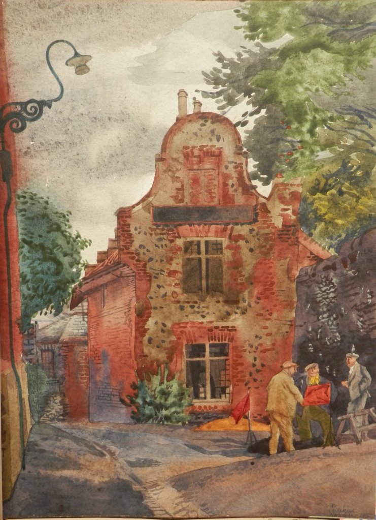
 The two works display a good eye for depth and shading. The two paintings show the interior of The Old George, Norton St. Philip.
The next painting Still-life with Lampshade (1952) is painted by Muriel Wyman. The only thing that I have come across in regards to her is a photograph of her and New Zealand artist Beatrix Charlotte Dobie. Dobie moved to London to study at the #SladeSchoolofFineArt in 1911. Other than this photo I have found no other info concerning Ms Wyman. This work is done completely using only a palette knife. A nice work and very heavily painted allowing for the play of shadows on the work itself. It may be that all three women knew each other since they studied with #HenryTonks at the Slade School of Fine Art.
 We begin with an image showing a view of the gardens and buildings of the Cortile del Belvedere at the Vatican Palace in Rome. The space was designed to link the Belvedere Court to the Vatican Palace via a series of terraces and stairs. Our next two views are not published by Laurie & Whittle. There were a number of publishers at the time which also held vue d’optique in there production books. Three of those were #RobertWilkinson, #RobertSayer, and #CarringtonBowles.
 These two prints have all three of the aforementioned publishers on them. At times appearing in different order depending on which publishing house they came from.
  These depict Rome at its’ beautiful best. Sites as the Trojan Arch, the Tomb of Cestus, the Imperial Palace, the Senate House, the Egyptian Obelisk, and the Temple of Fortune appear in these two views. Again all are hand coloured and show their age in one way or another. We look at another pair published by Laurie & Whittle. These show events rather than specific sites.
 This pair of views show events pertaining to the siege of Barcelona. The first shows men digging trenches to fortify their position as well as captured building which would then be used as barracks and hospitals. In the distance stands Barcelona. The second attempts to display the barbarity which can ensue when soldiers succumb to battle fury and becoming ravagers, looters, and plunderers.
 The magnificent Niagara Falls. A place that certainly most who would view this print would never have seen in person. A written description in English and French appears at the bottom of the image.
 We return to Rome for a view of The Church of St Peter published by Bowles & Carver. The piazza and basilica are wonderfully portrayed here. The last, a plate published by Robert Wilkinson shows the stunning Rialto Bridge in Venice as it crosses over the Grand Canal at its’ narrowest point. I appreciate that these final two have not been coloured.
 We see a scene of the river Seine as it divides to bypass the Ile de la Cite. It is considered to be the epicentre of Paris and the site of Norte-Dame Cathedral. The bridge seen connects the Ile Saint-Louis to Ile de la Cite. I am not quite sure why the horsemen are riding down the ramp into the river.
  From here we move to the Chateau de Versailles. We look down towards the palace. It was the royal residence until the French Revolution in 1789 and is located some 12 miles from Paris. A place of great events in history. Marie Antoinette married here, the Peace of Paris (1783) was signed here as well as the Proclamation of the German Empire and the Treaty of Versailles to end WWI. It is now a Unesco World Heritage site and welcomes close to 8 million tourists a year.
  We now take to the water and visit the city of Naples. If Italy is a boot then Naples is it’s ankle. Nearby sits Mount Vesuvius, a still active volcano, which destroyed the city of Pompeii. The city is a focal point of art and architecture, Neapolitan cuisine which includes pizza. We board our ship again and sail out of the Mediterranean to the Portuguese city of Oporto.
 A coastal city located in north-west Portugal. It is known for its’ bridges, the Ribeira (riverside) district, and its narrow cobbled streets. The city is also known as Porto – a mistake by the English in pronunciation led to the Oporto name. The city lies at the mouth of the Douro River. It is the second largest city in Portugal and is famous for port wine created in 1678. We re-board our ship to sail up the coast to the city of Amsterdam.
  This capital city of the Netherlands is famous for its elaborate canal system, its narrow houses with gabled facades, its artistic heritage. The Rijksmuseum holds works by Rembrandt and Vermeer and a visit to the Van Gogh Museum would be special too. A visit to the Anne Frank house would not be amiss and there are many small eccentric museums to visit. And we board again to set sail for distant Bombay.
  Today, this city is called Mumbai and lies on India’s west coast. It is a financial centre for India, it’s largest city, and the centre of the Bollywood film industry.
 #RobertLaurie (1755-1836) and #JamesWhittle (1757-1818) formed a partnership in 1794 to take over the publishing company of #RobertSayer. Sayer’s collection of maps and atlases and decorative prints were the foundation of the new partnership but the new owners added new material to freshen up the atlases and also printed on topical issues such as the Napoleonic Wars.
  Laurie was apprenticed to Sayer from 1770 to 1777. He was a talented artist as well as engraver of mezzotints. Producing portraits, scenic views and decorative works. Whittle was apprenticed to the Needlemaker’s Guild.
 All of these prints were printed in 1794 and are hand coloured. The image size of the first four without lettering measures 9″ by 15″ while the last is 10″ by 16″.

 The first portrait is of an unknown gentleman. Painted in the 19th century. The image measures 6″ x 6 1/2″ . Finely painted in watercolour with the focus on the face. This is quite typical of the style of portrait painting at that time. The accuracy leans toward vagueness as one goes further away from the face. This allows the artist to finish his work quickly while still presenting the subject with their desired object – a beautiful image of themselves.
  We go to a somewhat more delicate portrait. This miniature is 2 1/4 x 2 3/4 in an oval frame. It is, I believe, painted on ivory. You can see through the damage to the paint work the underlying white ivory it is painted on. I think possibly an 18th century work. The execution is superb. Once again the face being the focal point and having an almost three dimensional feel to it. Luckily the damage has not reached the face so this man’s visage is still wonderful to look at. Once again the gentleman is not known nor is the artist.
  We finish with a large portrait done in 1908. It sits again in an oval matte. The image is 14″ by 17″. This of course is a copy of a painting by Rembrandt – his portrait of Aechie Claesdr done in 1634. This copy is painted by Lilian Harries in 1908. It is fairly true too the original but it lacks precision and accuracy bis t still manages to convey that Lilian had some talent as an artist. I have found no information about her.
 The portrait is of two young people. I would guess their ages at 2 1/2 and 3 1/2 years. One positioned slightly forward of the other with the arm of the older child protectively across the breast of the younger. The portrait is unsigned and undated, no watermark or any other identifying marks can be found. From the age and browning of the paper I would suggest first half of the 19th century.
 Here, I am going to suggest that this piece, even though unsigned, is by a very important artist and that this portrait is of two very well known people. This of course is all conjecture. But. What if.
 The quality of the work is evident. The subtle shading, the minimal use of colour, the white outlining of the children’s bodies only adds to the focus on the faces of the two sitters. And two very finely done faces they are.
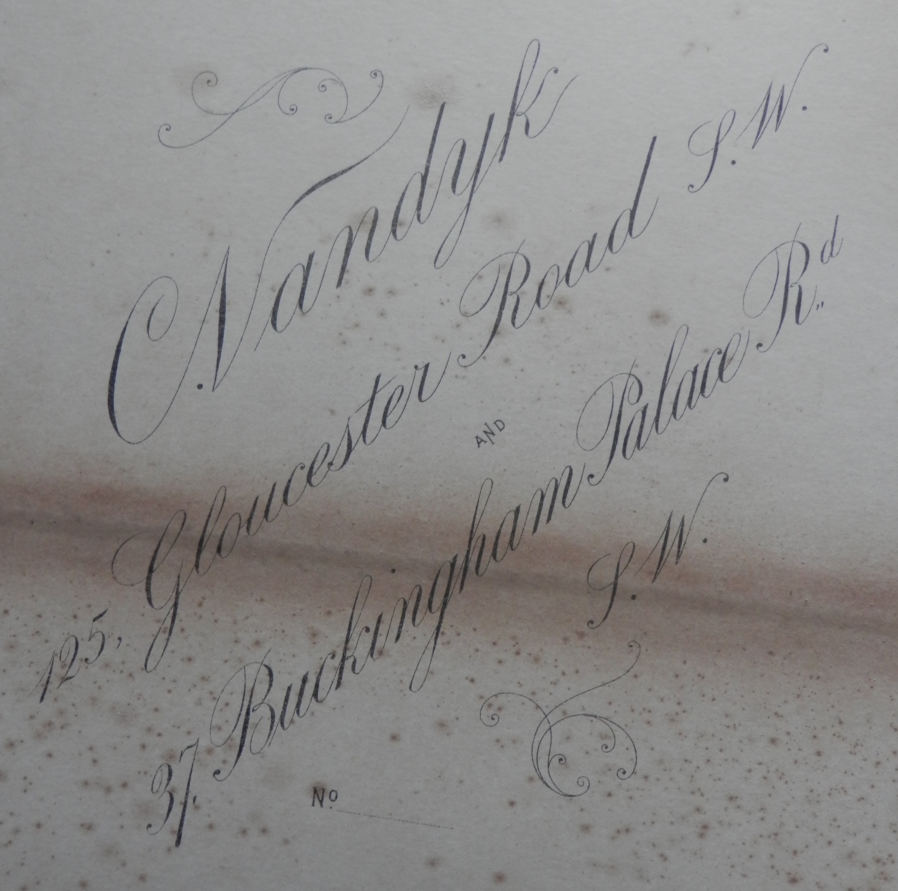 He was a royal photographer, taking portraits of Queen Victoria, Edward VII, George V as well as notables such as Alexander I of Yugoslavia, Christian X of Denmark, Buffalo Bill, and Enrico Caruso. Vandyk is associated with 659 portraits in the #NationalPortraitGallery in London. This portrait does not appear in the NPG catalogue. His two brothers were also photographers with their own studios and his son carried on his studios after his death.
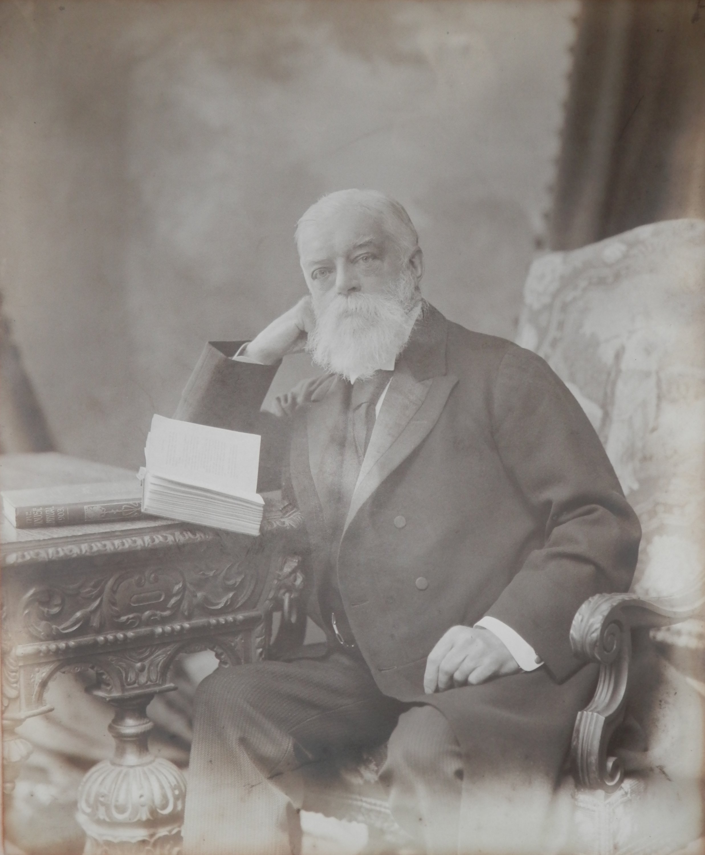 It is a superb image of a man very comfortable in his surrounding. The image is so good, one can read the title of the unopened book (The House Annual – 1903), make out that the gentleman is reading German poetry, that his suit is of superb quality, and that he is wearing an Albert chain to his pocket watch. A very fine portrait indeed.
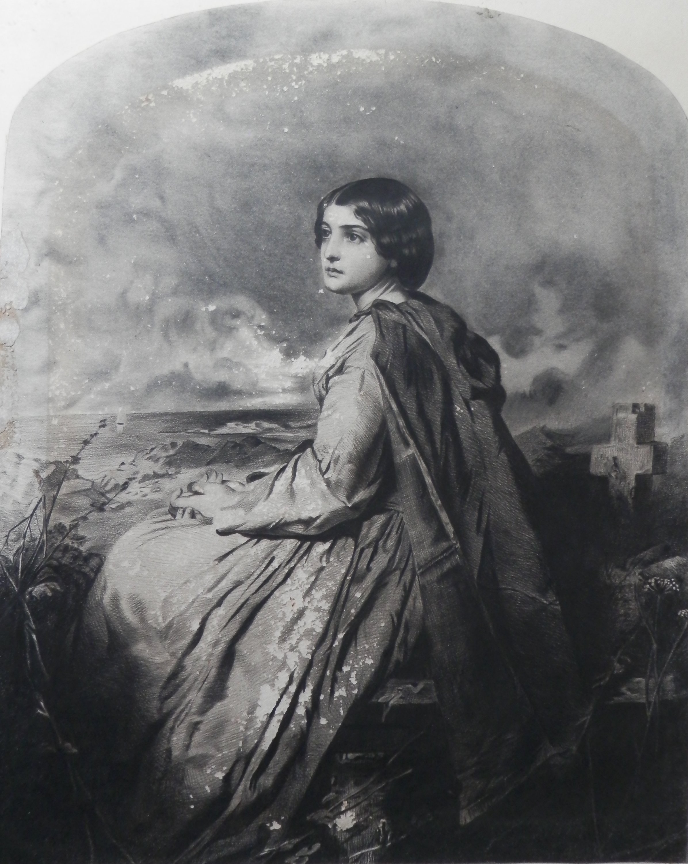 #ThomasFaed (1826-1900) was born in Kirkcudbrightshire, Scotland. He and his siblings were all artists. Educated in Edinburgh, he eventually moved to London and found fame as a painter of domestic genre scenes.
 The sublime technique presented here certainly displays the virtuosity of the artist. It is said that Thomas Faed was to Scottish art what Robert Burns was to song. I believe this is the image from which Thomas’s brother James created the mezzotints and engraved prints. Even with all its’ small flaws and imperfections, it is an amazing work to look at. The photographs don’t really do it justice.
 I took it home and as you can see it is a fine work with a great degree of finesse but here is the hook. It is not an etching. After a better study of this piece, I have come to the conclusion that it is actually an original #pencil/graphite drawing. This certainly makes the piece more interesting. It is done with very little shading but is worked with lines. This style of work is called #crosshatch. The more lines you add the deeper the tone. This can be and is very tedious work. ‘Shading’ or ‘colouring in’ is possibly the norm. One tends to find this type of work in etchings/engravings (often not to this degree of finesse) and is not as popular as a drawing technique.
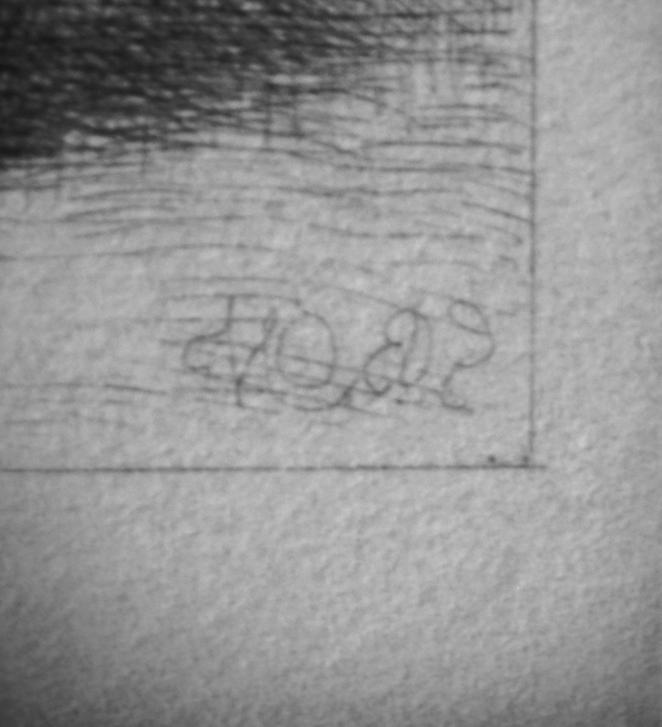 I attach an image of the signature, in the hopes that my readers might have better luck than I at deciphering the signature. In the second image, one can see the myriad of fine lines which are used the give the drawing depth and tonality. A superb #drawing, even if I don’t know who the artist is. And I can’t shake a feeling that I should know who this artist is.