The Song of Songs

We look, today, at an artwork created for #TheSongofSongs” (Song of Solomon) from the Old Testament. The image relates to chapter 4 and verse 16.

Awake,O north wind,
And come, O south!
Blow upon my garden,
That its spices may flow out
Let my beloved come to his garden
And eat its pleasant fruits.

‘From The Song of Songs’ engraving (artist proof) by Ya’akov Boussidan @ 1981

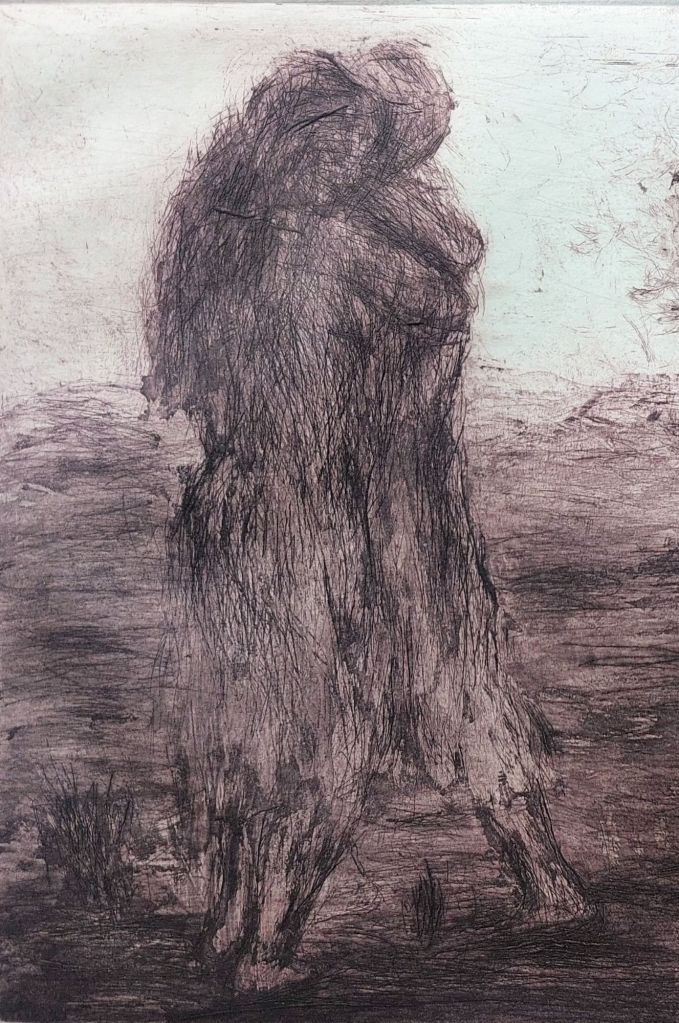
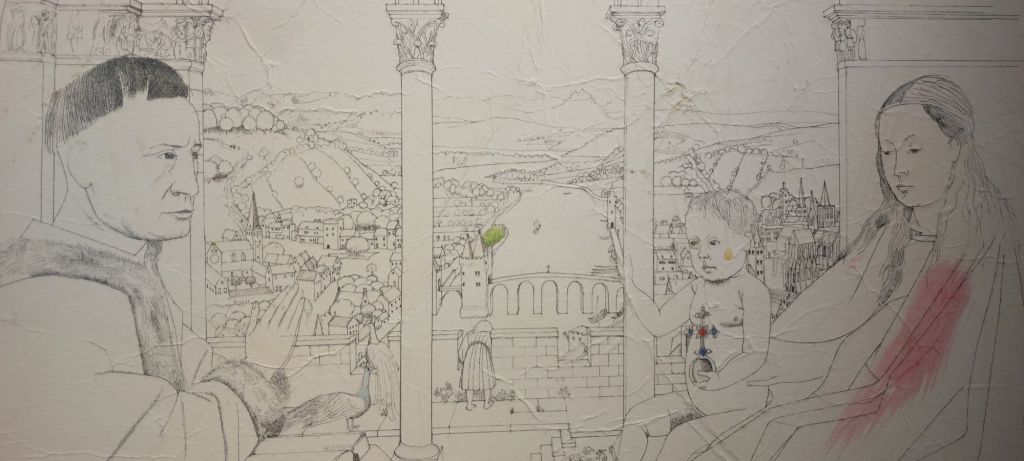
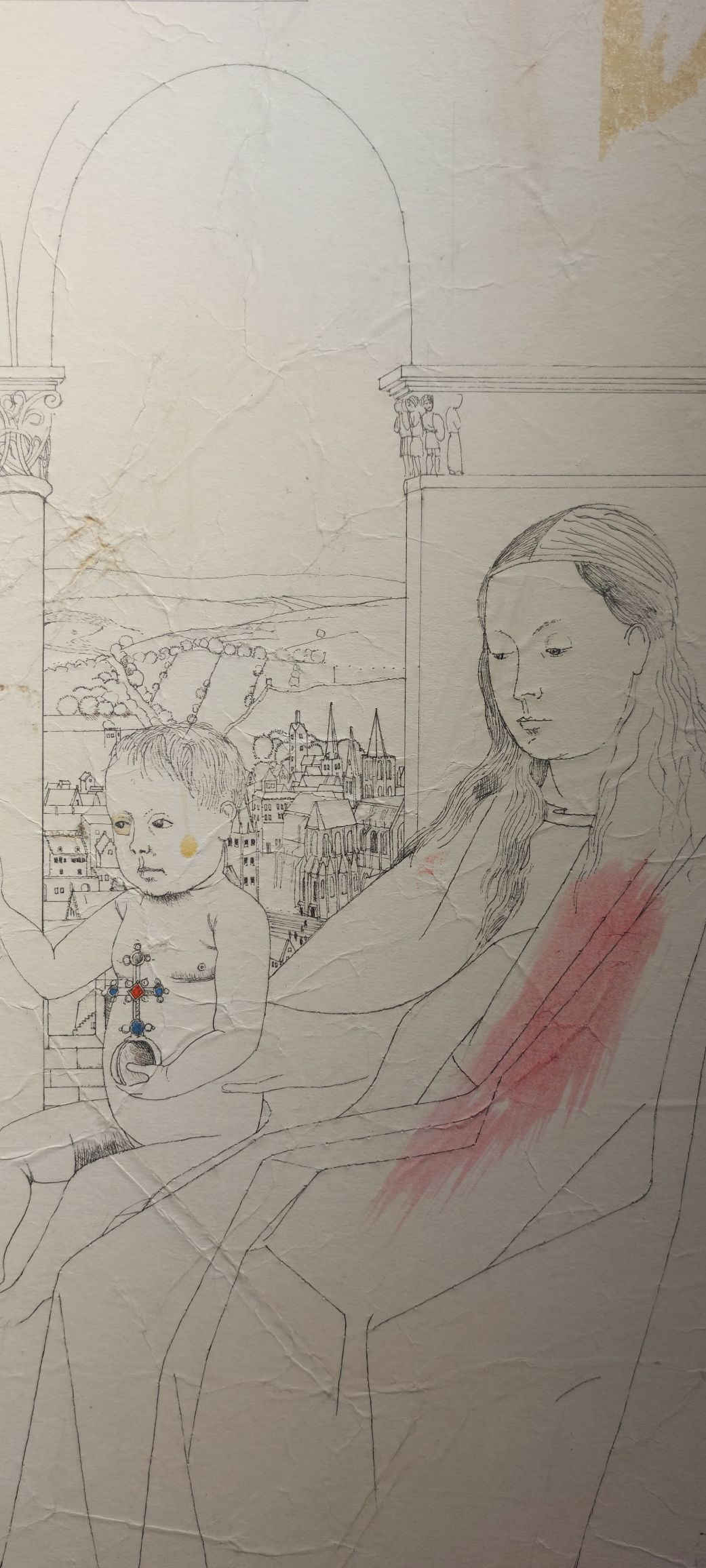
The artist is #Ya’akovBoussidan. He was born in Port Said, Egypt, in 1939. Boussidan is a painter, a sculptor, and a printmaker. When he was ten, he and his family were exiled from Egypt due to the Arab-Israeli war. Boussidan was interested in the furtherance of Jewish tradition through his art. At the mature age of 27, Ya’akov travelled to London to study printmaking at Goldsmith College. With access to presses and printing facilities, Ya’akovs’ love of the colours ‘black and white’ were brought to the fore. His technique of etching was refined, along with the mastering of mixing his own inks brought a more focused approach to displaying his thoughts. A few different shades of black can bring warmth or coolness to an image.

From ‘The Song of Songs’ ch 4 v 16 – engraving (artist proof) by Ya’akov Boussidan @ 1981

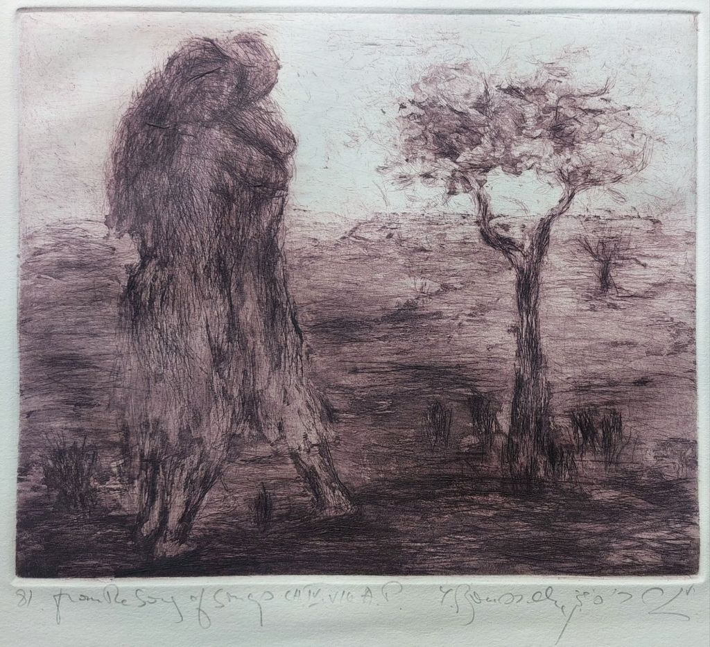
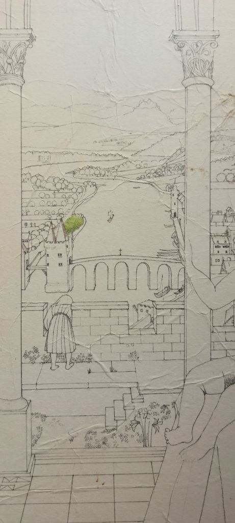
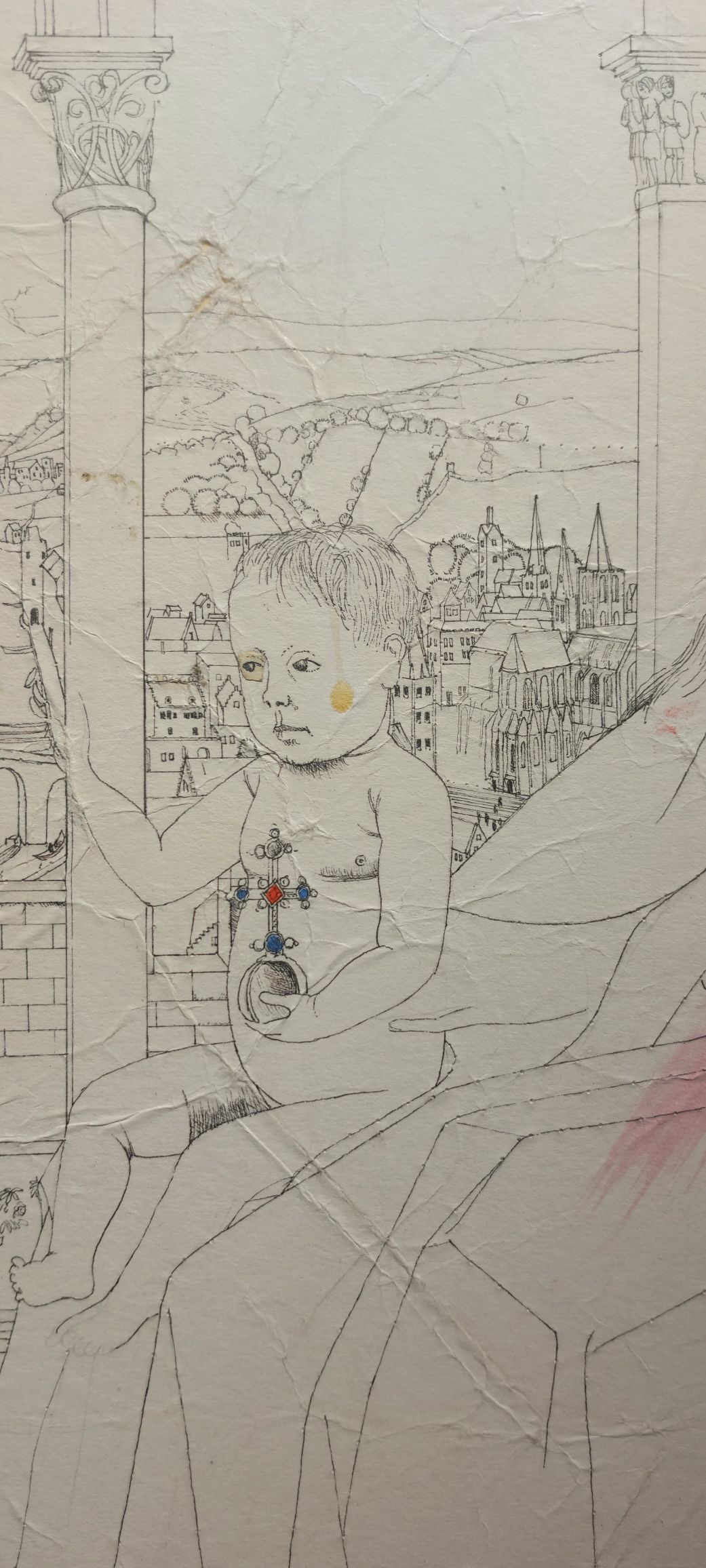
Boussidans’ ‘The Song of Songs’ was published in 1982. It was limited to 200 copies and contained not only the 8 offset lithographs but also one original engraving from the set. I love the way the two bodies male and female meld into a unified form. Two shall become one. It is an absolutely beautiful piece to look upon.

Posted in Etching, Mezzotint | Tagged , , , , , | Leave a comment

Carl von Dombrowski artist

Today, we look at a German artist who specialised in animal and hunting scenes. #CarlvonDombrowski (1872-1951) studied at the art Institutes in both Vienna and Munich. Many of his works were produced as woodcuts for Die Gartenlaube (The Garden Arbor – Illustrated Family Journal). It was the first successful mass-circulation German newspaper and paved the way for all modern magazines. The magazine aimed to reach all members of a family by providing articles on current events, biographies, short stories, poetry, essays on science ,history, etc, and full page illustrations.

Roebuck looks attentively out from the bushes – watercolour by Carl von Dombrowski @ 1920

Dombrowski worked in watercolour and oil. The above piece is done with charcoal, watercolour, and body colour and is a fine example of his work. It is undated, but I would date to @ 1920.

Posted in Drawings and Sketches, Watercolour paintings | Tagged , , , , , | Leave a comment

Bushey Heath Pottery and Fred Passenger

Well, I did it again. I got chastised by my wife for buying a broken piece of pottery, but to my eye, it is a fine artwork. This piece bears an impressed mark for #BusheyHeathPottery

Bushey Heath impressed Mark @ 1922

As you can see, it is made up of 2 crossed ‘P’ letters and the letters ‘De’ and ‘M’. The two ‘P’ marks stand for Henry and Ida Perrin, who were the great admirers of #WilliamDeMorgan (1839-1917) and his designs (hence, the De M). The Perrins set up a kiln and workshop at their holiday home ‘The Cottage’, Bussey Heath. They also hired #FredPassenger (1858-1938) to create and decorate their pottery using De Morgan’s designs. Passenger was one of De Morgan’s most skilled decorators. The ‘FP’ are Fred Passengers’ initials, signifying that he decorated this piece.

Rear of the Bushey Heath plate

The plate is a monochrome using cobalt blue, and as you can see, it is badly damaged and unprofessionally reassembled. It is not till you see the face of the plate that you will understand why I purchased this piece.

Bushey Heath plate by Fred Passenger using De Morgan design @ 1922

Even with it’s flaws it is a truly fine example of Passengers’ technique and the use of De Morgans’ designs. I love this piece not only for its beauty but for its history also. We as people should remember not only the artist’s and makers of pieces but also those patrons of the arts, which have allowed those  artists to work their gifts.

Posted in Ceramics/Pottery, Sculpture | Tagged , , , , , , | Leave a comment

Philippe-Jacques de Loutherbourg artist

I acquired a watercolour recently, which might be the study for an oil painting by artist #Philippe-JacqueLoutherbourg (1740-1812). This watercolour is the same size (465mm x 640mm) as the aquatint, which was created in 1787 by #MarieCatherinePrestel (1747-1794).

A view of a black lead mine in Cumberland – watercolour by PJ de Loutherbourg @ 1783

Loutherbourg was a French born artist who later became a British citizen. He is best known for his large-scale naval canvases and his work as a set designer/backdrop artist for London theatres. He studied with Charles-Andre van Loo and Francesco Casanova. In 1771, he moved to London, where he worked at Drury Lane Theatre for David Garrick.

Close-up section of ‘A view of the black-lead mine in Cumberland’

Loutherbourg became involved in the esoteric fields of faith healing, the occult, alchemy, and the supernatural. During these ventures, he continued to paint and exhibit.

My favourites from the above images are the horses. They are so wonderfully portrayed. Trust you enjoy this beautiful artwork.

Posted in Drawings and Sketches, Watercolour paintings | Tagged , , , , , , , , , | Leave a comment

The Beauty in Glass

I came across a small piece of leaded glass this past week. Just one small piece from a larger window. It is not something which I generally collect but this little piece is quite beautiful in its own way.

The Wren  and the Spider
The Wren and the Spider

Above, I show both sides of this small piece, and it is very hard to say there is anything special about it. But from a different angle, one then begins to see the peculiarities found therein.

Reverse from a different angle.

Above, you see from a slightly different angle the technique with which it was decorated. And if we follow with two other photos showing the numerous imperfections, one can finally guess at an age.

Imperfections in glass
Imperfections and thickness variations in glass.

The original version of this piece is found within the Zouche Chapel in York Minster. It was saved with several other pieces that had been used as temporary patch repairs on the larger windows. They were installed in the Zouche chapel in the 1950’s. The piece in the chapel is believed to come from the 15th century. I  am quite sure this is a modern copy, but it is well made and looks lovely hanging in my window.

Close up of the wren and spider
Posted in glass | Tagged , , , , | Leave a comment

Harold Williamson artist

I truly enjoy finding a new artist and can introduce people to that artist. I came across a watercolour by painter #HaroldWilliamson (1878-1972) a while back. When I first saw it, I loved its beautiful sombre mood. Williamson was a painter, etcher, designer, and teacher. His studies at the Manchester School of Art were interrupted by WWI, in which he served as a Royal Navy Volunteer Reserve. He returned to complete his studies after the war. At the end of his studies, he moved to London and worked at Arthur Sanderson & Son as a designer of fabrics and wallpaper. In 1926, he was granted the post of Painting Master at the  Bournemouth College of Art. He held this post until 1947 when he accepted the post of head of department at the Manchester College of Art and Design. He  retired in 1962. His works also appeared in The Studio and Sphere magazine.s

Autumn Path – watercolour by Harold Williamson

A mesmerising image meets the eye. Dappled colours and earth tones set against the barren trees, and late autumn flowers display a world in transition. And there in the distance, a person is treading the leaf strewn path, breathing the crisp cool forest air, and feeling the turn of one season to another. A wonderful evocative image.

Posted in Watercolour paintings | Tagged , , , , , , | Leave a comment

Louis le Sueur artist

Today, I thought we might travel across the North Sea and visit an artist in France. #LouisLeSueur (1746-1803) was a painter print maker. I have not found a great deal of information on Louis Le Sueur, but the following two engravings will attest to his talent.

Vue d’un moulin aux Environs de St Mandé – drawn and engraved by Louis Le Sueur
Vue des Environs de Corbeil – drawn and engraved by Louis Le Sueur

LeSueur worked with watercolour, gouache, and printmaking. His works are mainly landscapes portraying village/homestead scenes. Le Sueur lived in Paris but traveled to Italy and Germany to paint and sketch..

Posted in Etching | Tagged , , , , , , , , | Leave a comment

The Artist’s Muse

We often see an artist or group of artists being inspired by an individual model. Today, we look at one such muse that inspired a group of artists called the #NazareneMovement. The movement was a group of artists based in Rome but hailing from Germany. Their muse, #VittoriaCaldoni (1805-1872/1890), was their favourite choice of model. Over 100 paintings were done of her. She was discovered at the age of 15 and brought to Rome by #AugustKestner and instantly became a favourite. Vittoria was thought to have the ideal female figure. Usually portrayed in costume either allegorical or local with some semblance to the Madonna at times. Sadly, a large number of the paintings for which she sat were destroyed or disappeared in WWII. I think she stands beside Sarah Sissons, Emma Hamilton, and Jane Morris as being among the most important muses in art history.

Vittoria Caldoni – charcoal with highlights by JD Frye @ 1863

The drawing in my collection is by JD Frye and created in 1863. Alas, this would mean that this is a copy of an earlier painting/drawing but possibly still by a member of the Nazarene Movement (1809-1870?). Vittoria married a Ukranian artist and moved to Russia in 1839. Little is known of her after this move. The drawing is a beautiful tribute to a lady who inspired many an artist for over 20 years.

Vittoria Caldoni – close up
Vittoria Caldoni – signature of JD Frey @ 1863
Posted in Drawings and Sketches | Tagged , , , , , , | Leave a comment

Charles Edward Wilson artist

Recently, I came across a set of four lithographic prints. They were all based on one artist’s work. In truth, I was only interested in one of the four. All four are images of the Antarctica which were painted by #CharlesEdwardWilson.

Hut Point from the top of Observation Hill. April 1, 1911.
Looking north in McMurdo Sound, Frost smoke, 16 April, 1911
Cape Evans in Winter
Iridescent clouds looking north from Cape where the explorers waited for months Evans, 3 June, 1911

The three prints above are modern photographic prints.

Wilson was a doctor, ornithologist, and artist. He joined Scott on the Discovery Expedition to Antarctica from 1901-1904, later returning to Antarctica on the ill-fated Terra Nova. He created watercolours, sketches, and observations that portrayed the polar environment and expedition life. Wilson sketched with pencil, notating colours for later painting. A trick he used was to add vodka to his watercolour water to keep it from freezing. He produced studies of birds and the polar environment, which later became the basis for the book Edward Wilson’s Birds of the Antarctic.

Wilson perished alongside Scott and his comrads of the expedition.

Mount Erebus April 2, 1911 – 6pm
Note on verso.

The last print is actually a true lithograph with colour layed upon colour. A note on the back says that it should be sold to advance The Boys Scouts back in 1962 and sold for the princely sum of £10. In todays money, you would be looking between £350 to £450 for this print. A lovely and historically informative piece.

Posted in Lithographs, Modern prints | Tagged , , , , , , | Leave a comment

Jan van Eyck a beginning

As I was writing the previous chapter, I discovered that the drawing was of a painting by #JanVanEyck. Van Eyck is considered the creator, or almost so, of oil painting. There are about 20 paintings that exist today of his. Although he did paint a number of portraits, most of his paintings are depictions of the Virgin Mary with the Christ Child on her lap in church interiors or chapels as well as a possible worshipper (patron) with them.

Jan van Eyck- engraving by Lampsonius @ 1572

Throughout Van Eyck’s religious paintings, one sees the juxtaposition of the spiritual world with the secular. In the drawing and painting, the carvings on the columns above Rolin’s head are scenes from the bible while the church situated above his folded hands may be a symbol of his great financial support for his local church.

Detail of main body of drawing

I find it interesting that there are a number of missing or changed items in the drawing from the painting. The four main alterations are 1. there is no castle in the middle of the river in the central arch, 2. the is only one child on the patio, 3. the peacocks become smaller in size, and the one on the wall goes from male to female,] 4. the angel with the crown does not appear at all in the drawing. There are a few other small differences, and this tells me that if this drawing was created to copy the painting, then those differences would not be there.

Detail of #ChancellorRolin
Detail of central arch, patio and river
Detail of the Christ Child
Detail of #VirginandChild

Van Eyck was a master at creating depth and giving his paintings a 3 dimensional feeling. He was also a master at producing an almost photographic effect in his backgrounds, which are filled with immense detail.

I sit wondering why create such a detailed drawing with obvious errors and omissions. It is a question I can not answer, but it is fun considering the reasons.

Drawing of #TheRolinMadonna
Posted in Drawings and Sketches | Tagged , , , , , , , , , , , , | Leave a comment