Almost a year ago, I wrote a chapter called ‘art on sale’ and in that chapter I wrote on two pieces by Beatrix Holms. This past week I came across another piece by her. I never did find any information in regards to her life but with this new piece, I can imagine a little bit more of who she was.
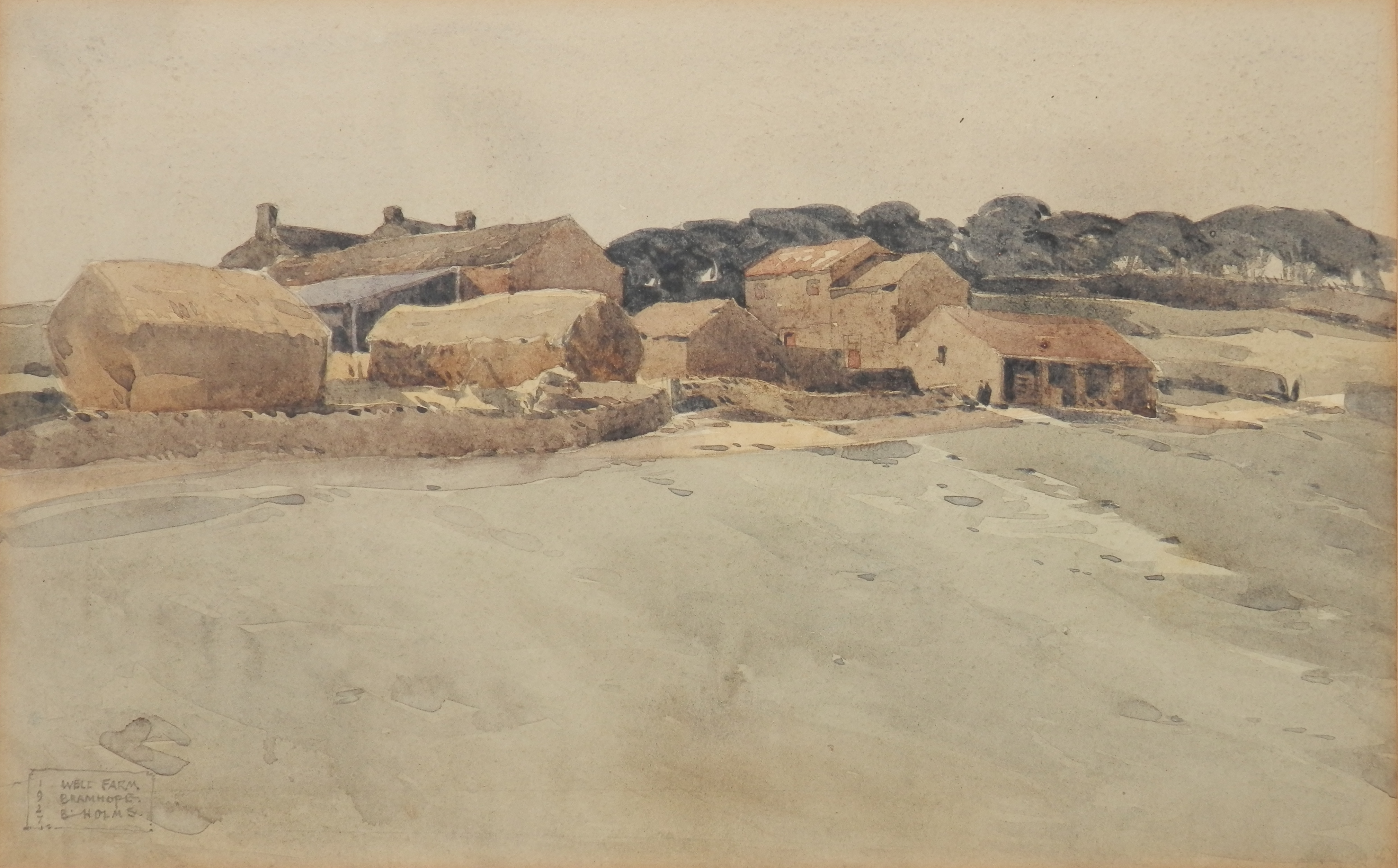
Well Farm, Bramhope nr Leeds
watercolour by Beatrix Holms
@ 1927
I give you, #WellFarm by #BeatrixHolms. The third piece in my collection by her. From this piece and the other two, I can more surely surmise that Beatrix was a Yorkshire lass living in the Leeds area in the early 1900s. As shown, this is Well Farm on Black Hill. It no longer looks anything like this today – for in the 1930’s a large complex was built along side the farm. Golden Acre Park was once a large pleasure park, officially opened in March of 1932. Motor launches, rowing boats and dinghy’s sailed the length and breadth of the lake whilst in the centre stood a large tower from which music and announcements were relayed. Around the lake (a distance of just over a mile) ran a miniature railway connecting the many attractions (including the open air swimming pool, Helter Skelter, and a Zoo) to the rest of the park. The Park closed after a relatively short life at the end of the 1938 season and lay derelict until 1946 when the land was purchased by Leeds City Council. It now consists of approximately 55 hectares of gardens and mature woodland surrounding an attractive lake which is home to many species of wildfowl. I think Beatrix would like what it has become today.
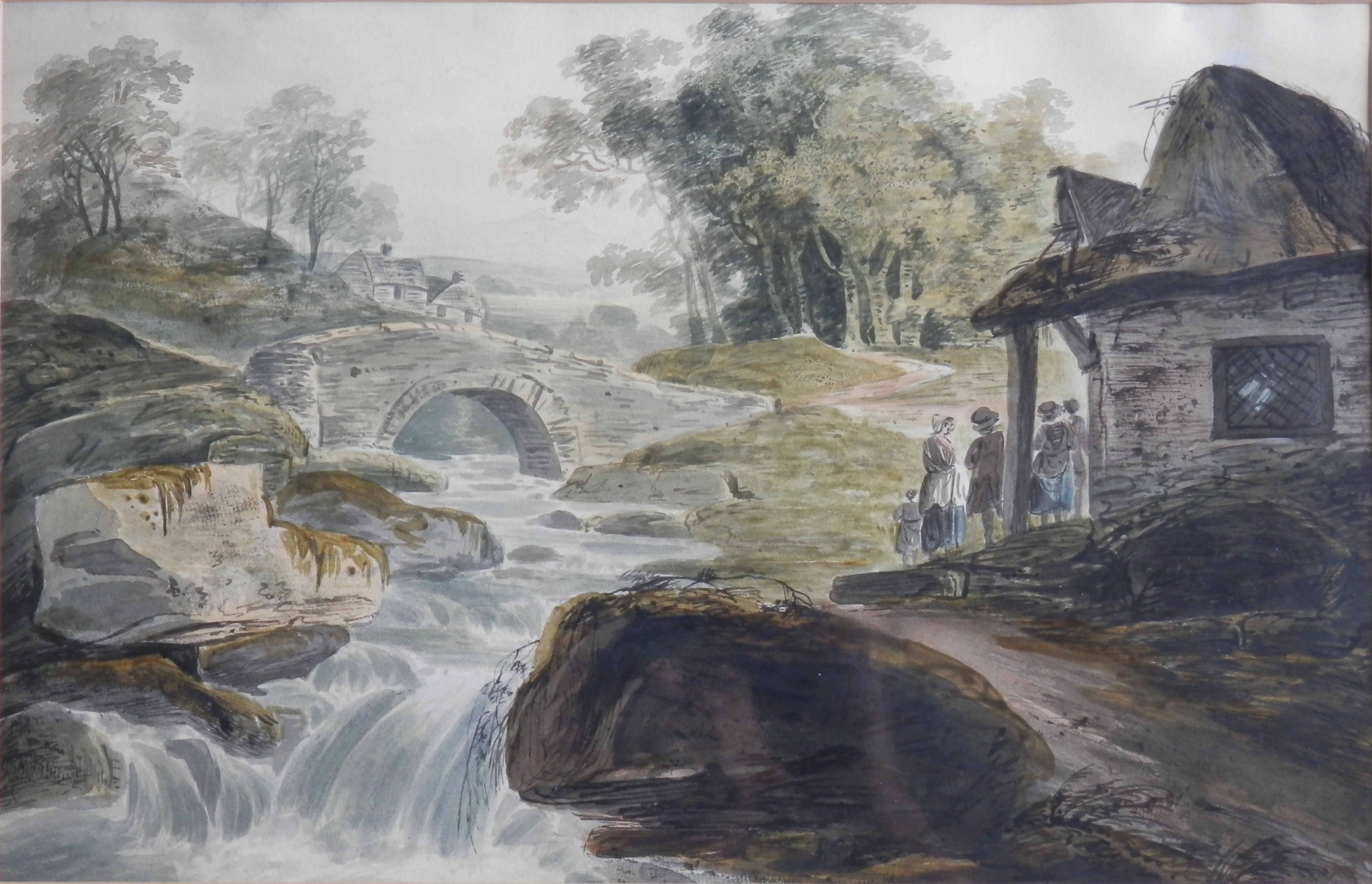
And although I considered that the landscape scene might have been Welsh in my first post, I now lean fairly positively in the Yorkshire direction and of course Barwick in Elmet Church is close to Leeds also. And so you don’t have to search for them here they are.
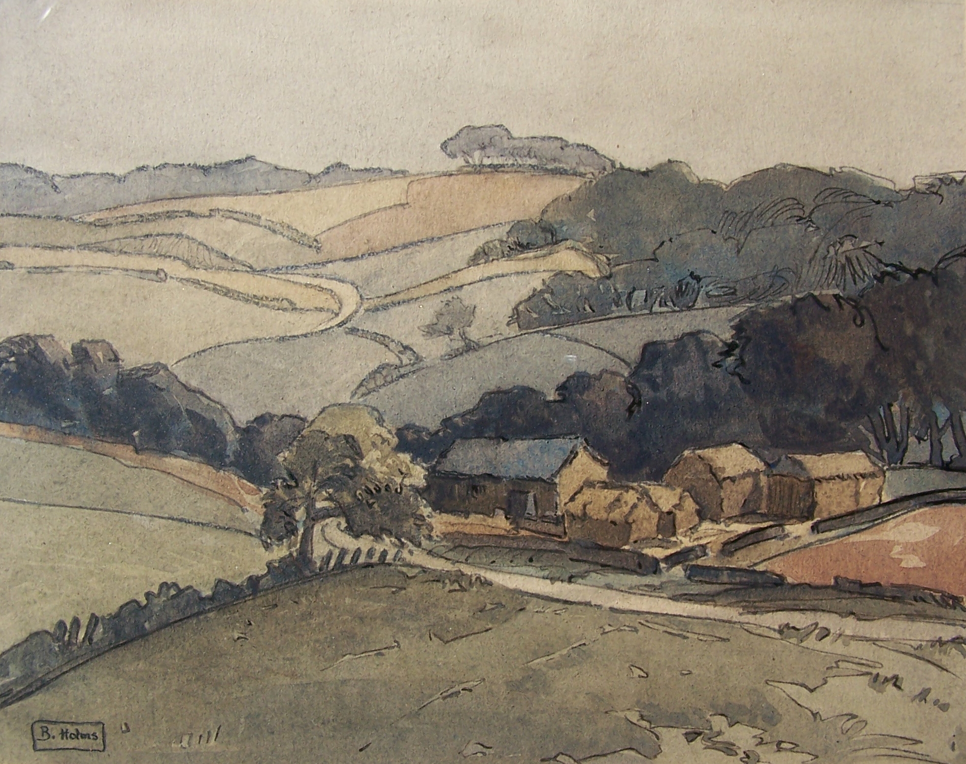
A Yorkshire Valley scene
watercolour by Beatrix Holms
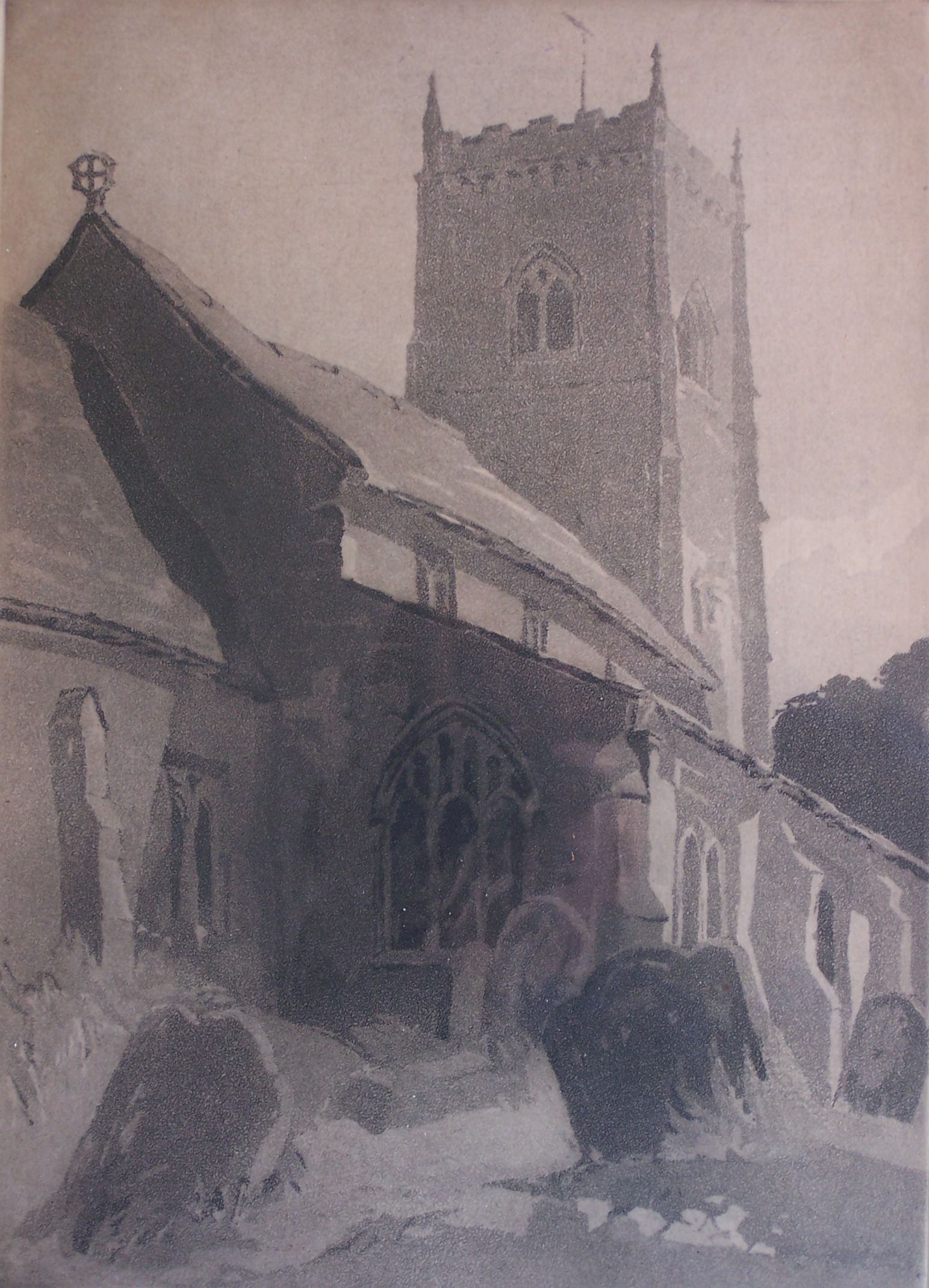
‘Barwick in Elmet Church, Yorkshire’
Aquatint by Beatrix Holms
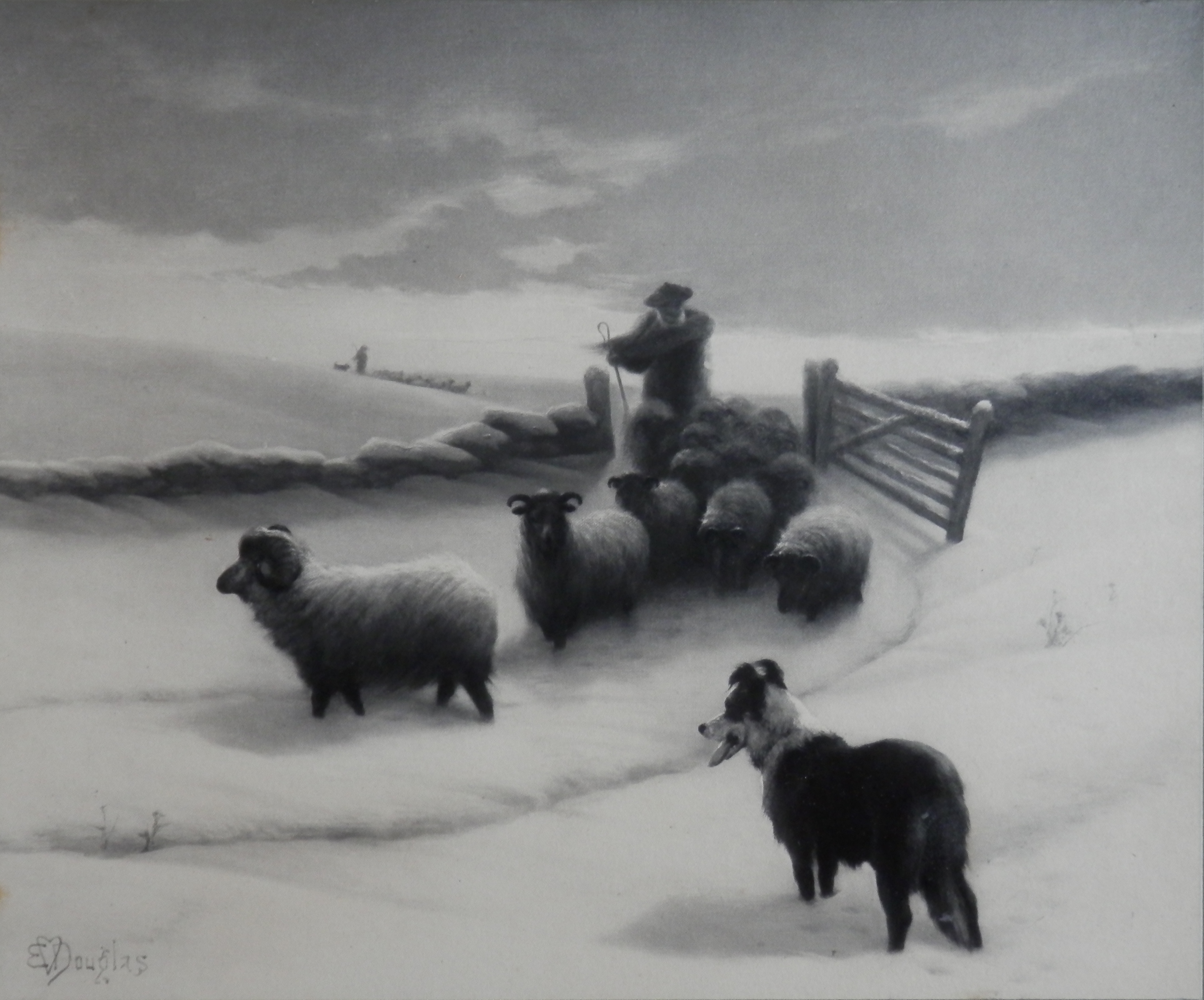
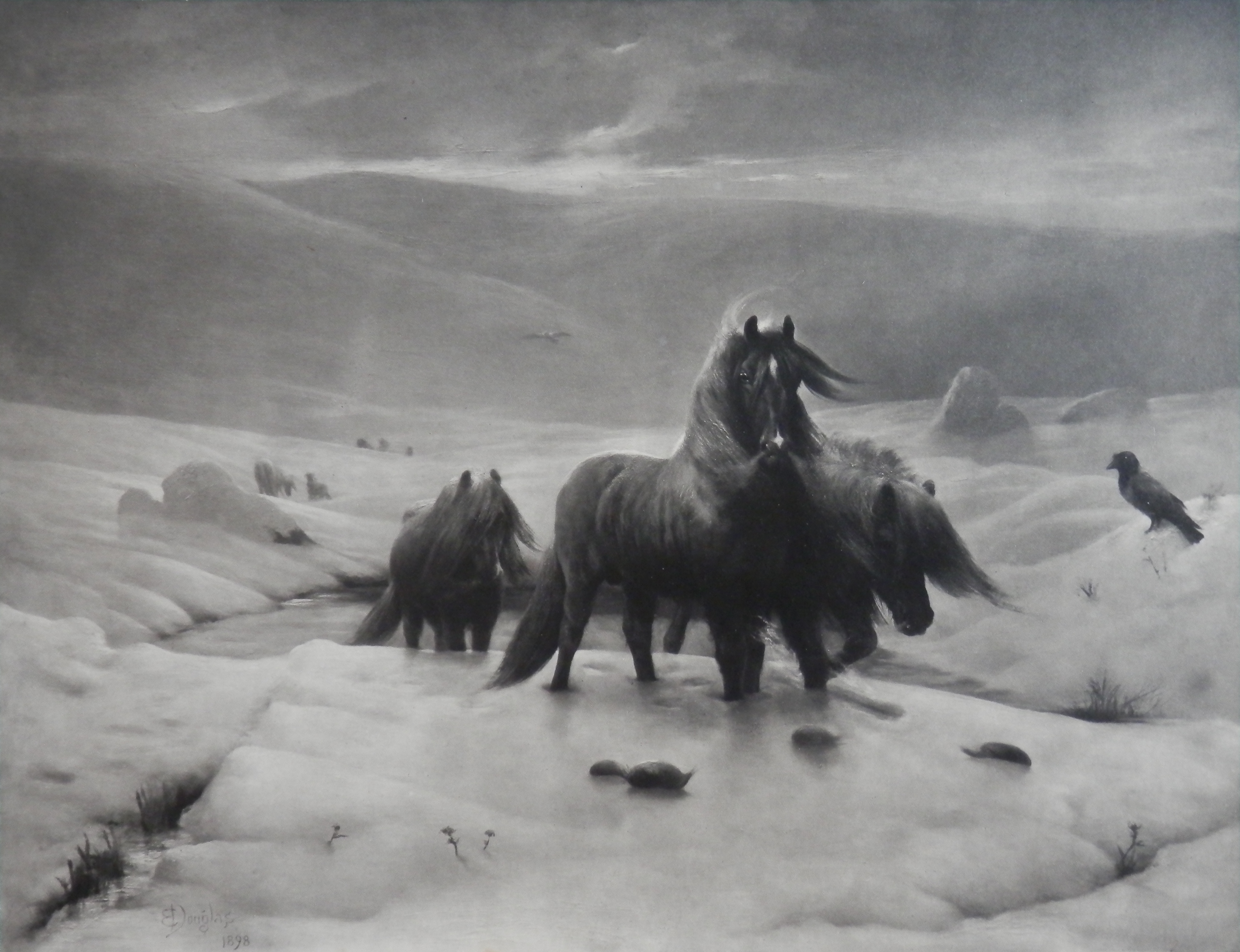
A fine and lovely group by the talented Beatrix Holms.