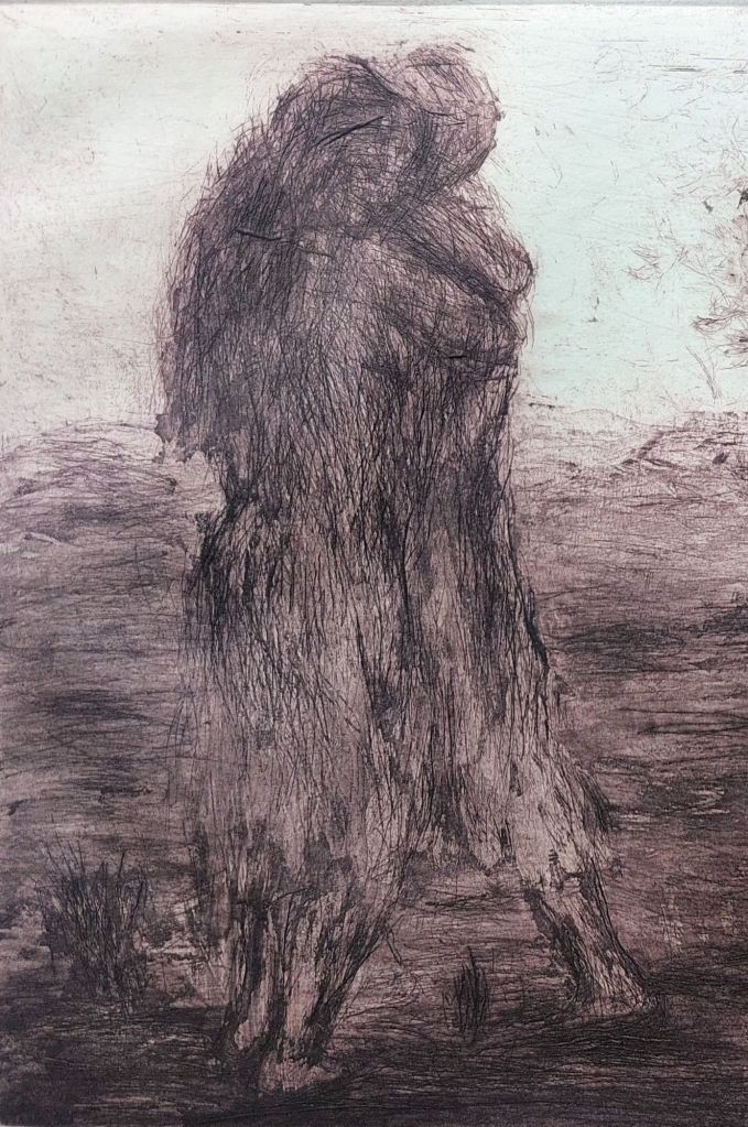
We look at an item this artist is not well known for today. #IosephBrodtmann or Karl Joseph Brodtmann (1787-1862) was a Swiss lithographer. He was considered to be among the finest engravers of his time. Ioseph is best known for his depictions of animals and birds. His works were beautiful and extremely accurate, for often, images like the ones he created were used for scientific research and education purposes.
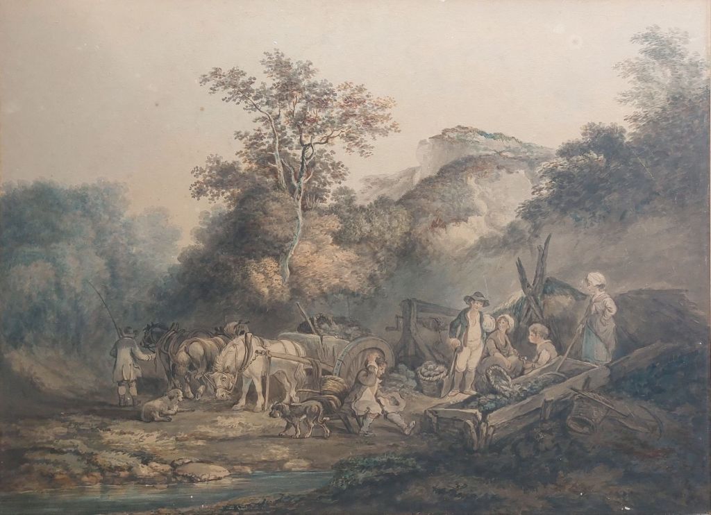
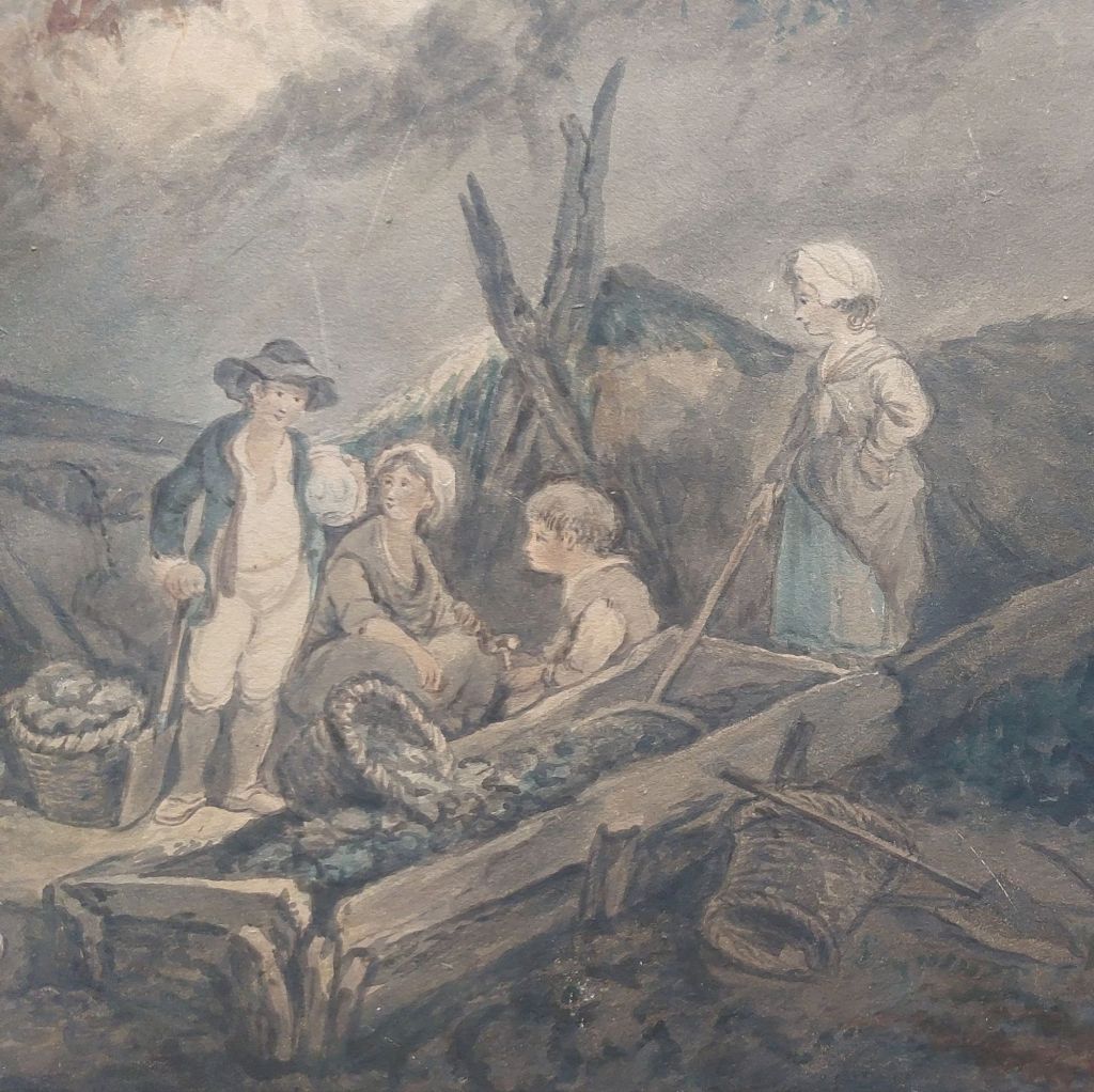
But we are going to look at a piece which displays the life of the working people.

The scene set before us shows a family gathered around their dining table, heads bowed in prayer, giving thanks for what they are about to receive. A bowl of potatoes, a truckle of cheese, and a loaf of bread or a piece of ham. Meagre by most standards today but yet sufficient.
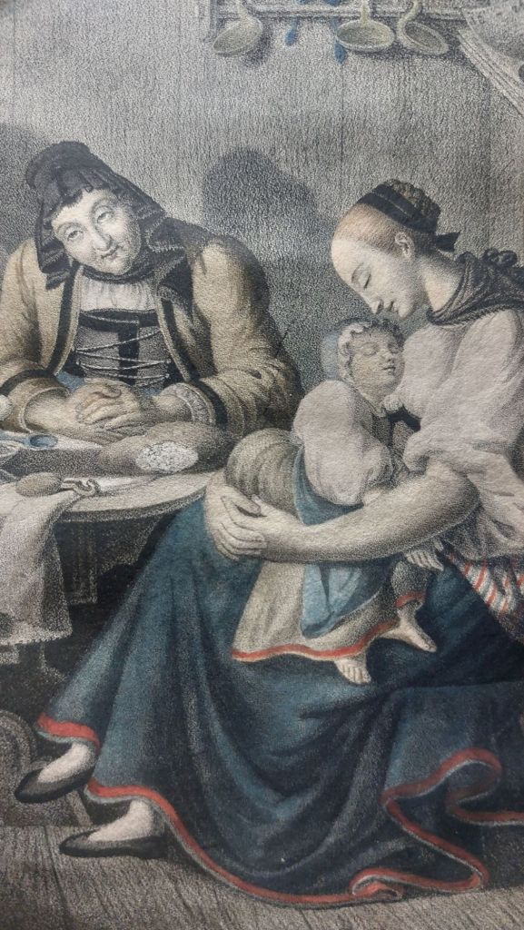
When I look at this image there, I see thankfulness and contentment. There is food to eat, a roof over their heads, and children – hope for the future.
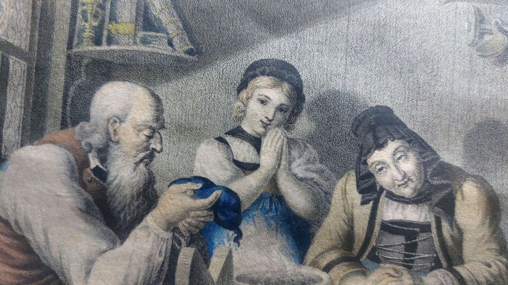
Exquisitely rendered onto stone by Brodtmann and later sympathetically and judiciously coloured, which has imbued a strength we rarely see today. I can understand why Brodtmann was one of the great lithographers of his time. The plate was printed by Henry Fuessli & Co. (1792- early 21c)